This spring, I completed the Du Bois Challenge - an annual online event where participants are tasked with recreating one of W.E.B Du Bois’s famous data visualizations each week over the course of 10 weeks.
Participants are allowed to use whatever tools they want, but my tool of choice for the challenge was naturally D3.js. Throughout the challenge, I discovered useful tools and historical data sources, and learned a lot about the intricacies of D3, SVG, and web technologies in general. Although modern technology can quickly produce accurate charts, some of the organic, imperfect shapes and colors of these historical visualizations were quite tricky to recreate.
For the rest of the post, I’ll discuss each of the ten plates I recreated, describing my process and interesting features in each visualization. Click into each title for a live view, or browse the source code on Github. In the galleries below, the left/first image is my reproduction and the right/second image is the original.
Week 1 - Plate 06 - Choropleths #
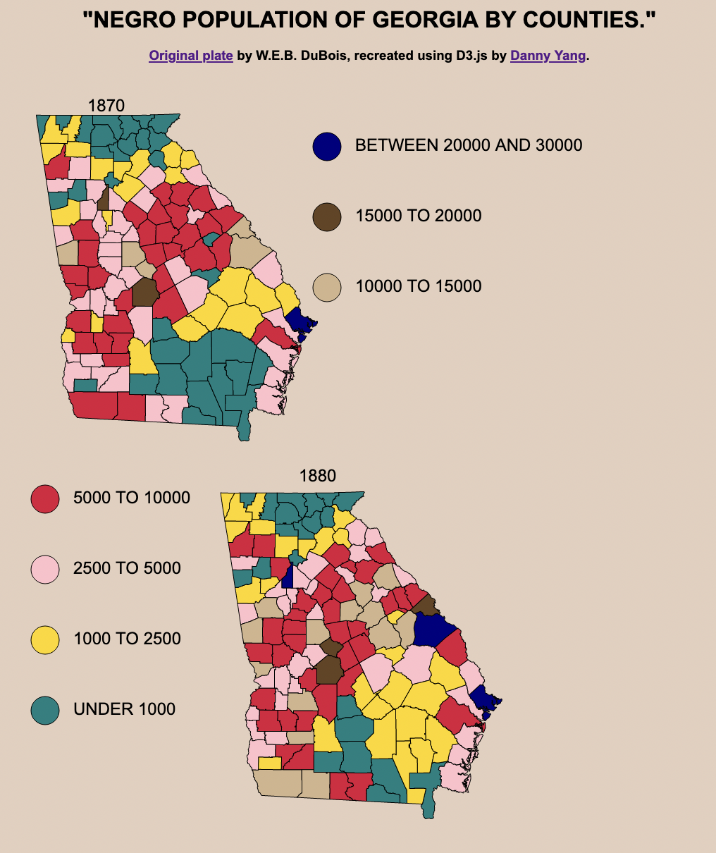
Although these two choropleths look deceptively straightforward to recreate, it wasn’t so simple. I couldn’t just plot the data on modern US county boundaries since county boundaries change a lot over time. In order to accurately recreate the visualization, I had to find the boundaries from 1870 and 1880.
National Historical GIS Data Finder #
The NHGIS Data Finder is an extremely valuable source of historical cartographical data that I wish I had known about sooner. Using that portal, I retrieved the county boundaries from the appropriate years, which ended up being 100mb unzipped. I used mapshaper to delete the other states, simplified the boundaries to reduce file size, and converted the shapes to a GeoJSON.
After I had the shape data and joined it with the dataset I was plotting, the rest of the process was the same as any other choropleth.
Colors #
I used the eye dropper tool in Firefox’s dev tools to pick out the colors from the chart, though if I had been making it from scratch I would have chosen a sequential color scale. As I mentioned in my review, the suboptimal color choice is likely because these visualizations were originally handmade and the creators had less granular control over color and shading using ink and paper than we do with computers today.
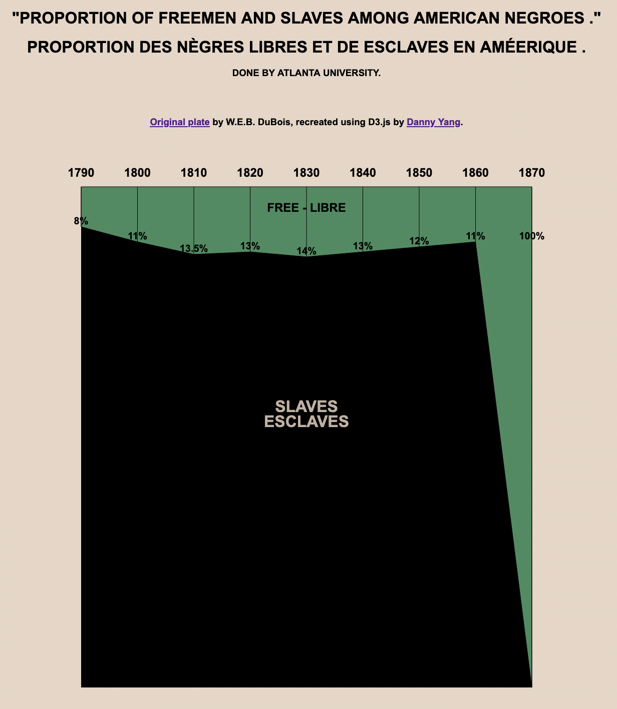
Week 2 - Plate 12 - Cut-off Area Chart #
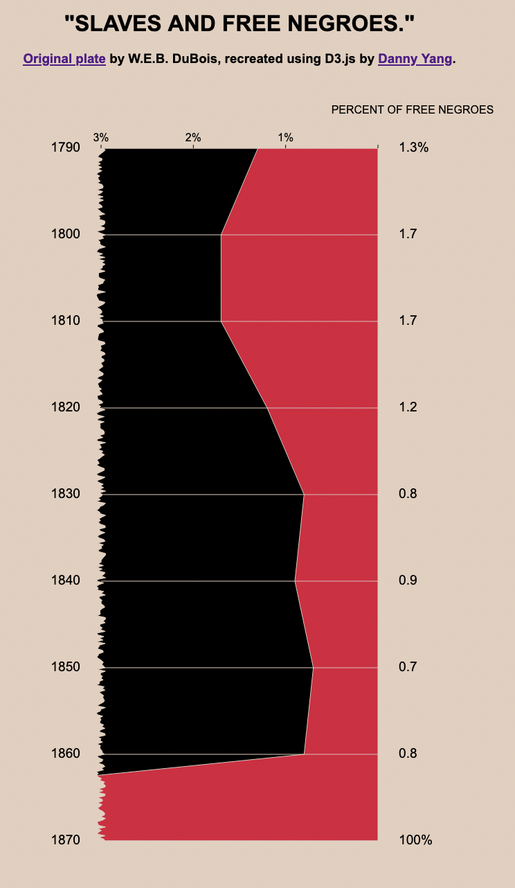
This visualization looks like a stacked area chart, except that the left side is cut off with jagged edges.
Jagged Edge/Cut-Off Effect #
To create this effect, I first plotted the data as usual with straight edges and added a randomized jagged shape covering the left side that was the same color as the background.
The edge shape was generated using this function:
const [minYear, maxYear] = d3.extent(data, d => d.Year);
const jaggedData = [];
const magnitude = 0.1;
const resolution = 5;
for (var i = minYear * resolution; i <= maxYear * resolution; i++) {
    jaggedData.push({
        n: 3 - Math.random() * magnitude + magnitude / 2,
        i: i / resolution,
    });
}
The bottom-most data point also had to be manually adjusted - had it been accurately plotted at 100 (offscreen), the line would have been much more horizontal. Although I prioritized matching the visuals of the original visualization over perfect accuracy to the data here, I don’t think it affects the story told by the visualization.
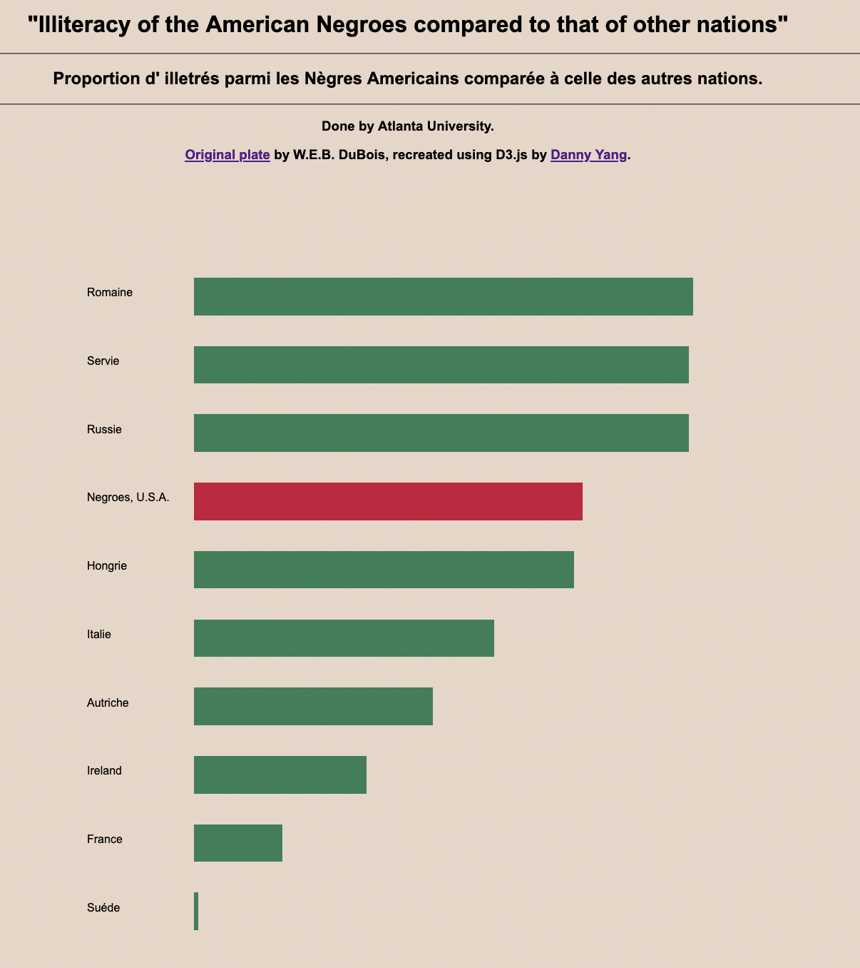
Week 3 - Plate 19 - Bar Chart #
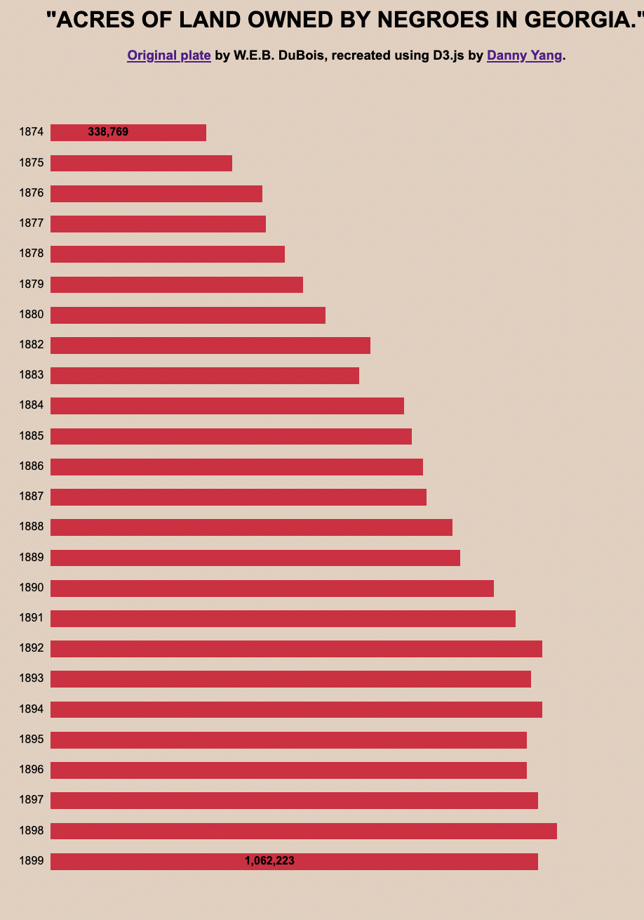
This standard bar chart was easy to recreate. By design it’s quite minimalist, with no axis lines and only two bars have their labeled for reference. This reminded me a bit of Tufte’s philosophy of data ink.
Text Extraction/Image to Text #
Many of Du Bois’s charts contain captions and additional information, and sometimes it was too much work to type it all up again. To speed up the process, I used an online image to text utility to get the text from the original plates and made small manual edits for correctness.
Week 4 - Plate 01 - Hemispherical Map #
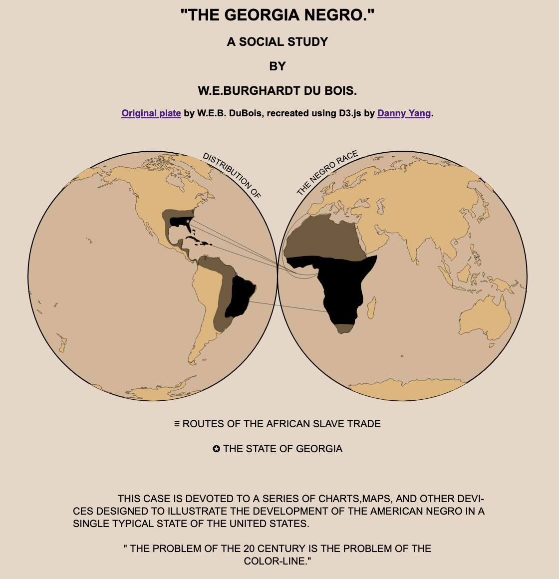
This chart had a super interesting visual layout, featuring a world map projected as two circular hemispheres side by side. I had never made anything like this before, so I had to do some research.
Interrupted Molleiwide Hemisphere Projection #
As it turns out, this projection is called “Interrupted Molleiwide Hemisphere” and D3 has an extension called d3-geo-projection that supports it out of the box.
const geoLand = topojson.feature(land, land.objects.land);
const projection = d3.geoInterruptedMollweideHemispheres().fitSize([1000, 500], geoLand);
const path = d3.geoPath().projection(projection);
I applied the projection to a standard 110m resolution landmass outline and some shape/line data created manually by another participant, but was met with colors spilling out of their paths.
At first I thought it was a winding issue, but some debugging I realized this was because some landmasses were getting cut off by the projection and I needed to clip the boundaries of the map to the two hemispheres.
This was done by first defining a clip path in the SVG:
const defs = svg.append("defs");
defs.append("path")
    .datum({ type: "Sphere" })
    .attr("id", "sphere")
    .attr("d", path);
defs.append("clipPath")
    .attr("id", "clip")
    .append("use")
    .attr("xlink:href", "#sphere");
And then setting the clip-path attribute on the path element:
.attr("clip-path", "url(#clip)")
Curved Text #
The original visualization also contained curved text, which I had never worked with before.
As it turns out, I could just generate a path element for the desired shape of the text, and add a <textPath/> child referencing it to the SVG <text/> element. The MDN doc on <textPath/> was a useful resource for this.
map.append("path")
    .attr("id", "lTextPath")
    .attr("transform", "translate(250,250)")
    .attr("d", d3.arc()({
        innerRadius: textRadius,
        outerRadius: textRadius,
        startAngle: Math.PI / 8,
        endAngle: Math.PI / 2,
    }));
map.append("text").append("textPath")
    .attr("xlink:href", "#lTextPath")
    .text("DISTRIBUTION OF")
Unicode Symbols #
I didn’t feel like finding and positioning SVG icons for marking Georgia with a star on the map and the hamburger/star symbols on the legend, so I just searched up the appropriate unicode characters and used the symbols in-line with the text.
legend.append("text")
    .attr("x", width / 2)
    .attr("y", 600)
    .attr("text-anchor", "middle")
    .text("\u2261 ROUTES OF THE AFRICAN SLAVE TRADE");
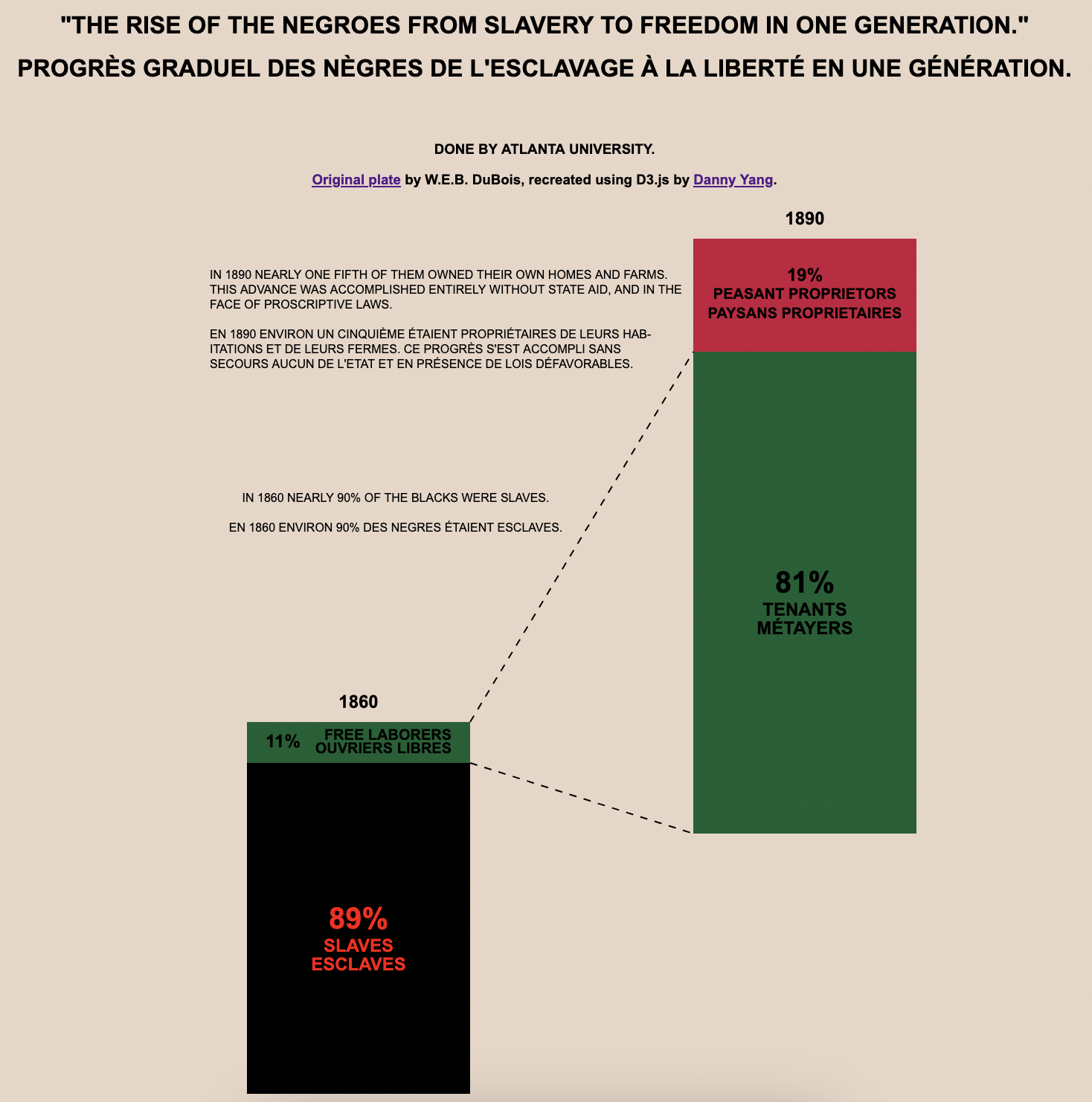
Week 5 - Plate 13 #
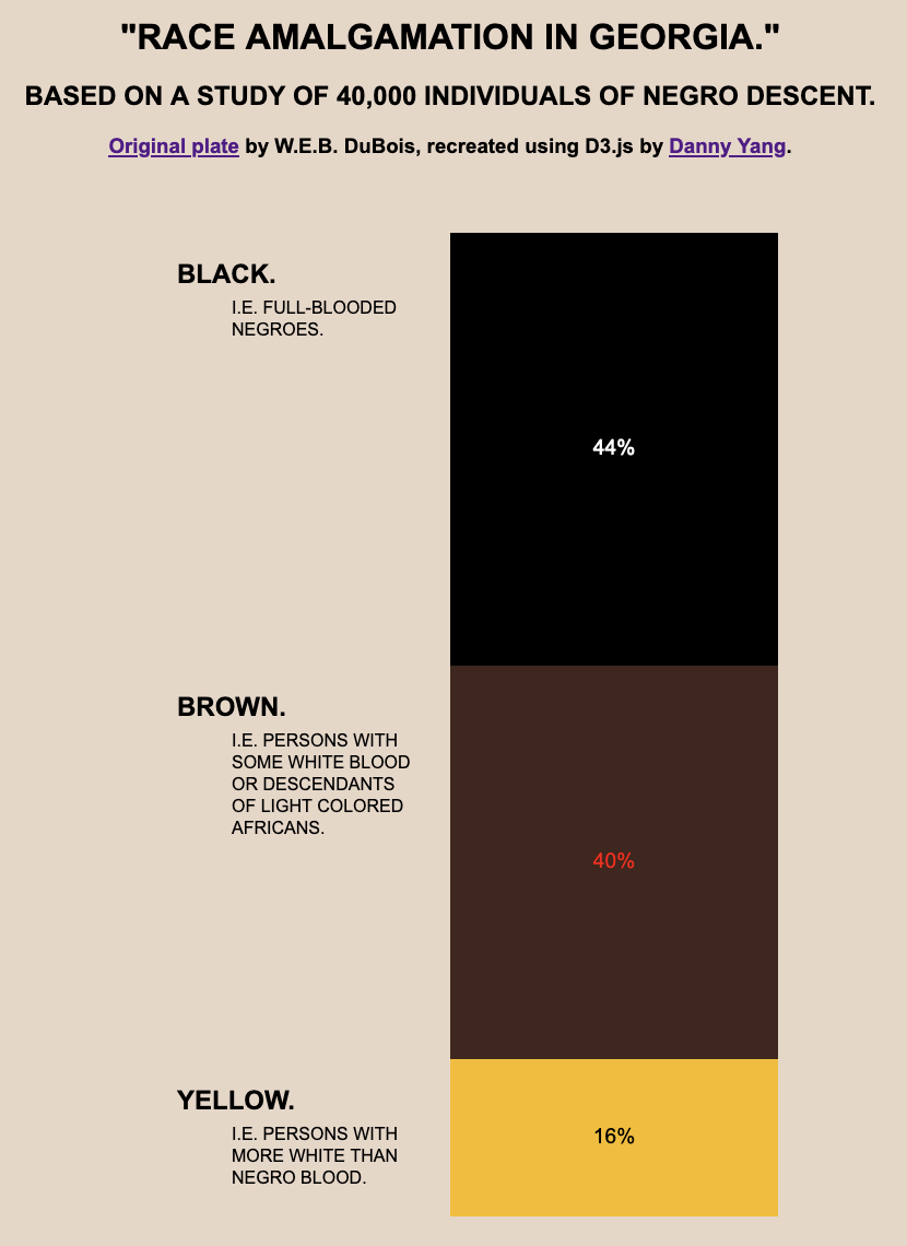
This visualization was a single stacked bar, so it wasn’t worth using D3’s stacked bar chart helpers. Instead, I created a single linear scale and did a bit of math to manually position everything.
Week 6 - Plate 54 #
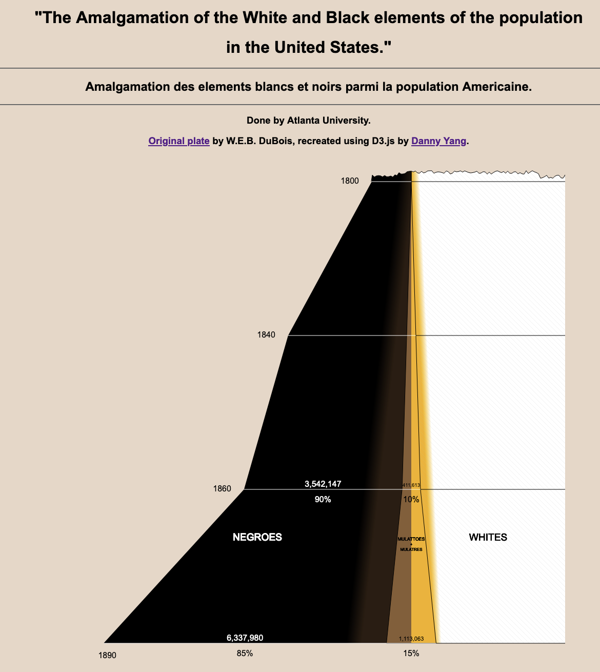
Similar to week 2, this was a stacked area chart with one side cut off. Beyond that, it employed several other visual effects that were quite a challenge to re-create.
Although the layout appeared to be symmetrical, it actually wasn’t since the bulk of the data was cut off to the right. I couldn’t find a D3 helper to control the centering, so I ended up plotting this as two separate area charts going in opposite directions around the center line. I added another rectangle underneath the right side for the cut-off white section, and added jagged edges to the top using a similar technique as before.
Rotated Gradients and Hatch Patterns #
There was some color blending between the sections of the chart to illustrate the blurry boundaries between each racial category. While simple to create on ink and paper, it was quite tricky to do in D3.
I ended up having to rotate the gradient definitions to approximate the original colors.
<linearGradient id="LeftGradient" gradientTransform="rotate(10)">
    <stop offset="95%" stop-color="black" />
    <stop offset="100%" stop-color="#2c1d11" />
</linearGradient>
<linearGradient id="RightGradient" gradientTransform="rotate(-5)">
    <stop offset="0%" stop-color="#f5b000" />
    <stop offset="3%" stop-color="white" />
</linearGradient>
To create the sketch-like hatching pattern in the white part of the chart, I used a repeating SVG pattern containing a single line.
<pattern id="Lines" x="0" y="0" width="10" height="10" patternUnits="userSpaceOnUse">
    <line x1="0" y1="0" x2="11" y2="11" stroke="silver" stroke-width="0.5" />
</pattern>
Week 7 - Plate 47 #
This was another minimalist bar chart with a small twist in that I had to create accented characters for the French labels.
In HTML this is done with & + your letter + acute/grave (or something else depending on the accent you want). For example, to create È you can write È.
Week 8 - Plate 50 #
This visualization was two separate stacked bars that are neither horizontally nor vertically aligned, with lines connecting them. Due to the strange layout, I hardcoded most of this, using D3 only for scales and creating SVG elements.
Week 9 - Plate 51 #
In this visualization, the rightmost text label had to be adjusted so it wouldn’t be placed at the bottom.
The positioning of labels in many of Du Bois’s charts do not perfectly reflect a mapping from the data like D3 would generate, nor are they fully consistent in formatting with each other. Some of it is intentional to make the chart easier to read (like in this case), others are simply human error. To accurately recreate the original visuals, I made many tweaks to the positioning and formats of individual text labels these recreations.
Week 10 - Plate 37 #
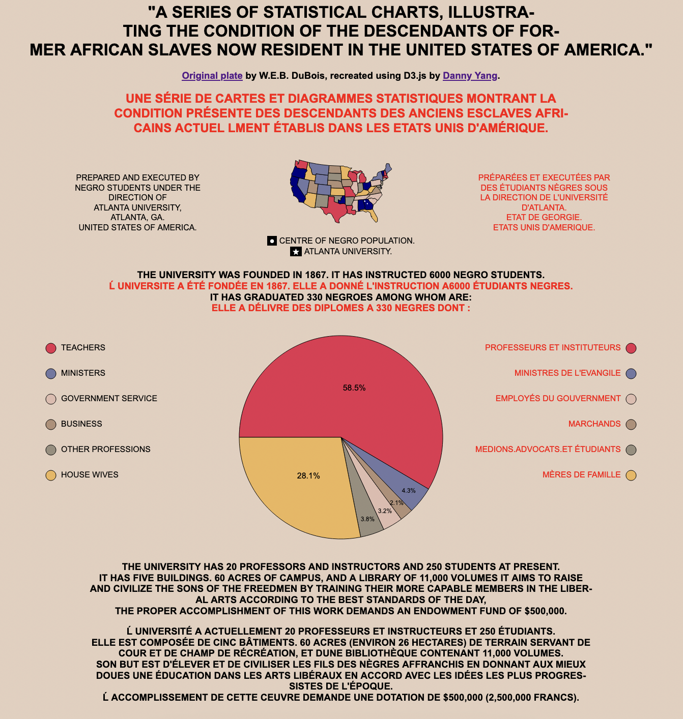
This was an interesting composite chart, containing a tiny choropleth, a large pie chart, and a lot of text.
Tiny Choropleth and Island Removal #
Since the choropleth was so tiny, I wanted to reduce the file size as much as possible by removing unnecessary details.
I used mapshaper to reduce the number of vertices and edges and delete Alaska and Hawaii (sorry, they weren’t states in Du Bois’s time). Then, I used the filter-islands command to clean up the islands.
$ help filter-islands
COMMAND
-filter-islands  remove small detached polygon rings (islands)

OPTIONS
min-area=        remove small-area islands (e.g. 10km2)
min-vertices=    remove low-vertex-count islands
remove-empty     delete features with null geometry
target=          layer(s) to target (comma-sep. list)
This was the command I ended up using to reduce the final dataset to 44kb.
mapshaper -filter-islands min-area=200km2
Finally, when drawing the map I gave each state a random color since it didn’t seem like the color channel encoded any meaningful data in the original.
Pie Chart Customization #
This was the first time I had to tweak the sorting order and start angle for a pie chart, since I don’t work with them frequently. I was pleased to discover that D3’s pie chart API supported those customizations.
const pie = d3.pie().value(d => d.Percentage)
    .startAngle(-Math.PI / 2)
    .sort((a, b) => a.Order - b.Order);
In the original visualization, the text labels for the smaller categories were placed closer to the outside and rendered using smaller font so they would fit in the narrow slices.
The standard way to place labels pie charts in D3 is to use the centroid of the slice, so I had to use a bit of a trick to make the positioning work in my re-creation. For the labels on smaller slices, I used a different arc generator with a larger radius than I used for the actual pie. That way, the centroid of this larger arc would be at the same angle but as the smaller arc, but closer to the outside of the visible slices.
// special arc for centroid calculations on smaller slices
const arc2 = d3.arc()
    .innerRadius(0)
    .outerRadius(radius * 1.7);

...

.attr("transform", d => d.data.Percentage > 5 ? `translate(${arc.centroid(d)})` : `translate(${arc2.centroid(d)})`)
Conclusion #
I was super stoked to participate this year - the Du Bois Challenge has been marked on my calendar since I first found out about it last year, when I was researching for my review of data viz techniques used in Du Bois’s works.
I participated each week in the Data Visualization Society’s Slack channel, and it was great to see how other participants completed the challenge using a wide variety of tools and approaches. Some focused on accurate visual recreations like I did - others applied the layout to modern data to see how much has changed since Du Bois’s time, or added interactive elements like tooltips to enhance the audience’s understanding of the chart.
For for completing the challenge, I was awarded a free copy of the latest issue of the Data Visualization Society’s Nightingale magazine, which was a pretty neat prize since I’ve purchased past issues of that magazine.
Overall, this was a great experience and I encourage everyone who’s interested in data vis to try the challenge next year. You don’t even need to use D3.js like I did - you can use any tool you want and make the recreation as faithful or creative as you want, but I think that regardless of what you use it will be a great learning experience.
Further Resources #
Kristin Baumann wrote about of her experiences with the same challenge in an online article for the Nightingale.
If you want to try these challenges for yourself, the assignments and release data for past challenges can be found here.