This post contains a set of D3.js visualizations to explore Edward Tufte’s concept of “data-ink”. The core of the idea is that we can make visualizations easier to interpret by eliminating unnecessary visual elements, reducing clutter and allowing the data to speak for itself.
What counts as unnecessary?
- non-data-ink: visual elements that don’t encode any data
- redundant data-ink: visual elements that encode the same information already shown by another element
As with everything, this is a principle that’s best applied in moderation. Going overboard and removing both the chart title and axis labels can lead to confusion, especially if viewers can no longer tell what units are used in your visualization.
I discuss the following set of visualizations:
- line chart
- bar chart
- box plot
- scatter plot with marginal histogram
- dot-dash plot (scatter plot w/ marginal rug plots)
- sparklines
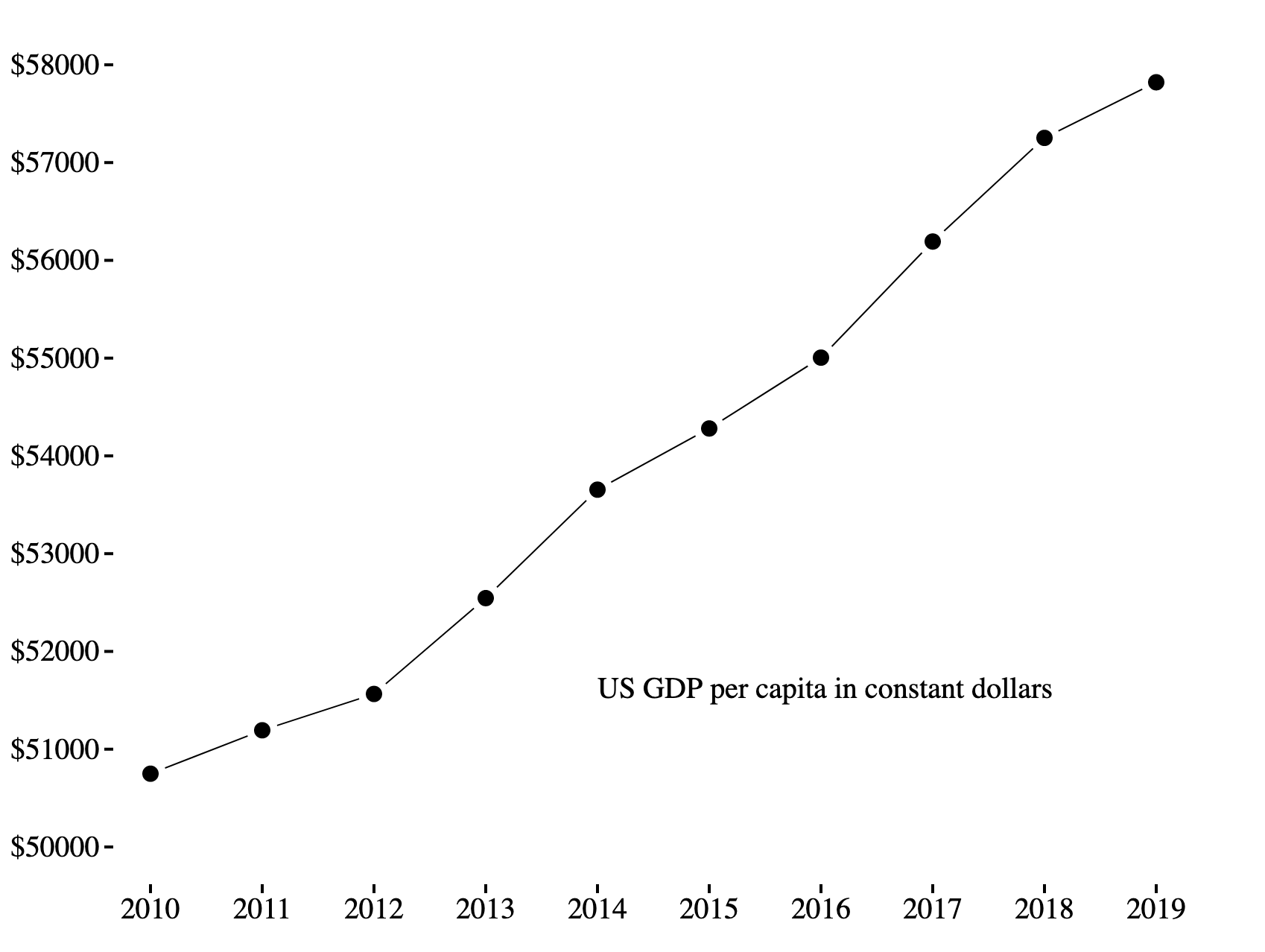
Minimal Line Chart #
Line charts are relatively simple to begin with, but this line chart removes a few elements like axis lines using a bit of CSS.
.domain {
    display: none;
}
For the y axis, we only show the range of values that appear on our dataset, a technique known as range-frame. This saves space and is fine for showing correlations, but for some types of charts (like bar charts) it can mislead the viewer - if there’s any doubt at all, start your y axis at 0.
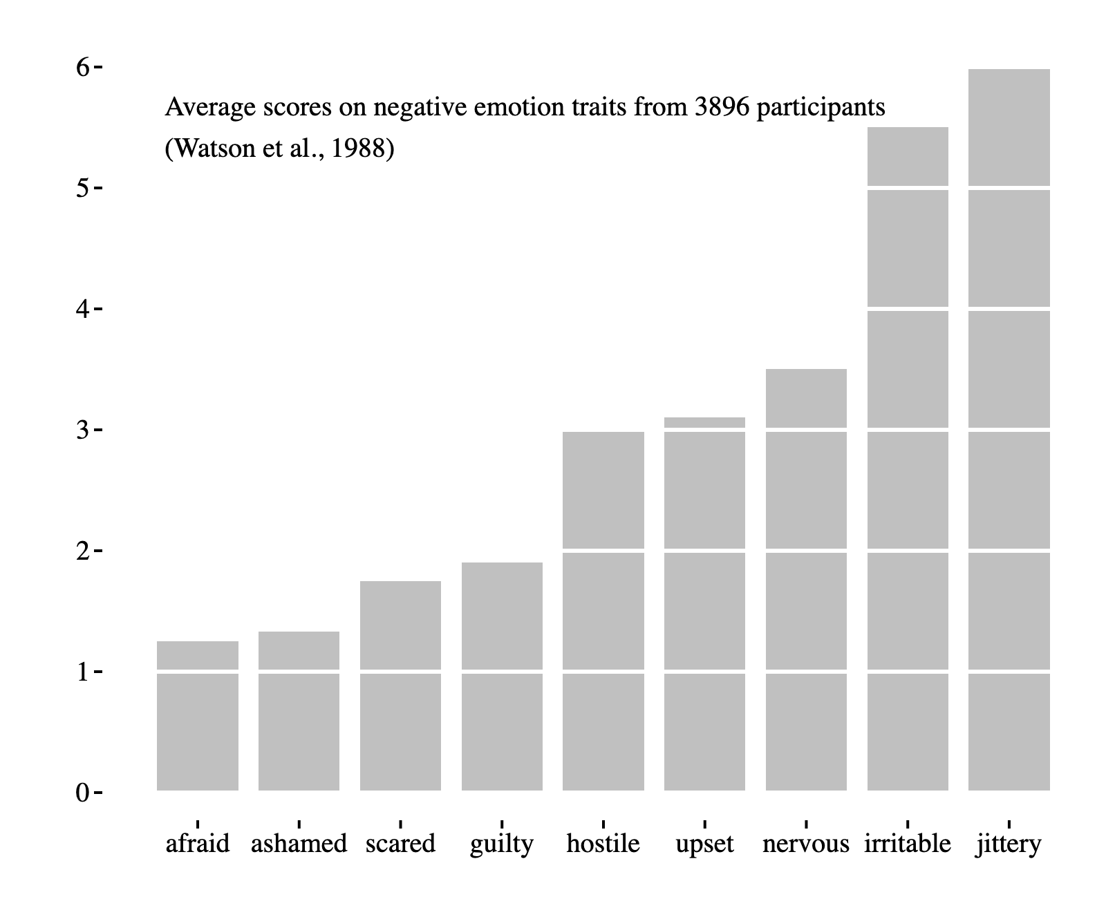
Minimal Bar Chart #
Using horizontal gridlines can it easier to compare different bars in a bar chart. In this example, we represent the gridlines with negative space to gain the benefits of gridlines without cluttering the visualization.
This is no harder to implement than regular gridlines - we simply draw white lines instead of black ones.
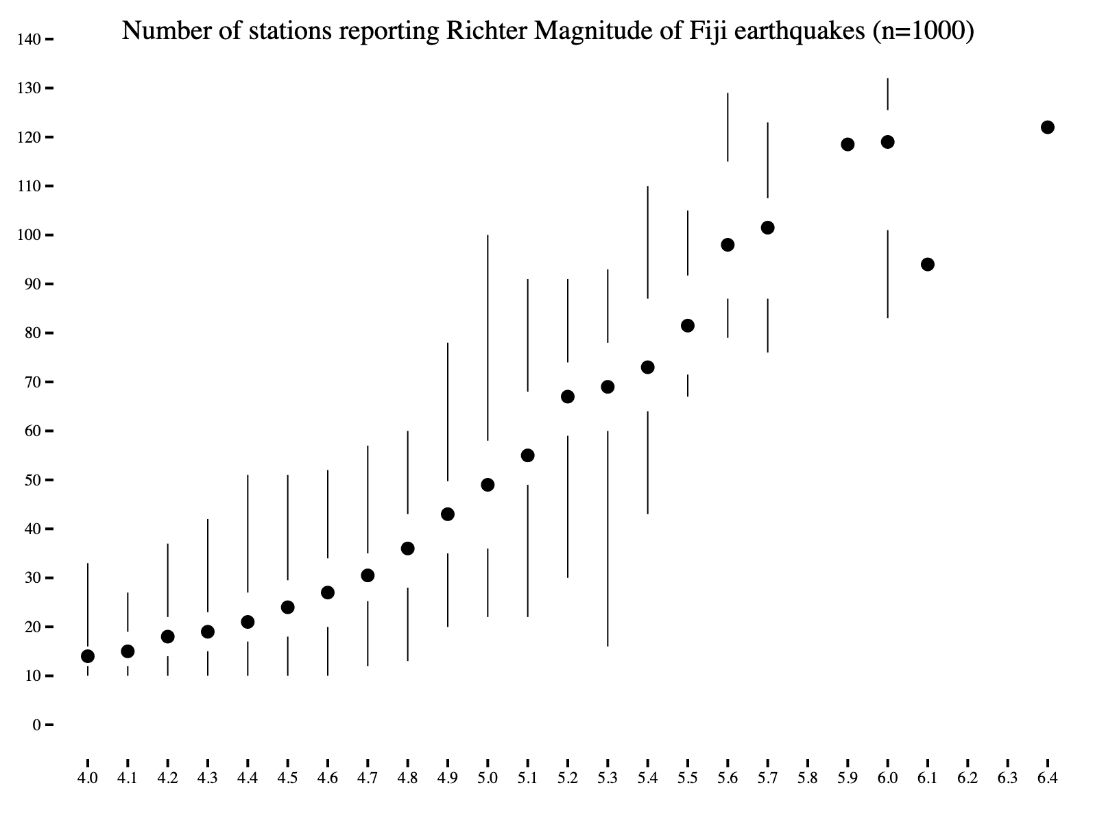
Minimal Box Plot #
This minimal box plot does away with the “box” part of the box and whisker plot. Even though we removed a somewhat prominent visual element from the chart, our visualization does not lose any information - the middle two quartiles are empty space, but their boundaries can be clearly seen.
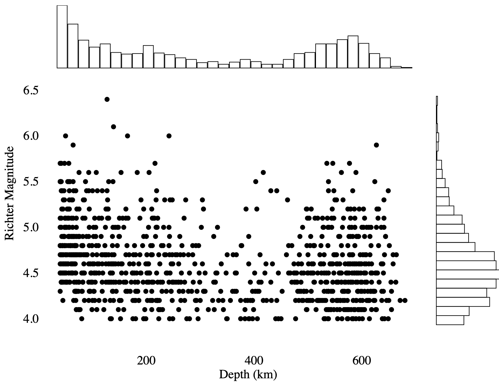
Scatter Plot w/ Marginal Histogram #
When displaying many data points on a scatter plot, it is sometimes useful to show the marginal distribution of each variable. To do this, we can plot histograms on the edges of the scatter plot.
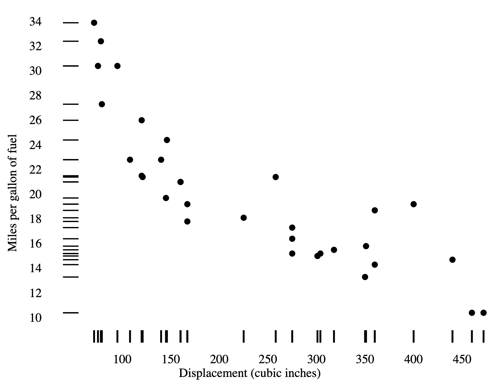
Dot-Dash Plot #
Rug plots (or barcode plots) are essentially one-dimensional scatter plots that represent each data point with a line. When two rug plots are combined with a scatter plot, it is called a dot-dash plot. Compared to the previous example, this is a more compact way to display marginal distributions when there is a small number of data points. If you have so many data points that the rug is fully colored-in, then you should switch to using a histogram.
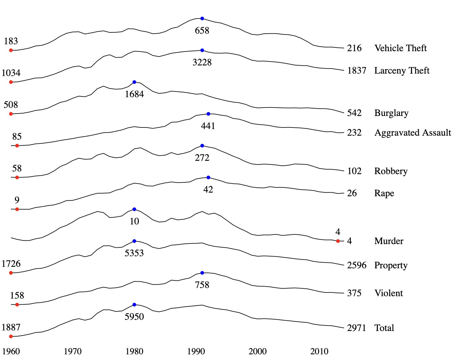
Sparklines #
Sparklines are a type of small-multiple chart composed of vertically-compressed line charts stacked on top of each other. It’s good for at-a-glance comparisons of multiple time series, and is easier to read than drawing many overlapping lines on the same chart.
At work, we use something called cubism, which is an extremely compact variant of sparklines.
Sparklines are most useful for comparing shapes; the lack of a y-axis prevents users from comparing the absolute values of each time series. In the example below, this is partially mitigated by the use of text labels.