Introduction #
This post is a bit different from my previous posts. It’s a review of the charts and visualizations in W.E.B Dubois’s Data Portraits: Visualizing Black America. The book features 63 charts by Du Bois and a team from Atlanta University, which were originally created for the 1900 Paris Exposition to show the progress that Black Americans had made since the Civil War.
I had known about these visualizations for a while (they are classics, after all), but I didn’t really take the chance to examine every print in detail until I recently acquired a copy. Truly ahead of their time both aesthetic appeal and clarity, Du Bois’s charts use color, shapes, and layout effectively to convey a strong narrative using data. Being able to look at these charts printed on paper (as they were originally created/displayed) made a huge difference in my ability to enjoy and critique them.
Since they were hand-crafted and hand-colored over 100 years ago, they also reflect the technology and limitations of their time. Several of the charts sacrifice visual clarity for novel and eye-catching colors/layouts (perhaps intentionally). Several other charts contain text or other elements that are challenging for today’s data visualization practitioners to automatically generate without any hard-coding, demonstrating how tailor-made additions can enhance the impact of otherwise quotidian chart layouts.
Beyond offering examples of well-executed standard chart types like bar charts and choropleths, these prints contain many other noteworthy design elements.
Below I discuss some that stood out the most to me, referring to the prints using the numbering system from the book.
Wrapped Bar Charts #
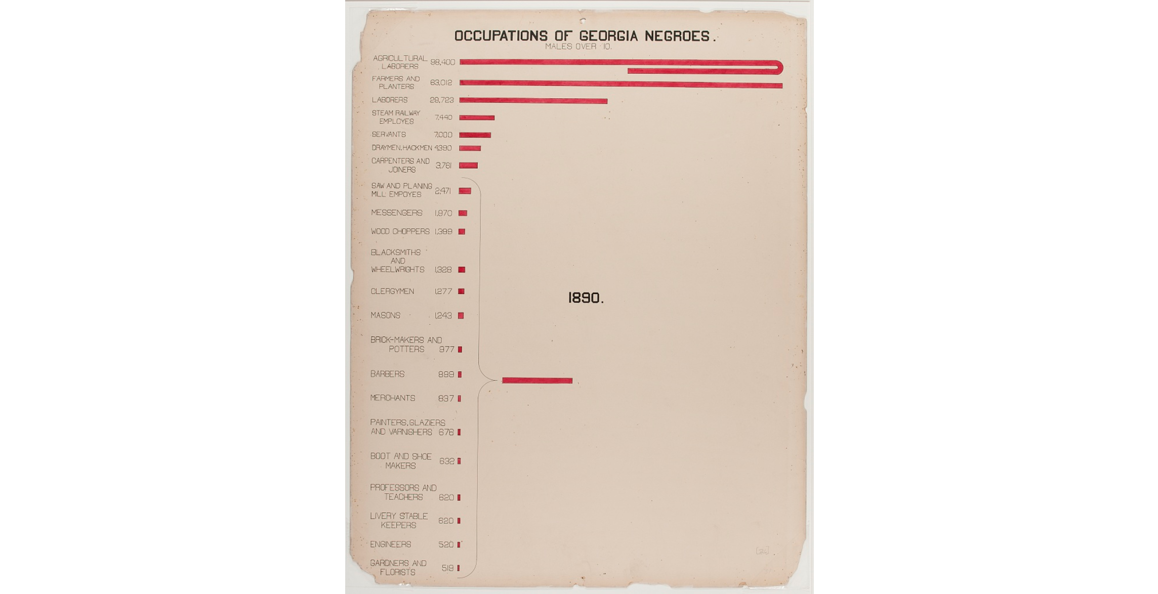
The bar charts in found in prints 17, 26, and 62 all have one bar that is much longer than the rest. Instead of showing the entire scale in a straight line and compressing every other bar, Du Bois instead chooses to wrap the longest bar around, sometimes doubling back on itself multiple times. It’s an effective way to highlight a large quantity without making the other bars too short, while keeping the size of the longest bar visually accurate.
The circular bar charts on prints 11 and 25 are conceptually similar, with the bars curving around in a spiral instead of doubling back in a straight line. I prefer the straight lines over circular ones since it’s much easier to compare at a glance, but if the goal is to convey the message “this number is a lot bigger than the others”, then these work just fine.

Finally, I must caution against going overboard and wrapping multiple bars in a chart. Wrapping the bar is an effective way of visualizing a single disproportionately large value (as shown by this study), but using it for multiple bars muddles the visual impact and makes the chart much harder to read. If you end up in a situation where you need to wrap every other bar in your chart, it’s a sign that you should either use different scales or split your chart up.
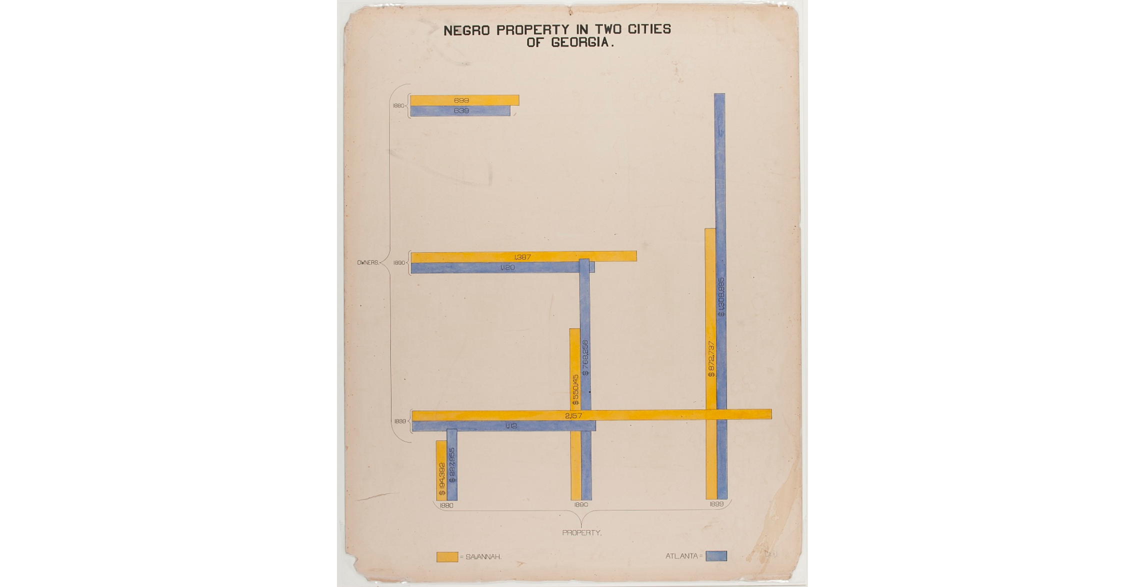
Grouping Data in Bar Charts #
Prints 26, 30, and 45 feature bar charts that use a } shape to group together several small bars into a single larger bar that represents the sum. This allows the smaller bars to be compared against each other, and for their sum to be compared against some other value.
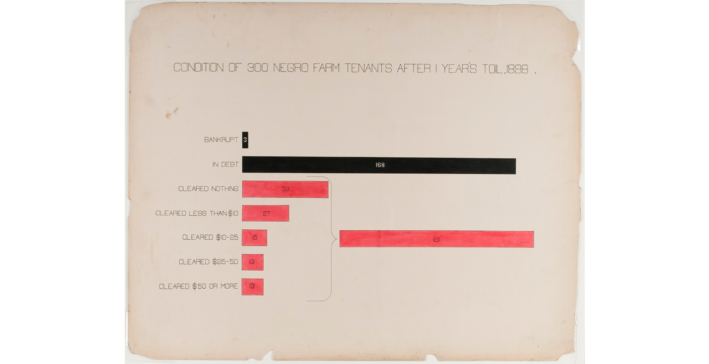
While the curved lines and the combined bar are easy to hand-draw in the perfect locations, it is significantly harder to computationally generate them in a generic/reusable way. A simpler solution that accomplishes the same effect is just to add an extra bar for the combined value, with a clear indication that it represents a sum. It does have one small downside though - compared to Du Bois’s approach which places the extra bar in a previously-unused space, this method would require a bit of extra space for the additional bar.
Mapping Values to Area #
In print 16, Du Bois makes a common mistake in scaling the diameter of each circle to the value it represents. This creates a visual distortion because the areas of the circles are no longer proportional to their values - the bottom circle appears roughly 1.7x the size of the top circle, even though the ratio between their values is only 1.32.

To draw correctly-sized circles, the largest circle needs to be √1.32x the diameter of the smallest one. In other words, the ratio between the diameters should be the square root of the ratio between the values.
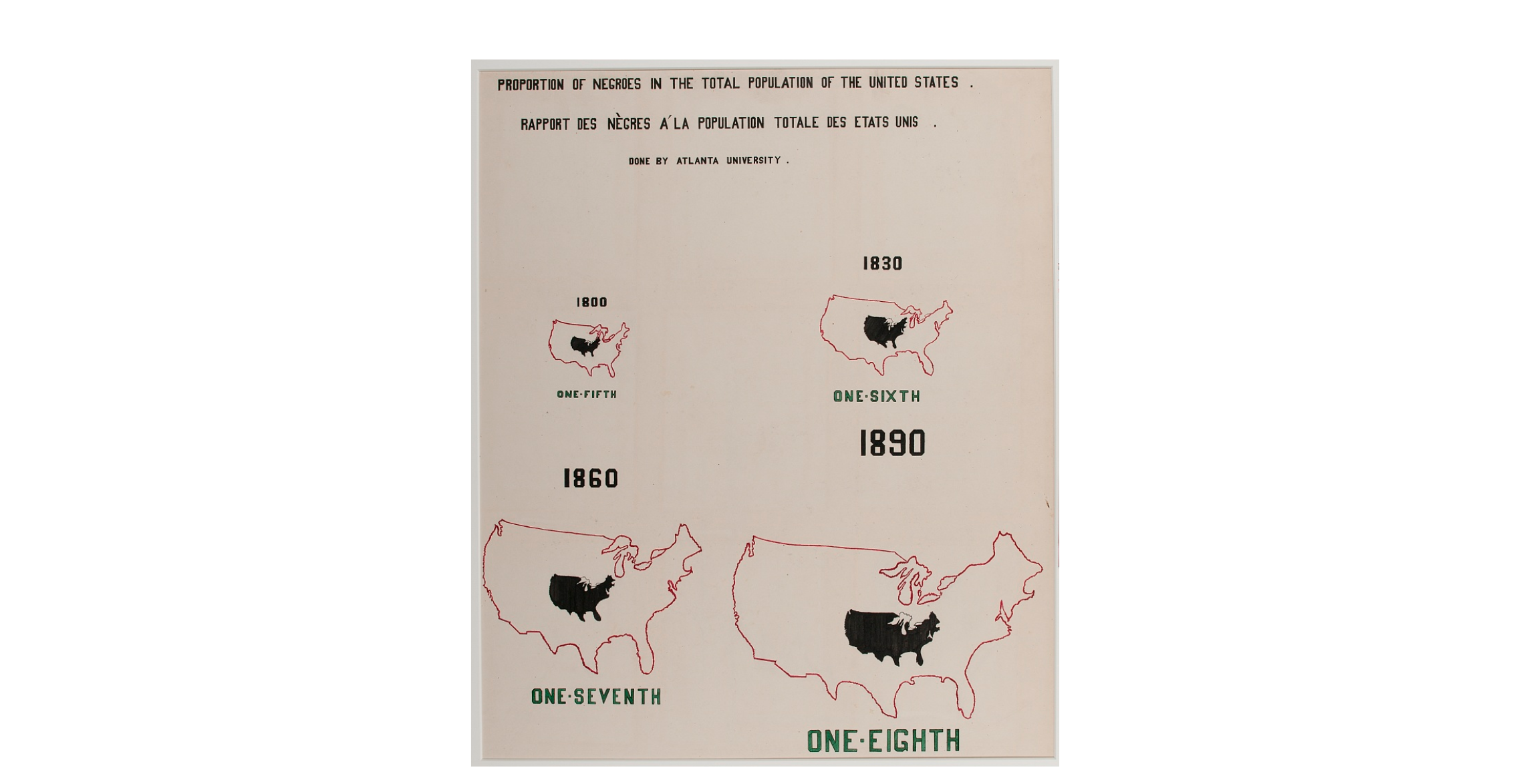
Interestingly, there are several charts utilizing other shapes that scale the areas correctly. This includes the money bags in print 18, along with the (surprisingly detailed) USA silhouettes in prints 41 and 42.

Arrows on Maps #
Print 8 is a cool layout showing immigration and emigration between Georgia and every other state.
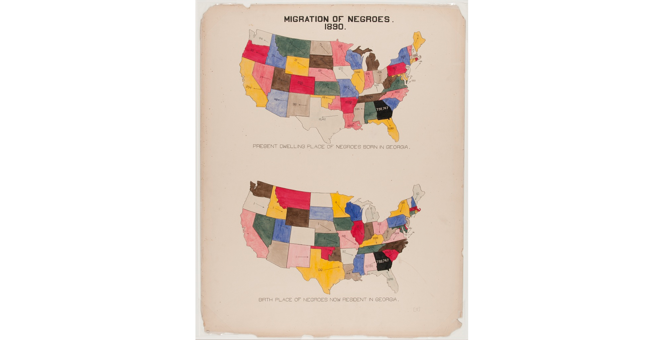
It looks like a vector field diagram, except here the lengths of the arrows are not proportional to the quantity of migration as I would expect.
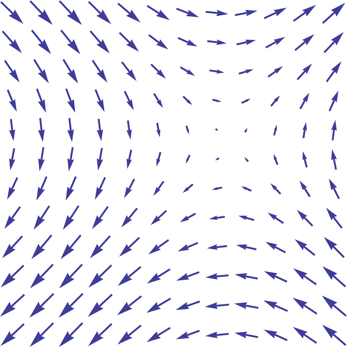
Although this chart gives up arrow length as a visual channel, I suspect this is intentional: closer states would need longer arrows to show more migration despite having less physical space to work with, which would have probably made the chart much more cluttered.
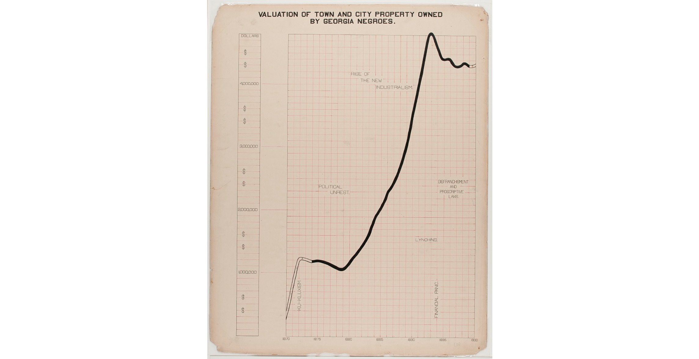
Axis Cutoff #
Breaking the axis in a bar chart or area chart is usually a terrible sin in data visualization since it ruins the relationship between the size of an element and the value it represents. Wrapping the bars around (as discussed previously) can highlight large values with less distortion, but in print 12 we see a surprisingly effective visualization featuring an axis break.
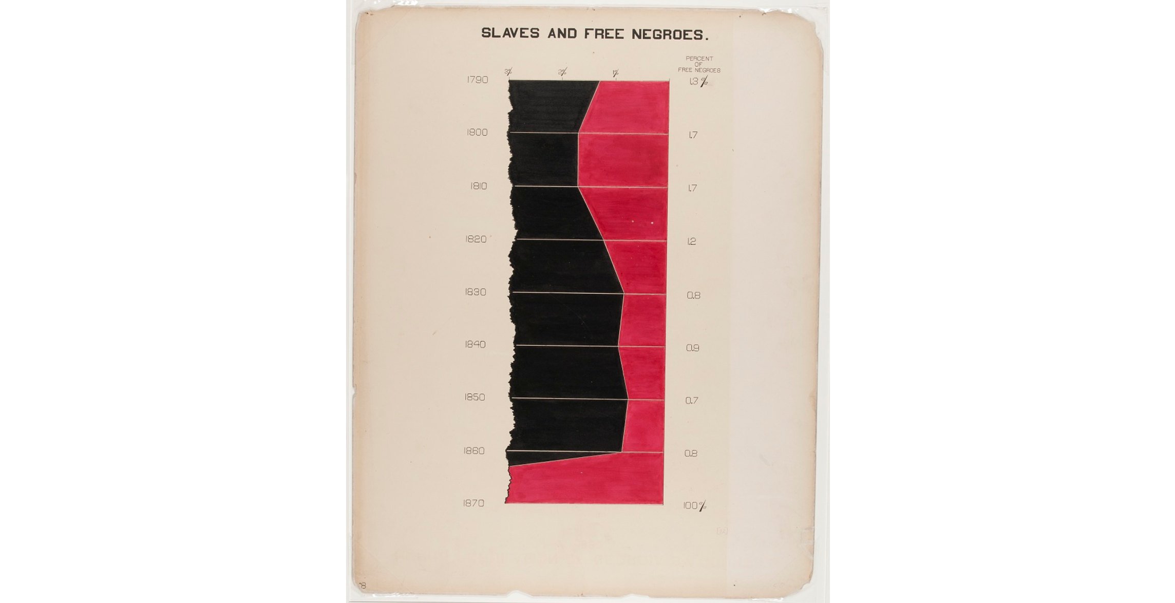
This chart shows the percentage of free blacks in Georgia climb from 1% to 100% following emancipation. Two points are key to its effectiveness in this situation: firstly, the axis does not continue - the chart is entirely cut off past the axis break; secondly, we don’t care about comparing the 1.X% values in the chart with 100% - we know the difference is huge and that’s all the point the chart needs to make.
Lattice Designs #
One effective use of this is print 14, which is simple to read and is more or less equivalent to adding labels/annotations for a bar chart in a novel position.
One less effective example is print 23, which I found confusing to interpret. If the ordering of the years on the vertical axis were reversed it might have been clearer.
Labeled Events #
When visualizing data over a long period of time, it’s very important to put the data into context. Labeling important events is a great way to call attention to interesting trends in the data and makes a visualization much more informative. Du Bois does this to great effect in prints 21 and 40.
Color #
I had quite a few gripes with color choice in many of the prints, but one use of color that stood out positively to me was 56. Using the dark color to fill what would have otherwise been negative space in the bar chart places the emphasis on what that space represents - the large proportion of Blacks that do not own land.

For many of the choropleths (for example: 2, 5, 6, 38, just to name a few), the chosen color scale was not sequential, which made it more difficult to differentiate geographical trends in the data.
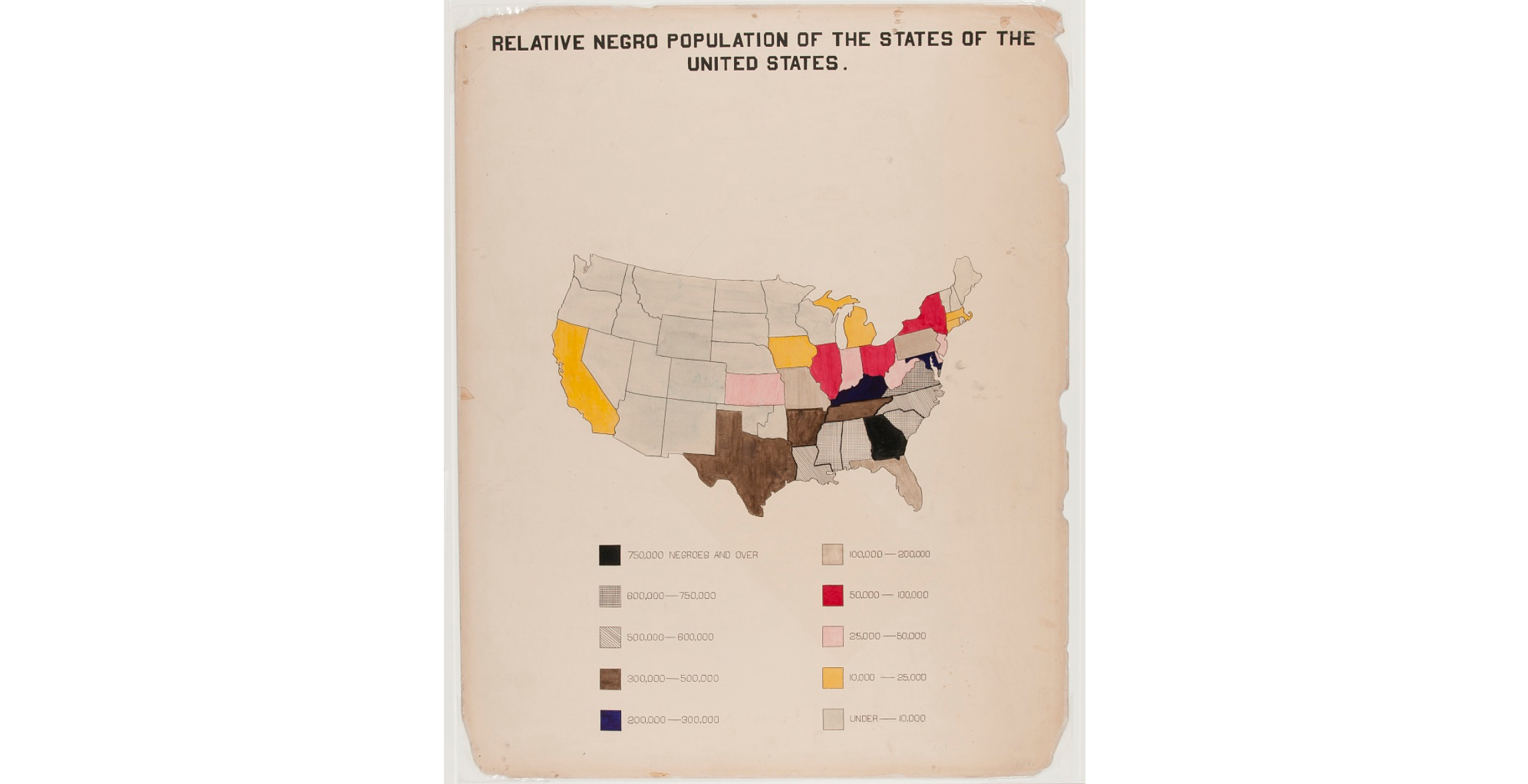
Although we see hints of using darker colors/denser marks to indicate larger numbers such as in print 2 above, ultimately the color selection was so poor that it hindered the effectiveness of the visualization.
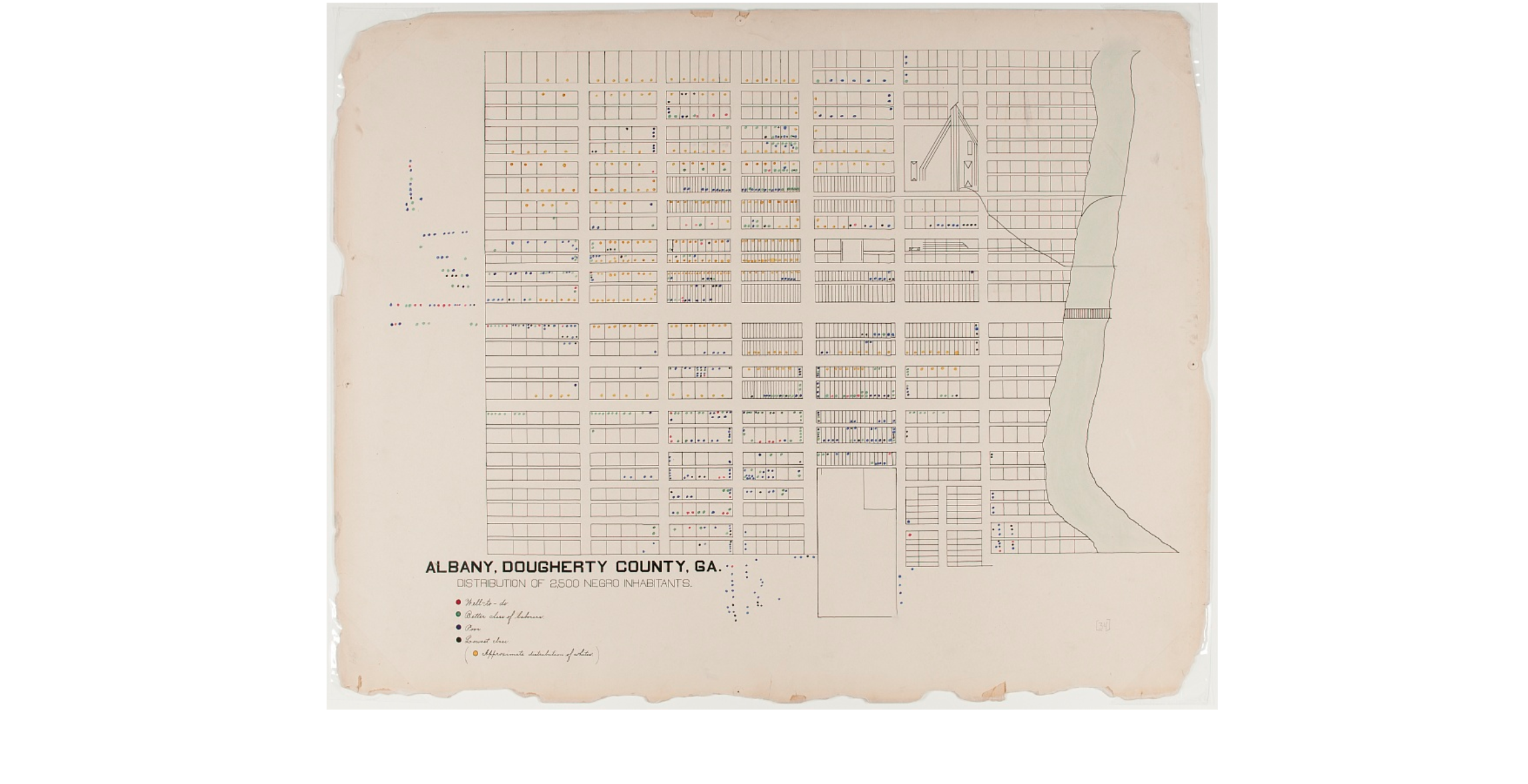
This poor color selection does not only affect choropleths. The geographic dot plots on prints 34-36 also suffer. Although partially attributed to the age of the prints, many of the dots are so small and dark that it was difficult for me to to tell their colors apart.
Of course, there may have been other concerns that led to this color selection - Du Bois and his students had much less control over darkness and hues for these hand-painted maps than we do today. Gradients and perfectly accurate color scales are trivial to create with computers nowadays, but back then perhaps an explicit choice was made to sacrifice a sequential color scale in favor of having high contrast between each bucket.
Conclusions #
Overall, I learned a lot more than I thought I would examining these classic prints and trying to understand the goals and intentionality behind each design choice. The designs were incredibly innovative and effective at telling a story, and many of the visual techniques and layouts embody evergreen visualization principles that remain relevant in the age of computational data vis.
While researching researching these prints, I came across the #DuBoisChallenge, an annual event happening since 2021 where people recreate Du Bois’s visualizations using the tools of their choice and share the results online. I missed this year’s event (it was in February), but I’ll definitely have it marked for 2024!
References #
All images of Du Bois’s prints were downloaded from the Library of Congress. You can view them online at www.loc.gov, as part of lot 11931.