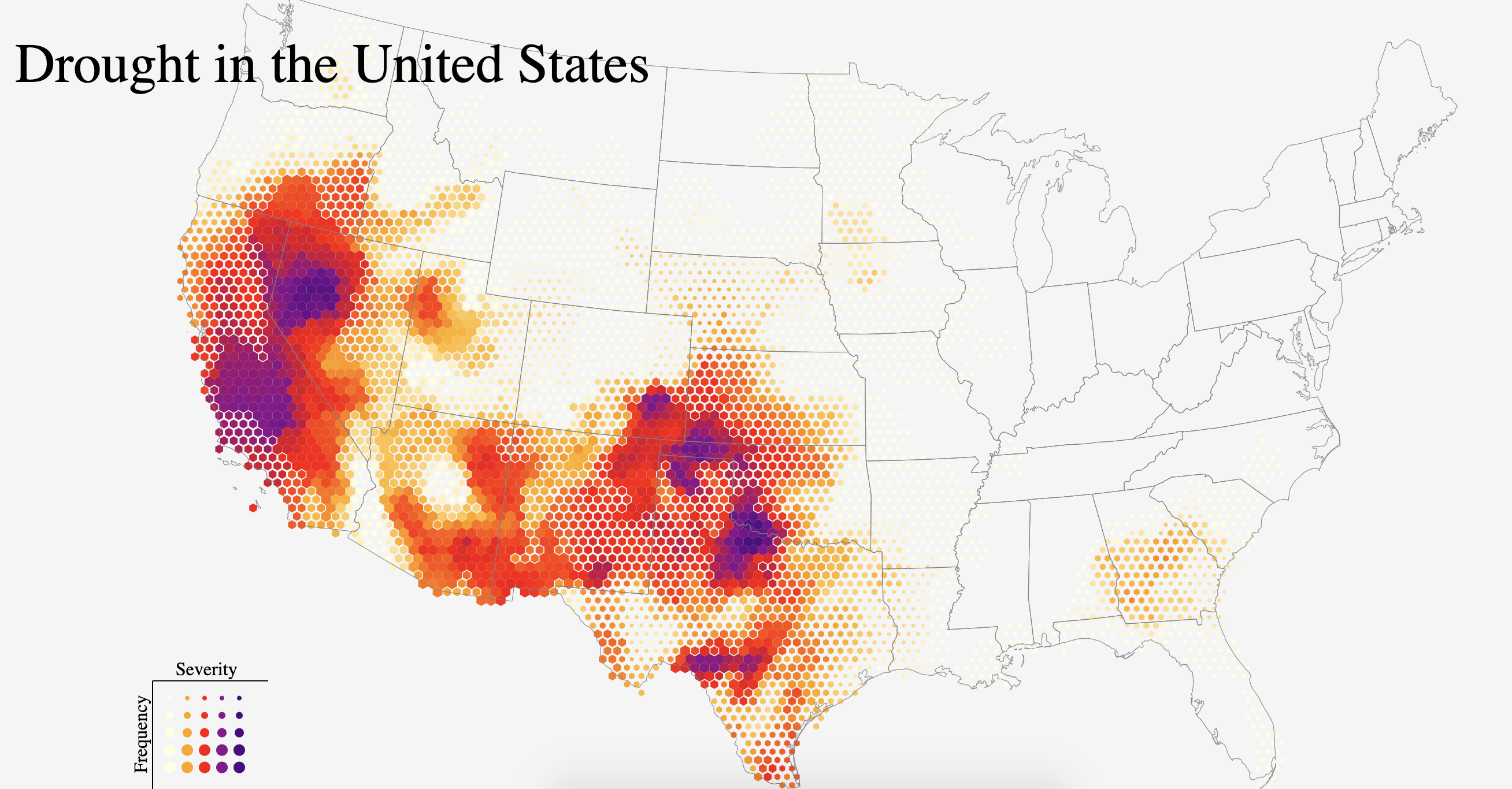
As a challenge for myself, I decided to recreate one of my all-time favorite visualizations: Five Years of Drought by John Nelson. As the name suggests, it’s a map of drought severity and frequency in the US over 5 years, with the drought data binned into a hexagonal grid. When I first saw it, I admired the stunning color scheme and was impressed that the author was able to display 2 variables on the same map (made possible by the hexagonal grid). This map has a lot of personal significance for me because it ultimately piqued my interest in the field of data visualization.
For convenience of comparison, the original map is is displayed below:

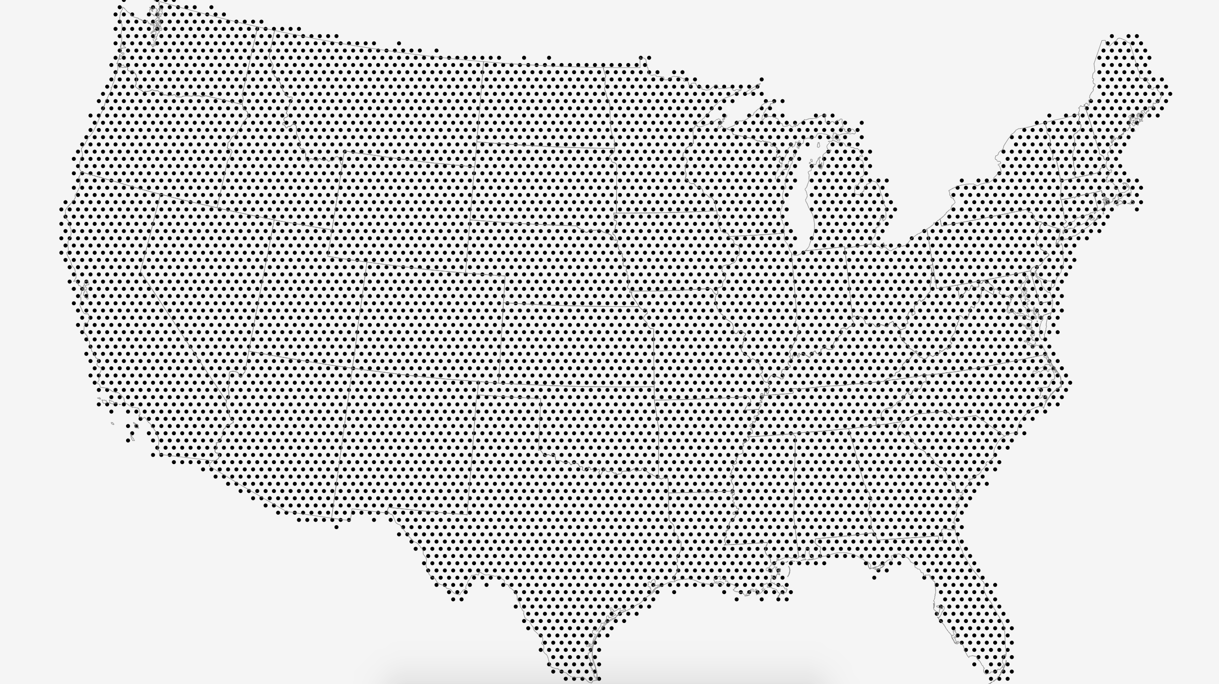
The original data was collected from weekly summaries provided by the US Drought Monitor, but since the author already aggregated and binned the data and shared the binned points as a shapefile, I decided to just use that.
When I plotted the data initially, I realized that the x and y coordinates of the points were not latitude and longitude, thus they would not work with D3’s projections and did not overlay properly with the US map TopoJSON. I ended up writing a custom projection function which scaled the points to fit the screen, while using the same extent to scale the US map so that the two elements would be the same size and were overlaid properly.
To generate a hexagonal grid, I used D3’s hexbin library. I used a quantized scale for the hexagon radius in order to create the contiguous regions of color seen on the original map, and chose appropriate colors for the linear color scale in order to match the original. The final outcome is shown below (live page + code: Drought Map).
In the end, I think I created a reasonably close approximation of the original. There are a few differences: the sizes of the hexagons are different (this is due to binning, smaller hexagons would have resulted in gaps due to the spacing of the original data), and the orientation of the hexagons is different as well (this is due to the hexbin library).
Using a different set of scales, I also able to replicate the “drought resilience” visualization from the same post.
Mine (live page + code: Inverted Drought Map):
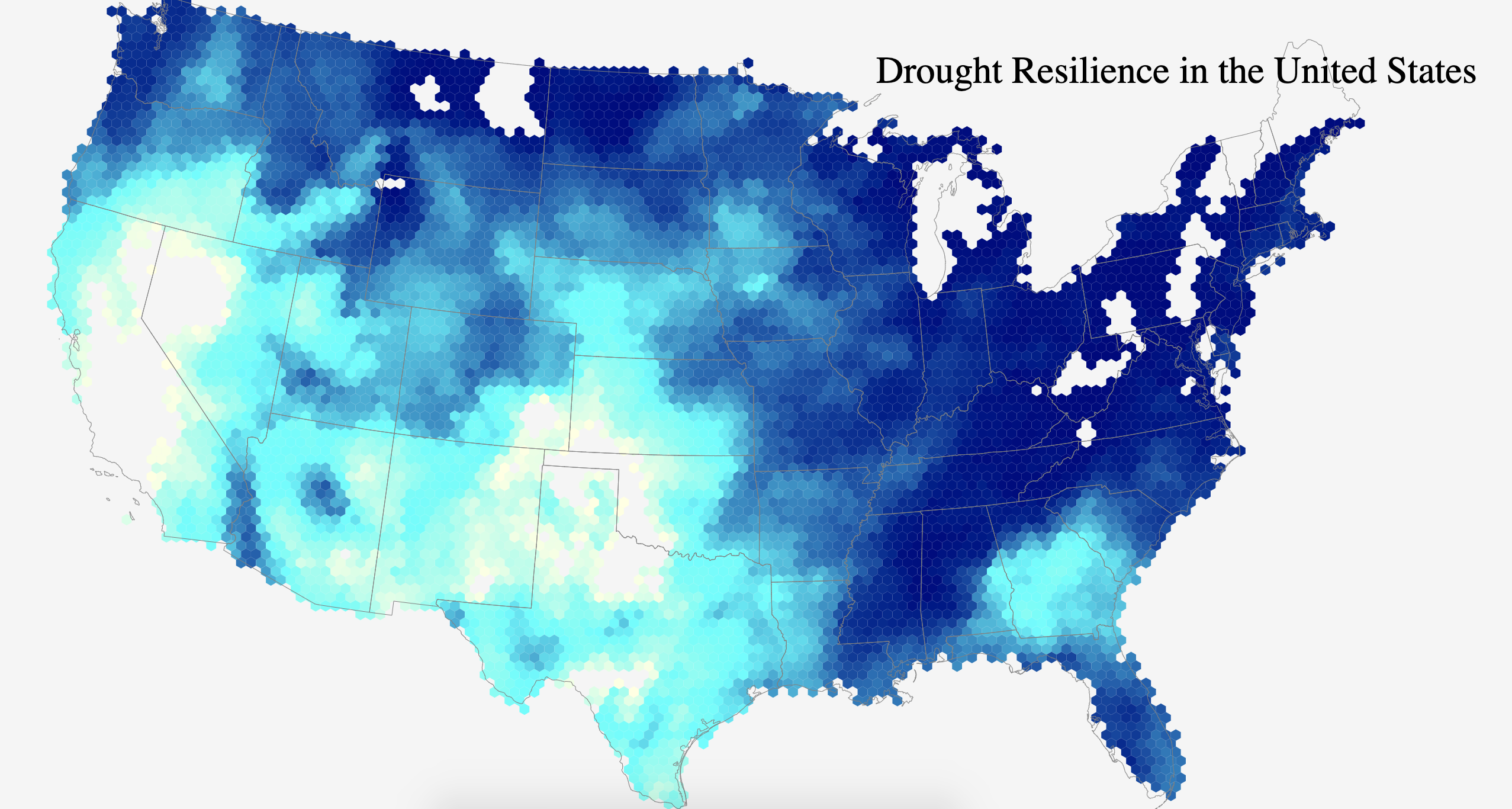
Original:

The data source I used is linked at the bottom of this post. The original creator of this map John Nelson has a fantastic blog that I often read for inspiration. Although we use different tools (he uses ArcGIS, which is a more specialized tool that’s better for making maps than D3), I find that the techniques he discusses to be very relevant and I find an interesting challenge in thinking about whether/how I could implement the same maps in D3.
I collected some D3 mapmaking tips and tricks for anyone that wants to try their hand at making maps with D3, which I hope will help people create more cool maps and visualizations of open data.