After participating in Open Data Week earlier this year, I became interested in getting involved in more community initiatives and doing more projects with publicly available data. One dataset that really piqued my interest is Adopt Your Spot NYC, which is a community cleanup program that I’ve been involved in for a few months.
The program is simple: volunteers step up to “adopt” their favorite spot in their community and help keep it clean, and the Sanitation Foundation mails them a free starter kit containing a trash grabber, gloves, and trash bags. Anonymized data on all 500-something adopted spots can be downloaded from the interactive map on their site, and after downloading and converting the data I fired up a notebook to see what questions it could answer, such as:
- What kinds of places do people adopt?
- Why were these places selected?
- Which neighborhoods have the most participants?
The code and data for this analysis can be found in this Github repository.
What kinds of places do people adopt? #
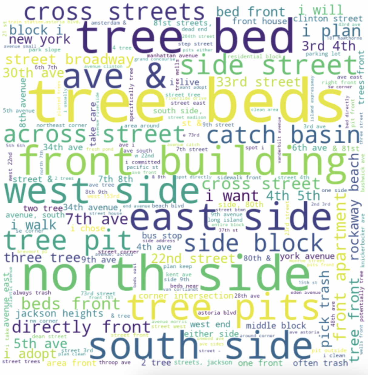
Each adopted spot has some text describing the location. Around half of the spots only list street numbers, but the rest of them contain other descriptive text such as “sidewalk” or “bus stop” or “apartment”.
I plotted the most common bigrams (two word phrases) in the responses as a word cloud, which shows that tree beds are a very popular spot to adopt:
I was also curious to see if there were any distinct clusters in the data. I experimented with a couple of different embedding techniques and clustering the results, but they were too general and didn’t yield any strongly-defined and meaningful clusters.
In the end, I fed the entire dataset to a large language model to get a list of themes and outliers, and checked to see how many responses contained keywords related to each theme. The results are plotted below as a bar graph. Each bar corresponds to a group of several related keywords, while the label is a single representative keyword for the group.
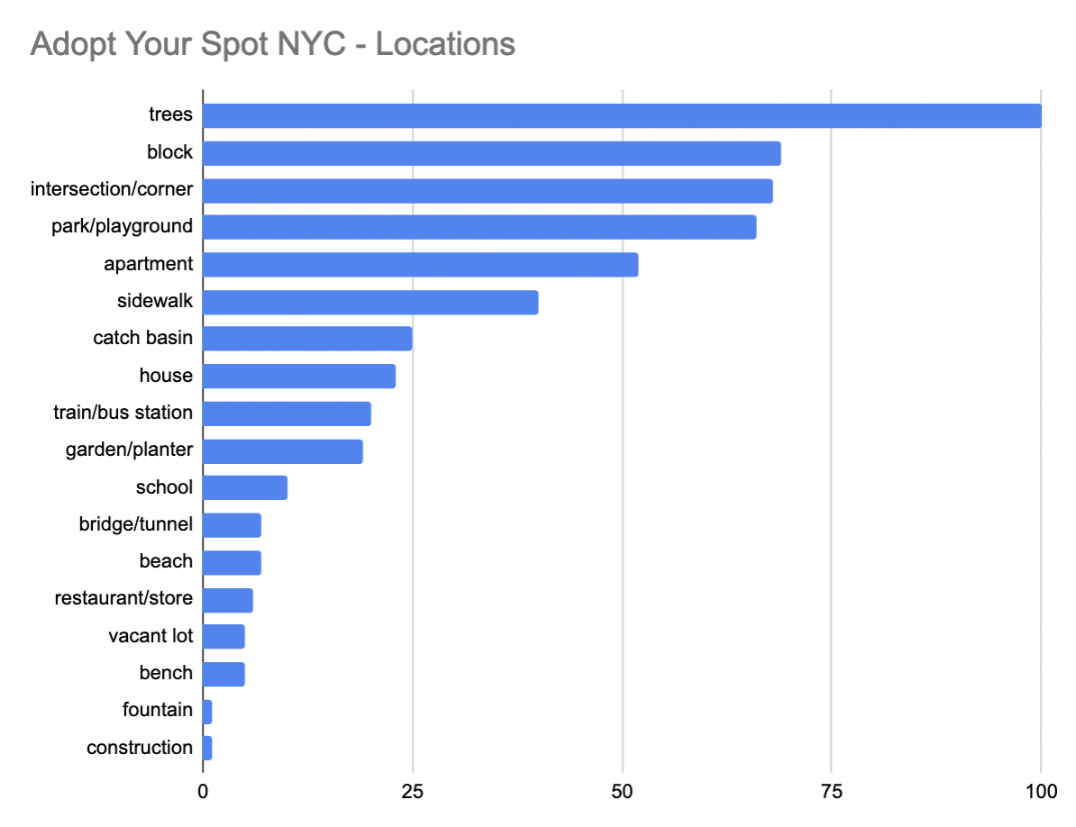
The data confirms that tree beds are the most commonly adopted spot by a fair margin. Other common locations include parks, residential areas, and street locations.
I was a little surprised to see so few responses mention vacant/abandoned lots or construction sites, since in my own neighborhood those areas tend to accumulate a lot of litter. Perhaps there are fewer vacant lots in other parts of the city.
Why were these places selected? #
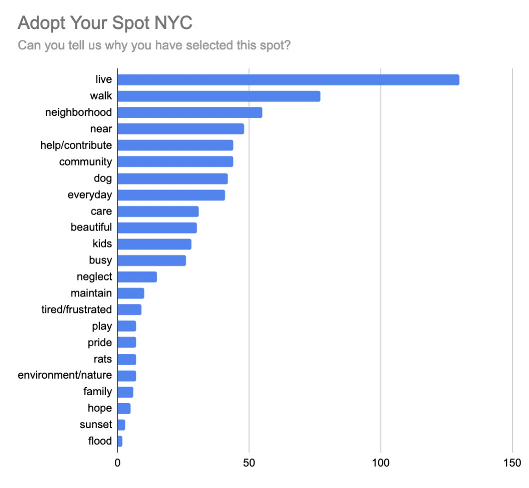
The signup form for Adopt Your Spot asks each applicant “Can you tell us why you have selected this spot?”. Here’s what their responses can reveal about why people volunteer to keep their community clean.
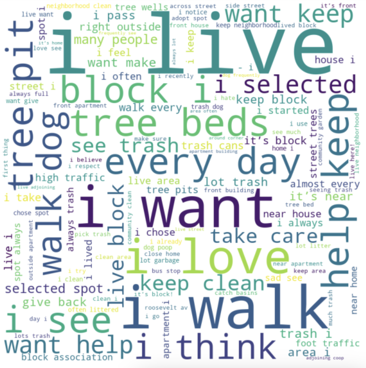
Below is a word cloud of common bigrams in the responses. The common occurence of phrases starting with “I” indicates that many people adopt places that they have some personal connection to.
Here is a frequency chart of common themes in the responses. As with before, each bar represents a group of related keywords, with a single representative label.
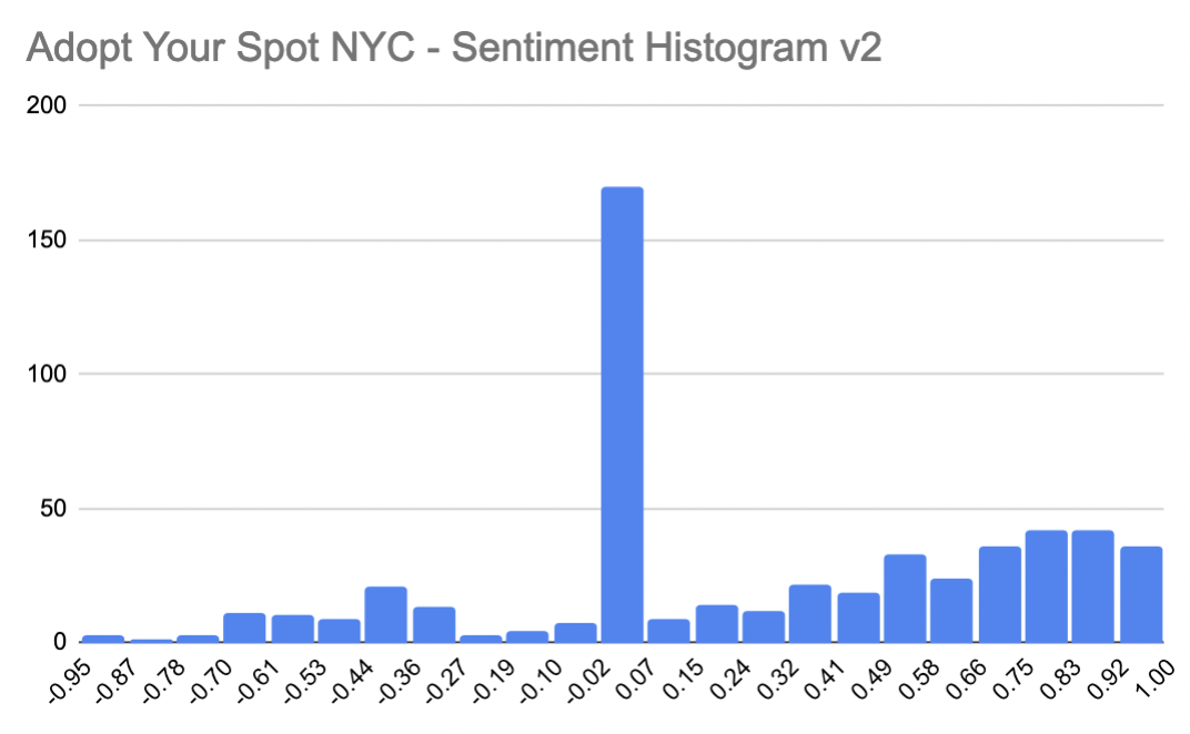
I also looked at the sentiment of the responses to try and understand people’s motivations and feelings around volunteering in this program. I used VADER, a rule-based sentiment analyzer, to classify the sentiment of each response as positive, neutral, or negative.
An example of a reason with positive sentiment is “because I want to help my community”, whereas a reason with negative sentiment would be “I hate that the street is so dirty”.
When I initially created the chart, there was a lot more negativity than I expected based on skimming the responses. When I spot-checked some individual examples I found that responses containing the word “block” were all being classified as highly negative. This is likely due to VADER treating “block” as a verb (“the path is blocked”) instead of a noun (“I live on this block”).
Since the latter definition is overwhelmingly predominant in this dataset, I decided to remove the word “block” from the data before classifying the sentiment. After this change, we can see that the reasons for selecting a spot are actually overwhelmingly positive.
Which neighborhoods have the most participants? #
The coordinates for each location are not available in the downloaded data despite being part of the map, so I had to use Google Maps’ Geocoding API to convert the location names back into coordinates, with some manual edits for ~20 locations that were ambiguous or unrecognized.
Below is a map of the number of participants by neighborhood.
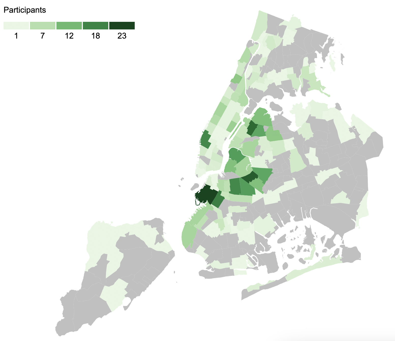
Northern Brooklyn seems to have the most participants, particularly around Carroll Gardens/Gowanus, Greenpoint, and Bed Stuy. Outside of Brooklyn, we see a lot of participation in both Chelsea and Astoria.
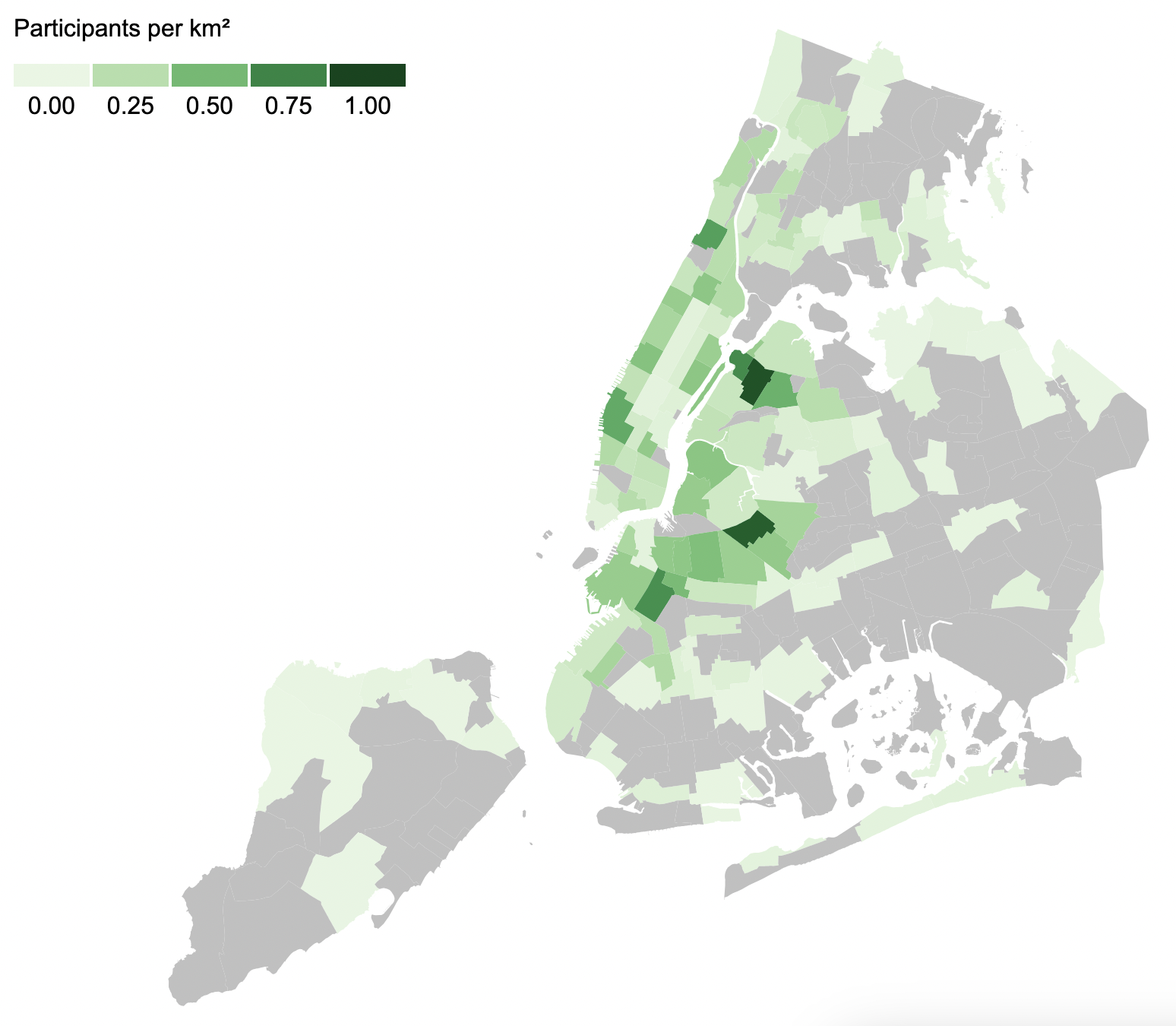
Neighborhoods vary greatly in size and population, and I would expect larger neighborhoods or neighborhoods with more residents to have more adopted spots.
When we normalize by the area of the neighborhood, we can see that Astoria and Bushwick have the densest concentration of adopted spots. No neighborhood has more than 1 adopted spot per square kilometer, but central Astoria comes close with 0.95.
We can also normalize the results by the population in each neighborhood. To get the population for each neighborhood, I first had to find which census tracts make up each neighborhood (data), and then I had to add up the 2020 population for those census tracts (data). After adjusting for population, here are the results:
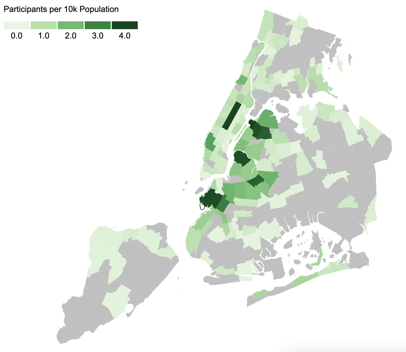
This looks pretty similar to the other charts, but there are a few key differences. Chelsea is no longer as dark - it has a lot of participants, but not an extraordinarily high number relative to the number of residents.
On the other hand, Central Park stands out here as an extreme outlier, with 155 participants for every ten thousand residents - the next highest is Old Astoria, with 4.2 participants per 10k residents. There’s a simple explanation for this - some people living near Central Park (but not inside the park itself) have adopted a spot in the park.
Besides the hotspots of participation, we can also see which areas are underrepresented. In Queens, Jackson Heights and Flushing are both very densely populated but have fairly few participants. Most of Manhattan and The Bronx are underrepresented as well.
Spreading Awareness #
In mid-November, I decided to share this program to some neighborhood-focused online communities to see if I could get more people involved.
I noticed that the map looked noticeably more dense a week and a half after I made the posts, so I became curious to see how many people actually signed up from my posts.
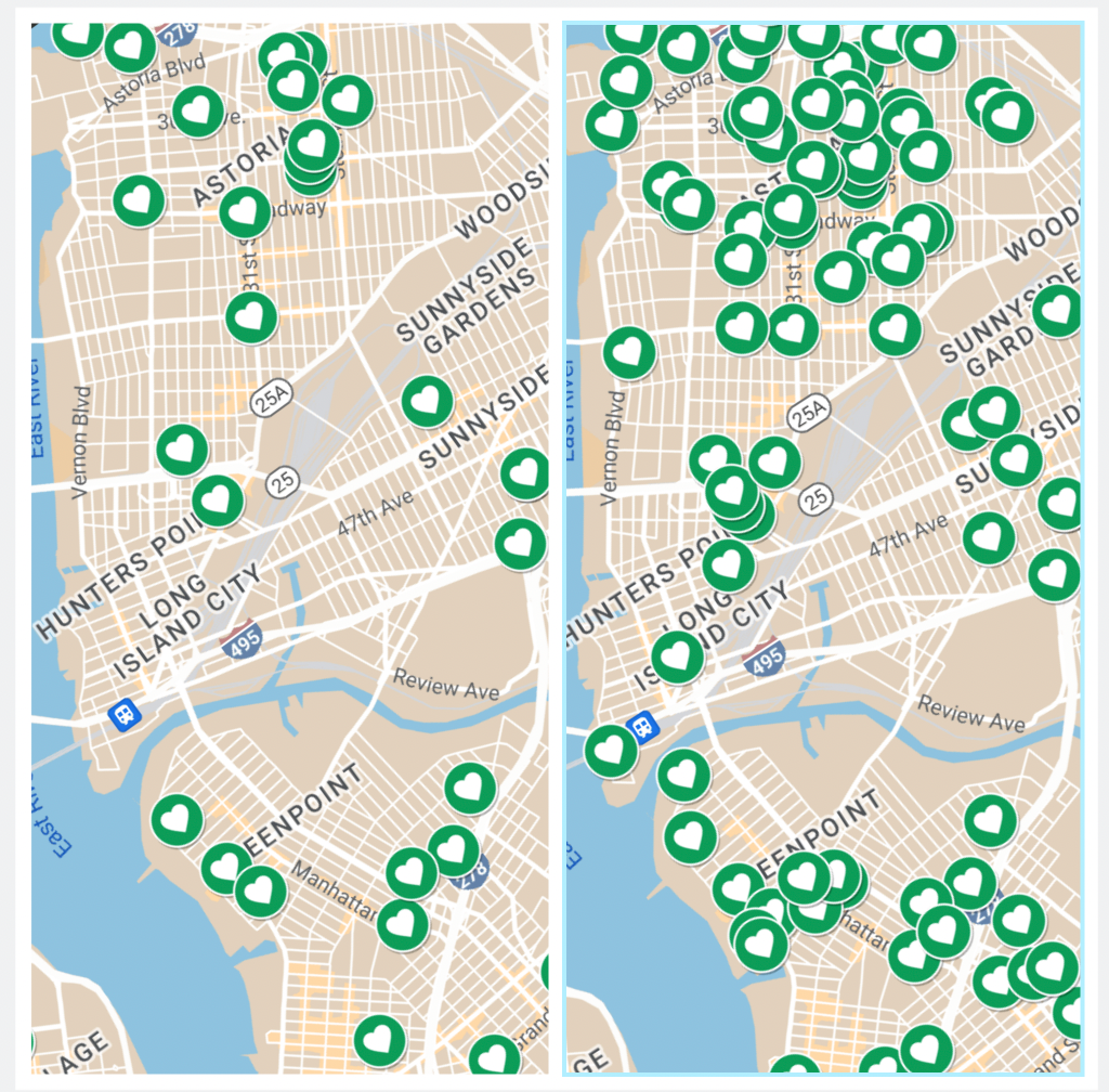
Since the signup data contains the date of each entry, I could just re-download the data and plot the daily and cumulative signups to see my impact:
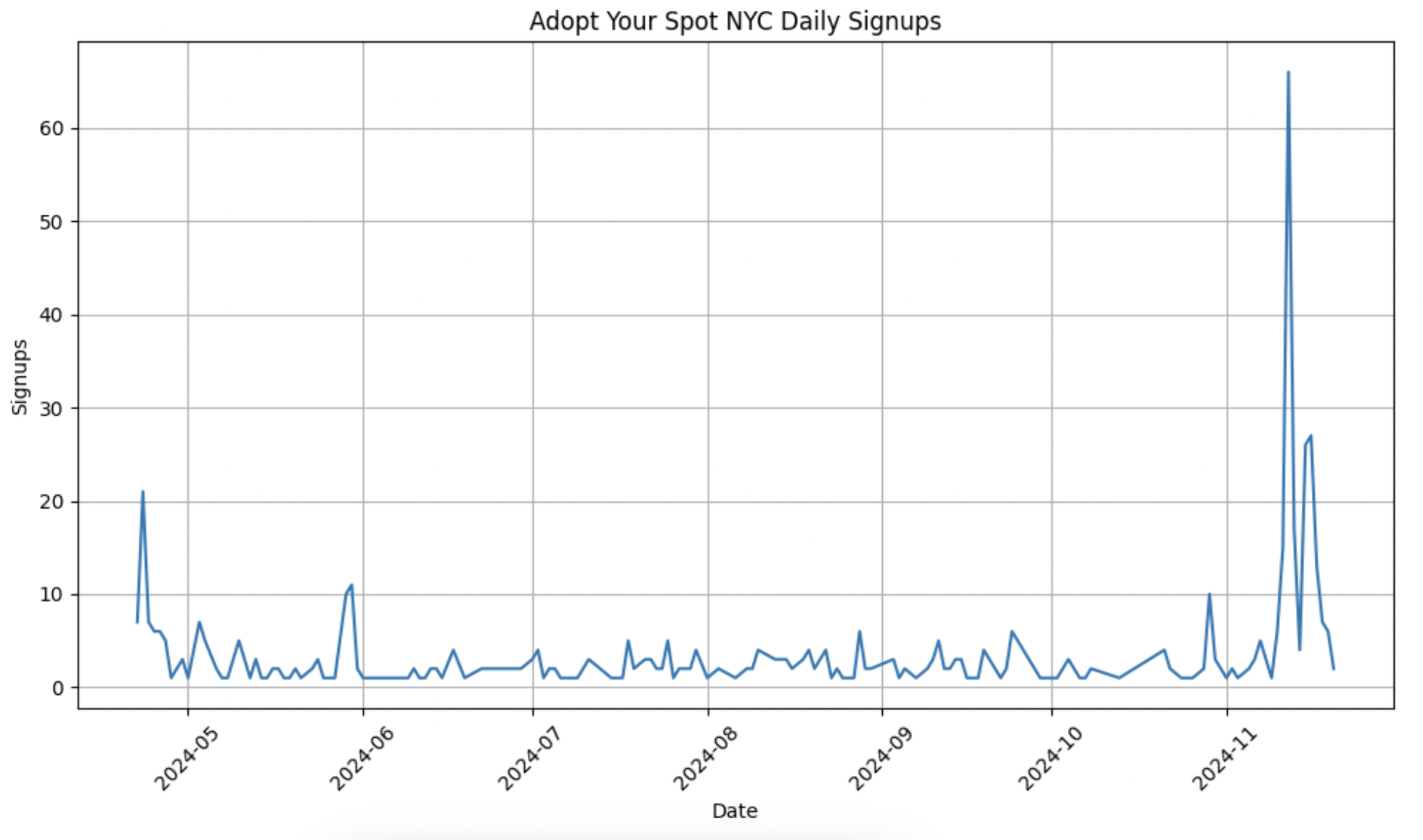
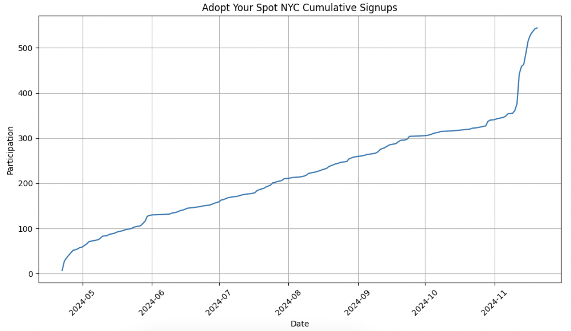
Of the 544 members (as of Nov 20), 187 signed up in the 10 days after I posted. For reference, the average number of signups in a typical 10 day period is around 15. This means my mini social media campaign led to a 46% growth in participation - not too bad!
Conclusion #
It’s pretty cool how much we can learn just from doing a little exploratory analysis. Some of the results confirmed things we knew qualitatively (like sentiment), while others could potentially lead to actionable improvements.
For example, over half of the neighborhoods (143 of 262) have no Adopt Your Spot participants at all! Clearly, this program still has a lot of room to grow, and maybe further analysis can help target outreach efforts.
Lastly, if you want to sign up for Adopt Your Spot, please visit https://www.sanitationfoundation.org/adopt-your-spot-nyc.