Earlier this year, I thought it would be cool to try and understand the “transit connectivity” of each neighborhood. That is, how easy is it to ride the train to another neighborhood, and how much redundancy is there if a subway line is shut down, rerouted, or delayed.
Although the subway system in NYC has impressive coverage, not all neighborhoods are equal.
Some neighborhoods, like Long Island City, have multiple stations and many subway lines passing through. Residents in those neighborhoods can reach many other parts of the city without needing to change trains, and have plenty of backup options if one line is severely delayed or shut for maintenance.
Other neighborhoods, like Greenpoint right next door, have only a single station or line. Residents often need to transfer once (or even twice) to get to their destination, and when their only subway line stops running (such as during the G train shutdowns this summer) they are left with few alternatives.
In this blog post, I discuss several proxies for transit connectivity in each neighborhood: how I calculated them, how different neighborhoods stack up, and their merits and flaws. Buckle in for some cool charts, graph theory, and taking pity on Greenpoint - there’s a little something for everyone here.
Datasets/Tools #
To explore these questions, I downloaded some open datasets and got to work creating some visualizations in Python and D3.js. For the purposes of this project, I define neighborhoods based on “Neighborhood Tabulation Areas” used by the NYC Department of City Planning. There are some drawbacks to this approach, which we’ll discuss later.
Data from NYC and NY Open Data:
The source code is all on Github. I used Python, Geopandas, and networkx for the analysis, and D3.js to make the online visualization.
The interactive visualization I created is live here - feel free to click and around and explore for yourself!
Number of Stations/Lines in Each Neighborhood #
The simplest proxy for the transit connectivity of a neighborhood is probably how many subway stations it has, and how many subway lines pass through it.
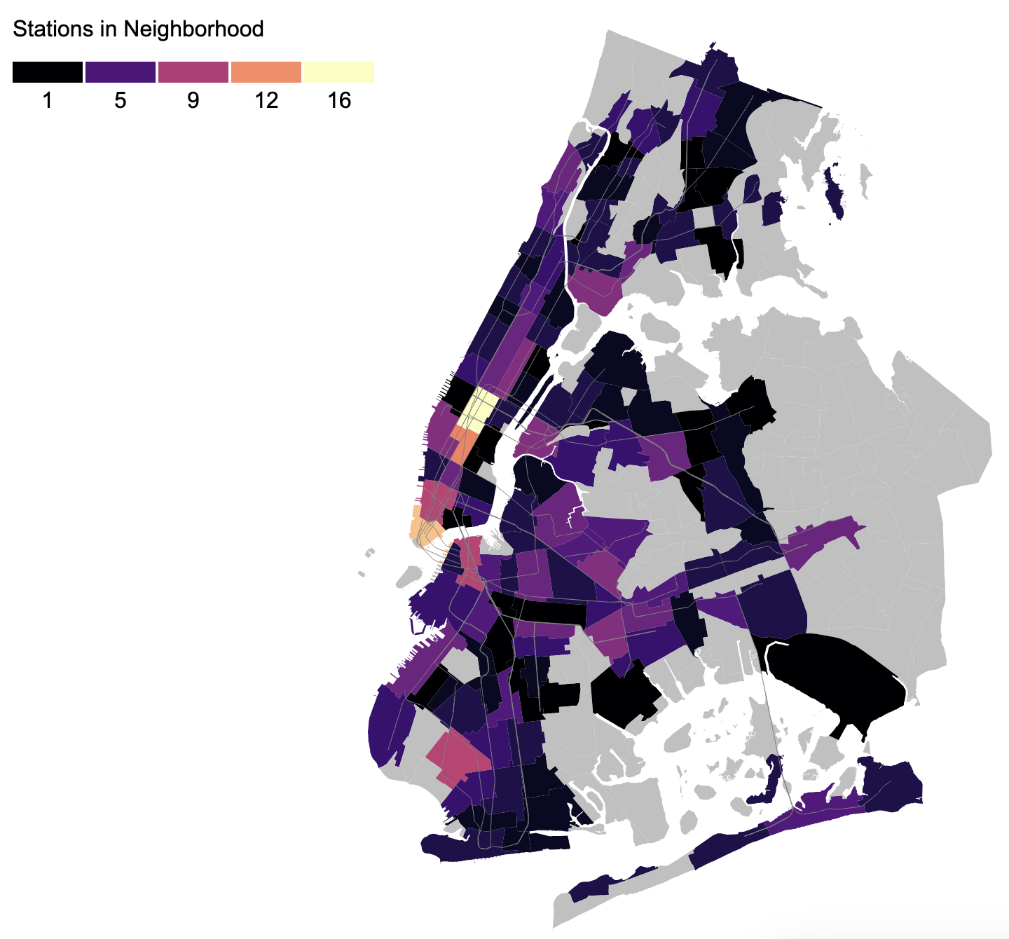
Here is a map of the number of stations in each neighborhood:

Firstly, the transit deserts in eastern Queens, Brooklyn, and the Bronx are all starkly visible as grey patches on the map. Looking at the areas that have subway access, midtown and lower Manhattan, downtown Brooklyn, and Long Island City stand out as being particularly dense. Crown Heights (North) is an interesting outlier - it appears to be very inconvenient, but there are a number of stations that fall right outside its boundaries so it’s actually much better than the map makes it seem.
One flaw with counting stations is that bigger NTA’s will naturally have more stations in their boundaries, including potentially multiple stations from the same line, making a neighborhood seem more convenient than it actually is. To partially adjust for this, we can count the number of lines instead. At the end of this post I discuss another way to control for neighborhood size.
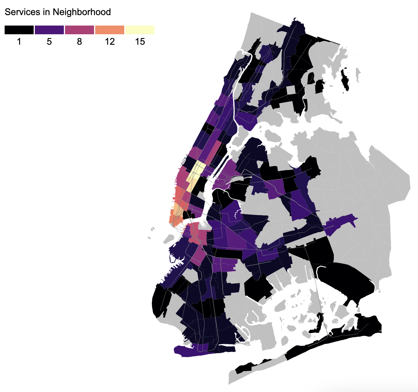
Below is a map of the number of subway lines in each neighborhood. Note that I only count weekday/daytime services, so any night/weekend service reductions are not reflected.

Bed-Stuy and Bushwick stand out as being particularly convenient, although their subway stations are all on the edges of the neighborhood so they may not be particularly easy to walk to. On the other hand, Astoria, Greenpoint, and Williamsburgh stand out as having few options compared to other popular neighborhoods, since they are dependent on only 1-2 lines.
One issue with counting lines is that not all lines are created equal - having the E stop in your neighborhood is much more useful than having the Franklin Ave shuttle, for example. The length of the subway line, or where you can actually travel to along that line, definitely matters.
Neighborhoods Reachable with Single Seat Ride #
Despite all the talk of deinterlining to reduce bottlenecks, the current configuration of the subway system allows for a lot of one-seat rides for popular travel patterns, and being able to take advantage of that feels really nice.
I wanted to capture this feeling of convenience by looking at how many other neighborhoods can be reached from a particular neighborhood without transferring trains.
For this analysis, I modeled neighborhoods and subway lines as a graph using Python:
- For each neighborhood N, we have 2 nodes: one representing that neighborhood as the origin of a trip (Ns), and another representing it as a destination (Nd).
- Each line is condensed into a single node L.
- For each line L that has a stop in neighborhood N, we have a 0-cost edge from Ns -> L and another 0-cost edge from L -> Nd.
To calculate the neighborhoods reachable with a single-seat ride, I used networkx to see how many Nd’s are reachable from a particular Ns.

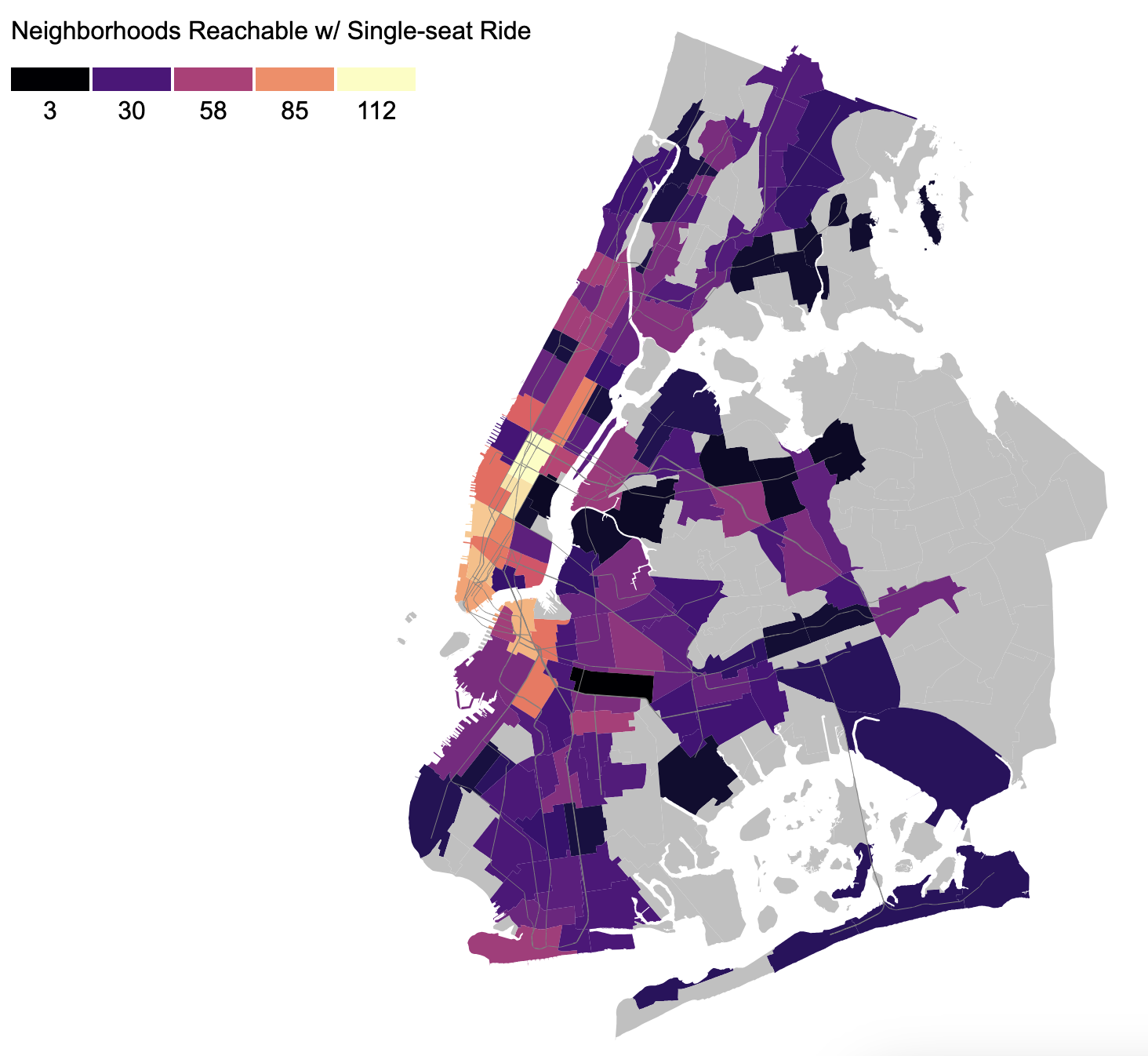
The median neighborhood can reach 50-something other neighborhoods with a single-seat subway ride, but neighborhoods vary wildly when evaluated by this metric.
Neighborhoods that only have access to a shorter line tend to suffer: Greenpoint (which can only reach places along the G), some neighborhoods along the L, and northeastern Bronx which only has the 6.
Some very densely populated neighborhoods in Queens, such as Jackson Heights, Flushing, and Sunnyside also measure relatively poorly with these standards since they only have access to the 7. Although the 7 is one of the nicer and more reliable lines, it is fairly short since it only passes through Queens and midtown Manhattan.
On the other hand, parts of Brooklyn like Park Slope rival lower Manhattan in terms of one-seat rides. Coney Island is another surprisingly convenient location, with the caveat that although you can have a single-seat ride to a lot of places, it’s going to be a very long ride if you start in Coney Island.
Looking at which neighborhoods are reachable is also interesting. Notably, it’s impossible for anyone in the Bronx or Manhattan north of midtown to reach Queens without a transfer.
Neighborhoods Reachable with One Transfer #
While a single-seat ride is nice for residents of well-connected neighborhoods, transfers are unavoidable for everyone else. I wanted to examine how the reachability score changes when we allow for a single transfer.
To model this, I added 1-cost bidirectional edges between any two lines that share a station or a station complex. Then, I took all Nd’s reachable from a particular Ns with paths with <=1 cost.

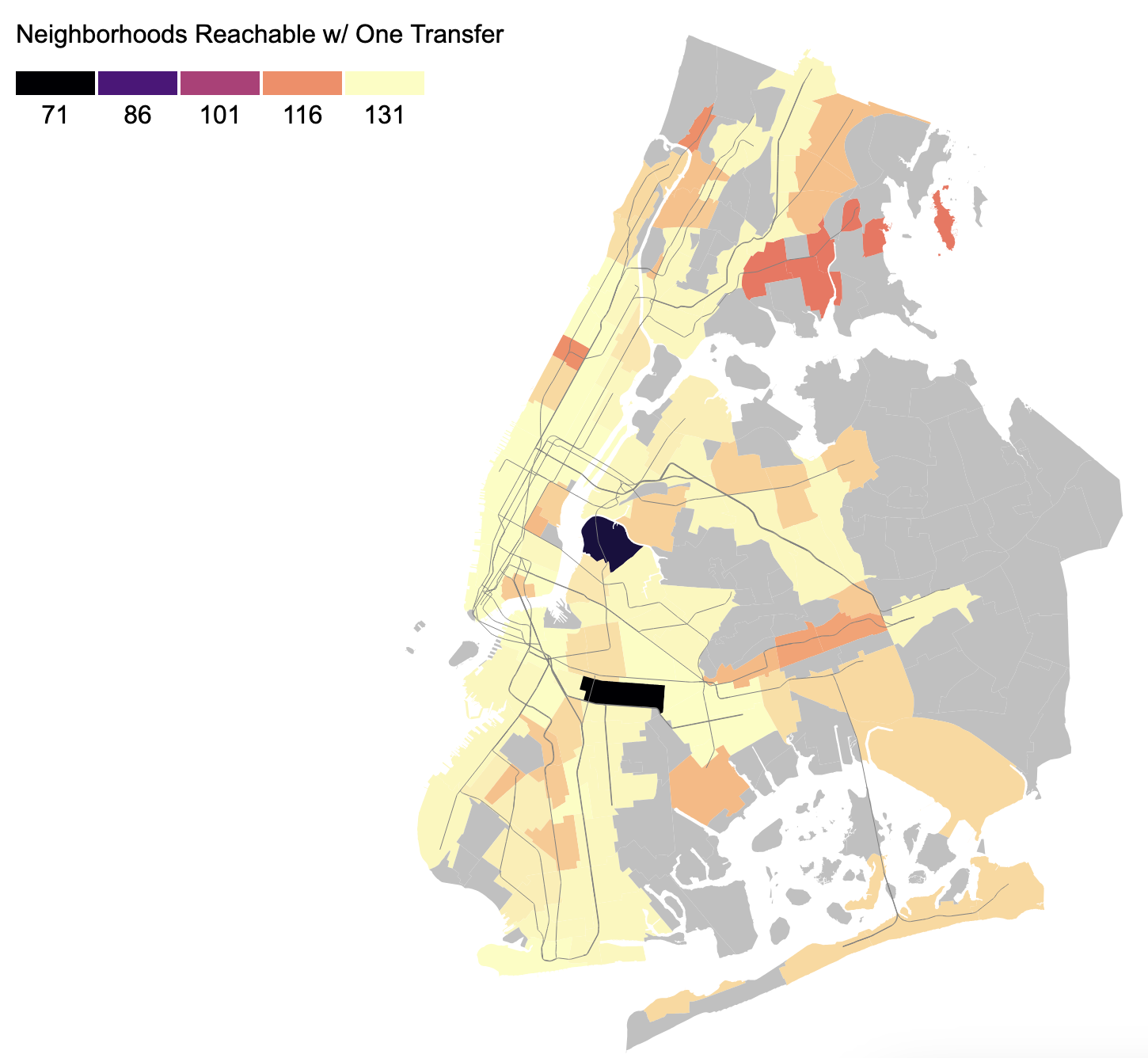
Unlike the single-seat analysis, this result is much more uniform. Of course, poor Greenpoint is singled out once again - since the G doesn’t connect to many other lines, Greenpoint residents require two transfers to reach a number of places.
Looking past that, the uniformity of this map showcases one of the greatest achievements of the NYC subway system - you can get from almost any neighborhood to almost any other neighborhood with only a single transfer (or less).
Future Work #
This is a decent start and has already yielded some cool insights, but there’s a lot more we could do with this data.
- Modeling more pieces of infrastructure in the graph such as tunnels and bridges could be used to analyze redundancy or bottlenecks, or to identify the impact of shutting a particular line/bridge/tunnel down.
- Using a more granular dataset such as census tracts might make this tool more useful for individuals to visualize their commuting options.
- Checking the catchment areas around each station instead of using hard cutoffs at neighborhood boundaries could eliminate some of the drawbacks of using NTA’s, since some stations lie right outside an NTA and some larger NTAs contain areas that aren’t reachable by train.
- Instead of just counting the number of reachable neighborhoods to measure connectivity, another metric to consider might be the total population in the reachable neighborhoods, to asnwer the question: “What fraction of the city’s population could you visit without changing trains?”
- Accounting for the length of a trip - for example, being able to take an express train for 2 stops is much more convenient than taking a local train for 10 stops.
- We could include Metro North and LIRR to this analysis, to give appropriate credit to neighborhoods that have commuter rail like Forest Hills.
Some of these ideas are being explored by other people right now - for example, just today I saw an awesome chart of the population catchment areas of each subway line.
I encourage anyone who reads this to play around with the code and data yourself, and see what insights you can come up with. The source code is all on Github.