The importance of data visualization is rapidly growing in today’s data-rich world, and web-based interactive visualizations such as those on New York Times or FiveThirtyEight can engage and inform a wide audience. One of the most popular tools for visualizing data on the web is D3, a powerful data visualization library for Javascript. This tutorial is intended to teach you how to make a circular bar chart in D3. Some knowledge of HTML and JavaScript is assumed.
Circular bar charts (also called radial bar charts) are a form of bar chart that curves each bar around a circle. They are more compact than regular bar charts, making them a good choice for situations where there are space constraints. The main disadvantage of this compared to regular bar charts is that it becomes harder to compare values between bars at a glance; bars closer to the middle appear much smaller than bars closer to the edge, even when the value they are plotting is larger.
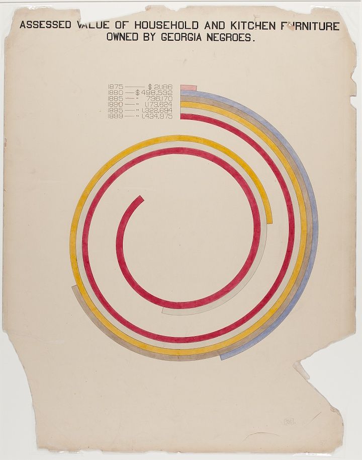
One famous example of the circular bar chart can be found in W.E.B Du Bois’s hand-drawn statistical charts highlighting racial and economic inequalities faced by African Americans in 1900.
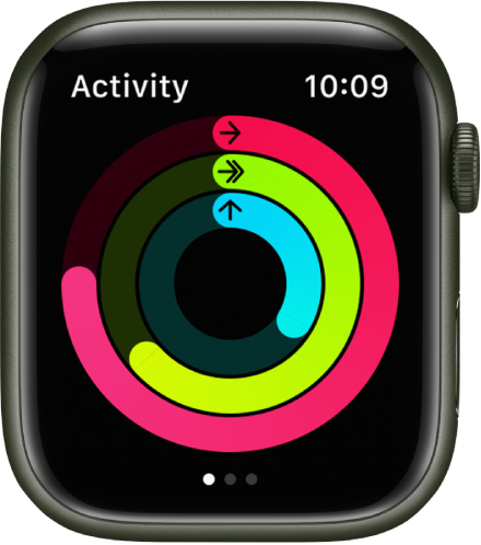
This type of chart is still popular more than a hundred years later, famously being used by the Apple Watch (which has very strict space constraints due to its tiny screen):
The main steps to making this type of chart for ourselves are: plotting the gridlines, plotting the axes, and plotting the shapes for the data. At the very end, I’ll also show how we can style the example to look like the chart shown on the Apple Watch.
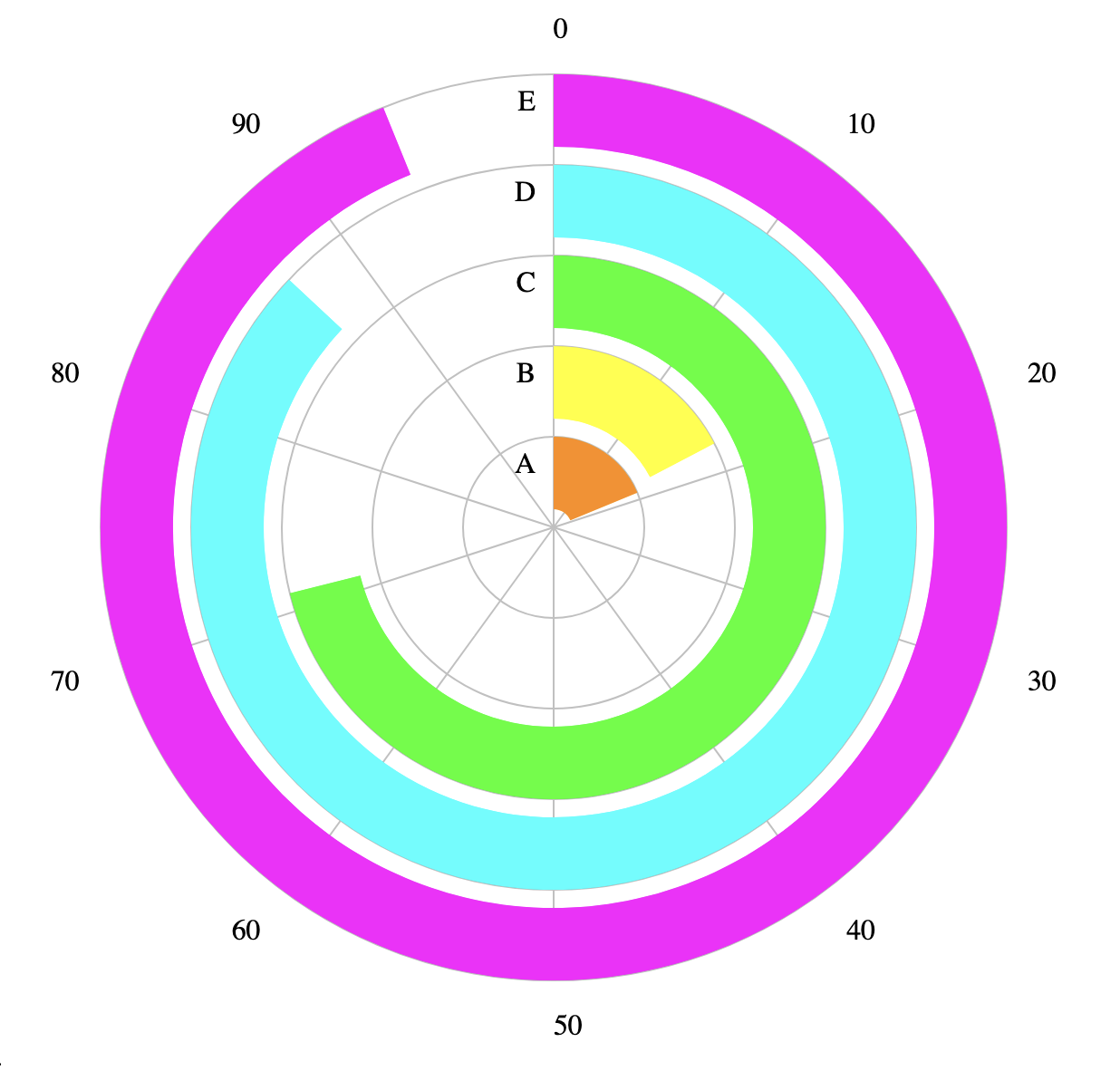
Before we begin the tutorial, here is a peek of what the final product should look like.
Setup #
First to get started we will need some boilerplate code. Create an index.html file with the following contents.
    <html>
        <script src="https://d3js.org/d3.v7.min.js"></script>
        <body>
        </body>
        <script>
            //code goes here!
        </script>
    </html>
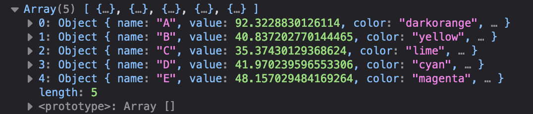
Let’s generate some fake data. Put the following code inside the <script> tag. This generates an array of JSON objects each containing the category name (A-F), the corresponding color, and a random value between 1 and 99.
let categories = ['A', 'B', 'C', 'D', 'E'];
let colors = ['darkorange', 'yellow', 'lime', 'cyan', 'magenta'];

// generate random values between 1 and 99
let data = categories.map((c, i) => {
    return {
        name: c,
        value: 1 + 98 * Math.random(),
        color: colors[i],
    }
});
console.log(data);
Note: the anonymous function for map can have two parameters. The first one corresponds to the element of the array, while the second one is optional and corresponds to the index.
Feel free to open index.html in your browser and inspect the data in the browser console; keep in mind that the data will be re-generated each time you reload the page. The console output should look something like this (note that your numbers will be different from mine):
In D3, the charts are usually displayed as SVG’s (Scalable Vector Graphics, an image format). We use d3.select to select the <body> tag, and add a 600x600 blank SVG inside to draw our chart on.
let width = 600;
let height = 600;
let svg = d3.select("body").append("svg")
    .attr("width", width)
    .attr("height", height);
Next, let’s do some math to figure out where to place each bar. The first bar will be pretty close to the middle, and the next bar wrapping around on the outside, and so on.
Here, chartRadius specifies that we want our chart to have a radius of 250px (so the whole chart will be 500px wide, on our 600px wide SVG). The variable barWidth calculates how wide each bar can be. In our case, there will be 1 bar every 50px, and in order to leave some empty space between the bars each bar will be 40px wide.
let chartRadius = width / 2 - 50;
let barPadding = 10;
let nBars = categories.length;
let barWidth = chartRadius / nBars - barPadding;
With this information, we can calculate the radius of the inside of each bar. We can iterate through our array of data and add this information (or, we can just add it when we generate the data in the first place). The first bar will start at 10px and extend to 50px; the next bar will start at 60px and extend to 100px, and so on.
data.forEach((d, i) => {
    d.radius = chartRadius / nBars * i + barPadding;
});
Plotting the Gridlines #
Next, let’s start plotting grid lines starting with the concentric circles. We name the variable rAxis because it is a radial axis that extends outwards from the center; each line corresponds to the position for one bar.
let rAxis = svg.append("g");
rAxis.selectAll("circle")
    .data(data)
    .join(enter =>
        enter.append('circle')
            .attr('r', d => d.radius + barWidth)
            .attr('cx', width / 2)
            .attr('cy', height / 2)
            .attr('fill', 'none')
            .style('stroke', 'silver')
            .style('stroke-width', '1px')
    );
If you want to understand what’s happening inside the call to .join, check out this page for an overview of data binding in D3.
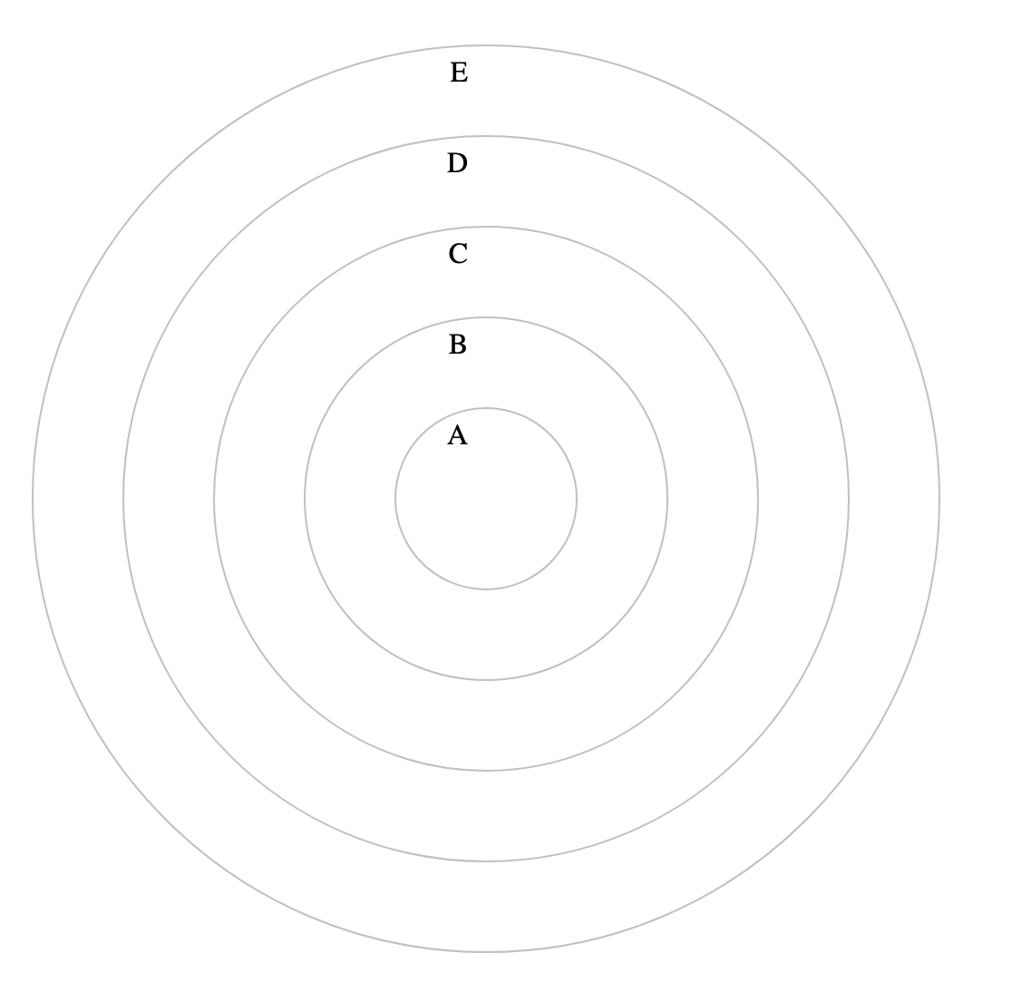
We can also add labels for each bar by adding text elements. Notice that the x position is a little bit left-of-center and the text-anchor is set to end. This ensures that the text extends to the left and doesn’t overlap with the bars that we’ll draw later.
rAxis.selectAll("text")
    .data(data)
    .join(enter => enter.append("text")
        .attr('x', width / 2 - 10)
        .attr('y', d => height / 2 - (d.radius + barWidth / 2))
        .text(d => d.name)
        .style('text-anchor', 'end')
    );
Now you should see something like this when you reload the page:
Looking back at the code snippet, observe that the y value is not the value output by the radial scale. This is because SVG coordinate systems have the top left as (0,0) and the y axis extends downwards from there (see diagram below). That means something that is 500 pixels from the bottom of the SVG has a y value of 100. Something that is 250 pixels up from the center of the SVG (like the text label for 10) will be at y value of 50.

Now, let’s define the ticks that go around the circle. D3 provides helper functions for mapping data into coordinates. We will make a scale to map our possible values to an angle in radians.
// define scale and ticks for bar values
let ticks = [0, 10, 20, 30, 40, 50, 60, 70, 80, 90];
let angle = d3.scaleLinear()
    .domain([0, 100])
    .range([0, 2 * Math.PI]);
We’ll also define a helper function that outputs the X and Y coordinates based on a value and a distance from the center.
// generate x and y coords based on angle and distance from the center of the chart
let coord = (value, radius) => {
    let a = angle(value) + Math.PI / 2;
    let x = Math.cos(a) * radius;
    let y = Math.sin(a) * radius;
    return { x: width / 2 - x, y: height / 2 - y };
}
Note that we add Math.PI / 2 to the angle. This is because normally 0 degrees points to the left. However, we want 0 degrees to start at the top, so we have to rotate everything clockwise by 90 degrees.
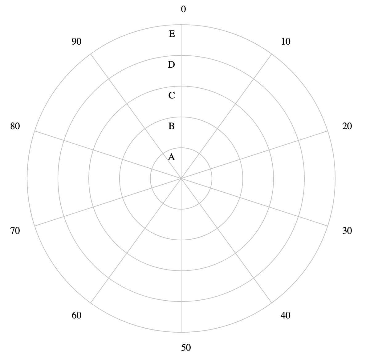
Now we can plot the grid lines extending outward from the center of the chart. We call this axis thetaAxis because the values correspond to the angle around the circle.
let thetaAxis = svg.append("g");
thetaAxis.selectAll("line")
    .data(ticks)
    .join(enter =>
        enter.append("line")
            .attr('x1', width / 2)
            .attr('y1', height / 2)
            .attr('x2', d => coord(d, chartRadius).x)
            .attr('y2', d => coord(d, chartRadius).y)
            .style('stroke', 'silver'));
We also want to label each tick with the value it represents. Two things to note here are that we multiply the radius by 1.1 so that the numbers are placed outside of the outermost circle, and we set the text-anchor to be end or start depending on which side the text is on so that the text always extends outwards.
thetaAxis.selectAll("text")
    .data(ticks)
    .join(enter =>
        enter.append('text')
            .attr('text-anchor', d => coord(d, 1).x < width / 2 ? 'end' : 'start')
            .attr('x', d => coord(d, chartRadius * 1.1).x)
            .attr('y', d => coord(d, chartRadius * 1.1).y + 5)
            .text(d => d));
The page should now look like this.
Plotting the Bars #
Finally, we can plot the bars for the data. Luckily, D3 provides helpers for drawing the bar shapes based on the values we specify.
let arc = d3.arc()
    .innerRadius(d => d.radius)
    .outerRadius(d => d.radius + barWidth)
    .startAngle(0)
    .endAngle(d => angle(d.value));
To plot the bars, we use our arc helper to generate the d attribute of each path element that we plot. For more information on SVG paths, refer to this documentation.
let bars = svg.append('g');
bars.selectAll('path')
    .data(data)
    .join(enter => enter.append('path')
        .style('fill', d => d.color)
        .attr('d', d => arc(d))
        .attr('transform', `translate(${width / 2},${height / 2})`));
Congratulations! You have made your first circular bar chart in D3. Refer to the beginning of this tutorial for an example of what your chart should look like, or check out a live example here.
Read on to see how we can style this chart to make it look like the Apple Watch UI.
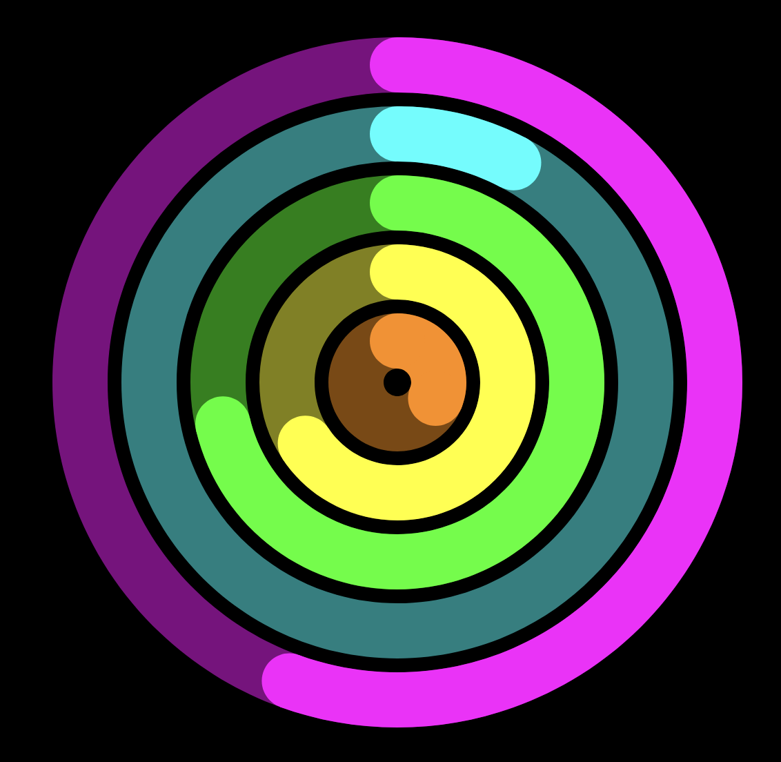
Bonus: Recreating the Apple Watch #
It only takes a little more work to make our chart look more like the chart in the Apple Watch. We’ll need to do the following:
- Remove all the grid lines, axes, and text labels
- Make the background black
- Add a faint ring behind each bar
- Add circles at both ends of each bar to make them look rounded
Starting from the code from our finished example, we will first delete all the code related to rAxis and thetaAxis.
To make the background black, we can make a black rectangle that covers the whole SVG. This should be done right after creating the SVG itself, so that the other elements are drawn on top.
svg.append('rect')
    .attr('width', width)
    .attr('height', height)
    .attr('fill', 'black');
To plot the faint rings in the background, we essentially plot another chart behind the main chart, with every bar’s value equal to 100 and the opacity set to 50%. This snippet should go before the code for arc and bars, since we want the actual bars to be drawn on top.
let bgArc = d3.arc()
    .innerRadius(d => d.radius)
    .outerRadius(d => d.radius + barWidth)
    .startAngle(0)
    .endAngle(Math.PI * 2)
let bgBars = svg.append('g');
bgBars.selectAll('path')
    .data(data)
    .join(enter => enter.append('path')
        .attr('class', 'arc')
        .style('fill', d => d.color)
        .style('opacity', 0.5)
        .attr('d', d => bgArc(d))
        .attr('transform', `translate(${width / 2},${height / 2})`));
Finally, to create the effect of rounded bars we’ll need to add a circle at each end of every bar, using our coord helper to calculate the position.
bars.selectAll('circle')
    .data(data)
    .join(enter => {
        enter.append("circle")
            .attr('cx', d => coord(0, d.radius + barWidth / 2).x)
            .attr('cy', d => coord(0, d.radius + barWidth / 2).y)
            .attr('r', barWidth / 2)
            .attr('fill', d => d.color);
        enter.append("circle")
            .attr('cx', d => coord(d.value, d.radius + barWidth / 2).x)
            .attr('cy', d => coord(d.value, d.radius + barWidth / 2).y)
            .attr('r', barWidth / 2)
            .attr('fill', d => d.color)
    });
And with that, we’re done! You can refer to the beginning of this section for how it should look, or check out a live example here.
Of course, we can make this even more faithful to the Apple Watch design by making the center empty, adding icons, and adding animations, but I’ll leave that as an exercise for the reader 😀