In this tutorial, we will be using Vega to make an interactive map that displays COVID-19 data for each state in the US.
Vega is a declarative language for creating visualizations. You simply specify a schema for the visualization in JSON format, and Vega will translate that schema into a D3 visualization.
Because Vega compiles to D3, a lot of D3 concepts will transfer over - the main difference is Vega eliminates a lot of the Javascript boilerplate that is required in D3 visualizations (such as hooking up listeners, preprocessing, etc) which results in more readable code that is easy to debug.
Since I’m writing from the perspective of someone who learned D3 first before picking up Vega, this tutorial assumes a working knowledge of D3. However, even if you don’t know D3 you can probably still follow along, since you don’t actually have to write any D3 code to make a Vega visualization.
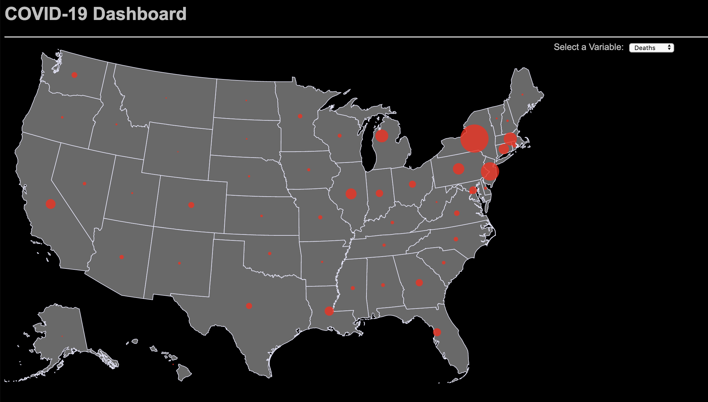
Before we begin, here’s an idea of what the finished product will look like:
Setup #
Create a directory for this visualization. Inside, create a file called index.html and paste in the following contents:
<head>
    <title>Vega COVID-19 Dashboard</title>
    <script src="https://cdn.jsdelivr.net/npm/vega@5"></script>
    <script src="https://d3js.org/d3.v5.min.js"></script>
    <script src="https://cdn.jsdelivr.net/npm/vega-tooltip"></script>
</head>
<style></style>

<body>
    <h1>COVID-19 Dashboard</h1>
    <hr>
    <div id="view"></div>
    <div id="viewControl"></div>
    <script>
        var view;
        function render(spec) {
            var runtime = vega.parse(spec);
            var handler = new vegaTooltip.Handler({
                'theme': 'dark'
            });
            view = new vega.View(runtime, {
                renderer: 'svg',
                container: '#view',
                hover: true
            })
                .tooltip(handler.call)
                .initialize(document.getElementById("view"))
                .run();
            return view.runAsync();
        }
        var spec = {};
        render(spec);
    </script>
</body>
This is some boilerplate HTML and Javascript that’s required for every Vega visualization. I’ve added 2 things to the bare-minimum boilerplate: viewControl which is a div that will hold a dropdown to change what variable is displayed on the map, and some imports/code for a tooltip, which is not included with Vega normally.
Note that the Vega spec (the spec variable) is defined as a JSON object, which is currently an empty placeholder.
Inside the same directory as index.html, you’ll also need to download the TopoJSON shapefile of the US.
Spec Overview #
Below is the starter code for our Vega spec, which we will use to define our entire visualization. Right now it just sets some basic properties about the visualization, but the data, projections, scales, signals, and marks fields are empty. I’ll explain what each of those things do as we fill them in.
{
    "$schema": "https://vega.github.io/schema/vega/v5.json",
    "width": 975,
    "height": 610,
    "padding": {
        "top": 0,
        "left": 0,
        "right": 0,
        "bottom": 0
    },
    "autosize": "none",
    "data": [],
    "projections": [],
    "scales": [],
    "signals": [],
    "marks": []
}
Data #
The data section of the spec allows us to define our data sources, and any preprocessing/transformations we want to do. We have 2 data sources for this visualization: state-by-state coronavirus cases data, and the map data that we downloaded earlier. The goal is to join the 2 datasets so that the number of cases/deaths/recovered/tested for each state is associated with a shape on the map.
We will use the https://covidtracking.com API for to get the coronavirus data. The specific endpoint is https://covidtracking.com/api/v1/states/current.json. If you open that in your browser, you can see that it looks like an array of JSON data with one entry for each state:
[
    {
        "state":"AK",
        "positive":374,
        "recovered":291,
        "death":10,
        "total":24341,
        "fips":"02",
        ...more fields
    },
    ...more entries
]
To include it in our spec, add the following JSON object to the data field:
{
    "name": "covid",
    "url": "https://covidtracking.com/api/v1/states/current.json"
}
Loading the map data is similar, except we will be loading the file we have locally:
{
    "name": "map",
    "url": "./states-albers-10m.json",
    "format": {
        "type": "topojson",
        "feature": "states"
    },
    "transform": []
}
Note that the transform field is empty. We’re not quite done here, because we have to use transformations to join the 2 datasets together. We will use 3 transformations in total; the transformations are applied in the order in which they appear in the array.
Transform #
The first transformation converts the TopoJSON into a GeoJSON. The difference between GeoJSON and TopoJSON is that TopoJSON stores each line in the map once: if 2 states share a border, the border is only defined once in TopoJSON, whereas in GeoJSON the edge is defined for each state. The former saves space, but needs to be converted to the latter to display.
{
    "type": "geopath",
    "projection": "projection"
}
The next transformation calculates the center of each state (so we know where to place the circles).
{
    "type": "formula",
    "as": "center",
    "expr": "geoCentroid('projection', datum.geometry)"
}
Finally, we use a transformation to join the map data with the coronavirus API data. The map data contains an id field for each state, which represents the FIPS code - this is matched with the fips field in the API data, and the relevant fields are transferred over and renamed.
{
    "type": "lookup",
    "from": "covid",
    "key": "fips",
    "fields": ["id"],
    "as": ["Confirmed", "Deaths", "Recovered", "Tested"],
    "values": ["positive", "death", "recovered", "total"],
}
With that, we’re done defining our data sources and transformations. The completed data spec should look something like this:
[
    {
        "name": "covid",
        "url": "https://covidtracking.com/api/v1/states/current.json"
    },
    {
        "name": "map",
        "url": "./states-albers-10m.json",
        "format": {
            "type": "topojson",
            "feature": "states"
        },
        "transform": [
            {
                "type": "geopath",
                "projection": "projection"
            },
            {
                "type": "formula",
                "as": "center",
                "expr": "geoCentroid('projection', datum.geometry)"
            },
            {
                "type": "lookup",
                "from": "covid",
                "key": "fips",
                "fields": ["id"],
                "as": ["Confirmed", "Deaths", "Recovered", "Tested"],
                "values": ["positive", "death", "recovered", "total"]
            }
        ]
    }
]
Projections #
The projection we need for this visualization is really simple, because the map data has already been centered on the USA scaled to fit in a 975 x 610 visualization. Normally this isn’t the case and we need to use projections like Mercator or Equirectangular, since coordinates are usually defined as latitude and longitude, but US map data sometimes comes nicely like this.
{
    "name": "projection",
    "type": "identity"
}
Scales #
We will define 4 separate scales for this visualization, one for each variable. Scales are functions we define to map our input data to a range of values.
We specify the domain and range, as well as the relationship between the two (for example linear, quadratic, square root). When we specify a dataset and field for the domain, Vega will use the extent (minimum and maximum values) of that field as the domain.
These scales will be used to control the size of the circles for each state. When we make circles, we want the input to correspond with the area of the circle and not the radius, to avoid misleading the viewer. In this case, the range corresponds to the area of each circle in square pixels (4-2500px^2 area corresponds to 2-50px radius) so the relationship can be linear. If we wanted a scale to calculate the radius, we could have used a square root scale.
[{
    "name": "Deaths",
    "type": "linear",
    "domain": {
        "data": "covid",
        "field": "death"
    },
    "range": [4, 2500]
},
{
    "name": "Confirmed",
    "type": "linear",
    "domain": {
        "data": "covid",
        "field": "positive"
    },
    "range": [4, 2500]
},
{
    "name": "Tested",
    "type": "linear",
    "domain": {
        "data": "covid",
        "field": "total"
    },
    "range": [4, 2500]
},
{
    "name": "Recovered",
    "type": "linear",
    "domain": {
        "data": "covid",
        "field": "recovered"
    },
    "range": [4, 2500]
}]
Signals #
The signals field in the spec is where we define the interactivity of the visualization. This includes things like hovering, clicking, scrolling, and dragging, as well as inputs elements that the user can use to change the visualization (which is what we’re doing here). We can reference the signal in many other parts of the spec, and Vega sets up all the event listeners so that the appropriate elements are updated according to the user’s actions.
In this visualization, we want to make a dropdown menu that the user can select what variable to display on the map. To do this, we create a signal named Variable and bind it to a select element with. 4 options (named like each of the fields for convenience). We set the default to display the number of deaths in each state, and specify that the input element is attached to the #viewControl div in index.html so we can control where it is positioned.
{
    "name": "Variable",
    "value": "Deaths",
    "bind": {
        "input": "select",
        "options": [
            "Deaths",
            "Confirmed",
            "Recovered",
            "Tested"
        ],
        "element": "#viewControl",
        "name": "Select a Variable:"
    },
}
Marks #
Marks are the visual elements that the visualization displays. In our dashboard, there are 2 marks: the outline of each state, and the circle that corresponds to the data for that state.
States & Tooltip #
The outline for each state is a path element, with one shape for each object in our map data. The encoding for each shape is specified in the encode field; enter, update, exit (not shown) correspond with D3’s update pattern and will not be explained here.
Each state is grey, with lavender borders. When the user hovers over a state, the color becomes lighter and a tooltip appears. The background color of the tooltip was set in index.html, when we defined the vegaTooltip.Handler with a dark theme.
The signal field of the tooltip controls what the tooltip displays. In this case, we pass in a stringified JSON object so that the tooltip displays a small table, but if you only have 1 thing to display you can just pass that in as a string.
Although we define the tooltip signal as a string, the signal field is interpreted as an expression so we can write Javascript to access and manipulate the fields in each state. The data for each state is bound to the datum variable, and here I use the format function to ensure that the numeric fields are displayed with the proper commas.
{
    "type": "path",
    "from": {
        "data": "map"
    },
    "encode": {
        "enter": {
            "fill": {
                "value": "dimgray"
            },
            "stroke": {
                "value": "lavender"
            },
            "tooltip": {
                "signal": `{
                    'State': datum.properties.name,
                    'Tested': format(datum.Tested, ',d'),
                    'Cases': format(datum.Confirmed, ',d'),
                    'Recovered': format(datum.Recovered, ',d'),
                    'Deaths': format(datum.Deaths, ',d')
                }`
            }
        },
        "update": {
            "path": {
                "field": "path"
            },
            "fill": {
                "value": "dimgray"
            }
        },
        "hover": {
            "fill": {
                "value": "silver"
            },
        },
    }
}
Circles #
These marks are red circles that appear over each state, with bigger circles corresponding to larger numbers of whatever variable we are displaying.
The circles are symbol elements instead of circle elements as you’d expect. The main advantage to this is that we can define the size (area) of each symbol, while we can only define the radius of circle elements. We add the tooltip here as well so that it doesn’t go away when we hover over one of the circles; the tooltip is identical to the one from the previous section.
The center of each circle is set by the x and y attributes. Recall that we calculated a centroid for the each state as part of our data transformations. The centroid is stored in the center field as a 2 element array, so we can access the x-component of the coordinate as center[0] and the y-component of the coordinate as center[1].
For the size of each circle, we take the value of a field and apply one of our sizing scales to it. Neither the field nor the scale are fixed - instead, they are bound to the Variable signal that we defined earlier. For example, selecting “Deaths” will cause the circles to update to use the Death field and the scale named Death. Naming the scale and the field with the same name is a trick of sorts that allows us to use a single input element to change both those things at the same time.
{
        "type": "symbol",
        "from": {
            "data": "map"
        },
        "encode": {
            "enter": {
                "tooltip": {
                    "signal": `{
                        'State': datum.properties.name,
                        'Tested': format(datum.Tested, ',d'),
                        'Cases': format(datum.Confirmed, ',d'),
                        'Recovered': format(datum.Recovered, ',d'),
                        'Deaths': format(datum.Deaths, ',d')
                    }`
                }
            },
            "update": {
                "size": {
                    "scale": {
                        "signal": "Variable"
                    },
                    "field": {
                        "signal": "Variable"
                    }
                },
                "fill": {
                    "value": "red"
                },
                "fillOpacity": {
                    "value": 0.8
                },
                "strokeWidth": {
                    "value": 0
                },
                "x": {
                    "field": "center[0]"
                },
                "y": {
                    "field": "center[1]"
                }
            }
        }
    }
Completed Spec #
Congrats! You just made your first Vega spec. The completed spec is shown below for reference:
{
    "$schema": "https://vega.github.io/schema/vega/v5.json",
    "width": 975,
    "height": 610,
    "padding": {
        "top": 0,
        "left": 0,
        "right": 0,
        "bottom": 0
    },
    "data": [{
        "name": "covid",
        "url": "https://covidtracking.com/api/v1/states/current.json"
    }, {
        "name": "map",
        "url": "./states-albers-10m.json",
        "format": {
            "type": "topojson",
            "feature": "states"
        },
        "transform": [{
            "type": "geopath",
            "projection": "projection"
        },
        {
            "type": "formula",
            "as": "center",
            "expr": "geoCentroid('projection', datum.geometry)"
        },
        {
            "type": "lookup",
            "from": "covid",
            "key": "fips",
            "fields": ["id"],
            "as": ["Confirmed", "Deaths", "Recovered", "Tested"],
            "values": ["positive", "death", "recovered", "total"],
            "default": null
        }]
    }],
    "projections": [{
        "name": "projection",
        "type": "identity"
    }],
    "scales": [{
        "name": "Deaths",
        "type": "linear",
        "domain": {
            "data": "covid",
            "field": "death"
        },
        "range": [4, 2500]
    },
    {
        "name": "Confirmed",
        "type": "linear",
        "domain": {
            "data": "covid",
            "field": "positive"
        },
        "range": [4, 2500]
    },
    {
        "name": "Tested",
        "type": "linear",
        "domain": {
            "data": "covid",
            "field": "total"
        },
        "range": [4, 2500]
    },
    {
        "name": "Recovered",
        "type": "linear",
        "domain": {
            "data": "covid",
            "field": "recovered"
        },
        "range": [4, 2500]
    }
    ],
    "autosize": "none",
    "signals": [
        {
            "name": "Variable",
            "value": "Deaths",
            "bind": {
                "input": "select",
                "options": [
                    "Deaths",
                    "Confirmed",
                    "Recovered",
                    "Tested"
                ],
                "element": "#viewControl",
                "name": "Select a Variable:"
            },
        }
    ],
    "marks": [{
        "type": "path",
        "from": {
            "data": "map"
        },
        "encode": {
            "enter": {
                "fill": {
                    "value": "dimgray"
                },
                "stroke": {
                    "value": "lavender"
                },
                "tooltip": {
                    "signal": `{
                        'State': datum.properties.name,
                        'Tested': format(datum.Tested, ',d'),
                        'Cases': format(datum.Confirmed, ',d'),
                        'Recovered': format(datum.Recovered, ',d'),
                        'Deaths': format(datum.Deaths, ',d')
                    }`
                }
            },
            "update": {
                "path": {
                    "field": "path"
                },
                "fill": {
                    "value": "dimgray"
                }
            },
            "hover": {
                "fill": {
                    "value": "silver"
                },
            },
        }
    }, {
        "type": "symbol",
        "from": {
            "data": "map"
        },
        "encode": {
            "enter": {
                "tooltip": {
                    "signal": `{
                        'State': datum.properties.name,
                        'Tested': format(datum.Tested, ',d'),
                        'Cases': format(datum.Confirmed, ',d'),
                        'Recovered': format(datum.Recovered, ',d'),
                        'Deaths': format(datum.Deaths, ',d')
                    }`
                }
            },
            "update": {
                "size": {
                    "scale": {
                        "signal": "Variable"
                    },
                    "field": {
                        "signal": "Variable"
                    }
                },
                "fill": {
                    "value": "red"
                },
                "fillOpacity": {
                    "value": 0.8
                },
                "strokeWidth": {
                    "value": 0
                },
                "x": {
                    "field": "center[0]"
                },
                "y": {
                    "field": "center[1]"
                }
            }
        }
    }]
}
Now, you can render the visualization by starting a localhost server and opening the page in your browser. Since the visualization needs to load a JSON file from your computer, it won’t work if you just open index.html without starting a server (browsers prevent web pages from loading files from your computer, for good reason).
If you have Python 3, the process is simple. Navigate to the folder containing your code, and type python -m http.server. Then, open https://localhost:8000 in your browser.
Another tip for debugging Vega visualizations: if there’s no errors shown in the browser’s console but things aren’t being displayed properly, you can inspect the data at runtime to see the result after all the transformations are applied. This is really useful because you can’t put console.log calls in the Vega spec. For example, you can type view.data("map") into the console to view the map data to make sure our data sources were joined properly.
Add Some Styling #
Finally, add the following styles to the style tag in index.html. Feel free to change around the fonts and colors depending on your preferences.
<style>
    body {
        background-color: black;
        font-family: Arial, Helvetica, sans-serif;
        color: silver;
    }
    select {
        margin-left: 10px;
    }
    #view, #viewControl {
        float:left;
    }
</style>
And we’re finished! Your dashboard should look something like the one I made here: Vega COVID Dashboard. I hope this tutorial was useful in showing how easy it is to pick up and work with Vega.
For an example of a more elaborate COVID dashboard that mixes D3 and Vega for more interactivity, see the Full Vega COVID Dashboard we made. Many thanks to Milan Zhou for assisting with my Vega projects.
For additional tutorials and examples, consult the Vega official documentation.