During my last semester at Cornell, I worked with my peers on Cornell Data Science to build a course visualization/recommender system. In this post, I’ll give an overview of the project and how we built it. I’ll also synthesize some of the lessons and insights that we learned from the process, for the benefit of anyone looking to build a similar system.
Here’s a link to the source code.
Introduction #
The app provides a visual interface to explore courses at Cornell and get course recommendations for what to take. After discussions with the professor that was supervising the project, we narrowed down the target audience to 3 main groups:
- Freshmen who don’t know what major to pick, want to see typical courses for each major
- Upperclassmen who want to know what classes to take next semester
- Upperclassmen who want suggestions for fun classes outside of major
Dataset and Exploration #
We were provided with registrar data of course enrollment over a decade, with each student identified by a unique ID. We initially separated the entries by major and modeled each major as a bipartite graph, with students and courses as individual nodes.
With this data, we wanted to answer 2 main questions:
- what courses did people take at the same time?
- if a person took a particular course in a particular semester, what courses did they take in the following semester(s)?
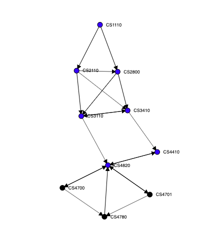
To answer the first question, we made a co-enrollment graph. This graph represented each course as a node, with an undirected edge linking each pair of courses with weight equal to how many people took both courses concurrently.
To answer the second question, we made a post-enrollment graph. In this graph, we had directed edges from course A to course B with weight equal to how many people took B the semester after they took A. Reversing the direction of the graph results in a pre-enrollment graph, which is useful for finding what courses people took prior to taking a particular course.
We noticed that a small number of edges had extremely high weights (edges connecting core courses), while most edges had low weights (edges connecting to various electives outside of the selected major). Below is a picture of a post-enrollment graph rendered in graphviz, filtered to only show edges with extremely high weights:
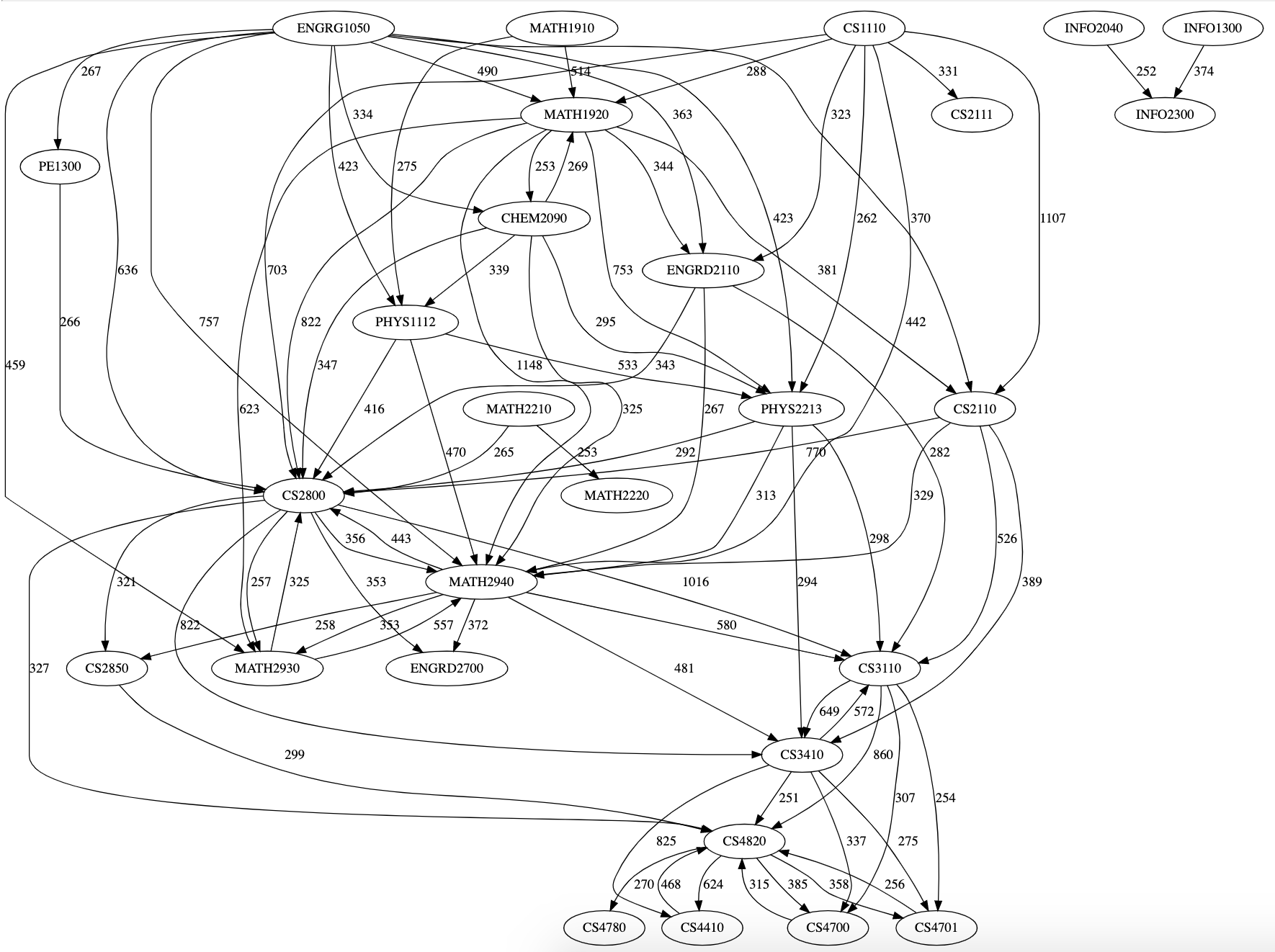
An early insight we reached was that this information would strongly reflect the pre-requisites and co-requisites that courses had. Although we had access to pre-requisite requirements for each course, we did not include it in our dataset. Since Cornell enforces pre-requisites loosely, we felt that seeing what courses people actually took would be more informative than seeing what courses people were supposed to take.
Visualization #
The visualizations for our project were all implemented using D3.js.
Based on the graph structure of the data, we initially thought of a force-directed layout. We also considered a dendrogram rooted at a selected course, to show branching options for courses to take.
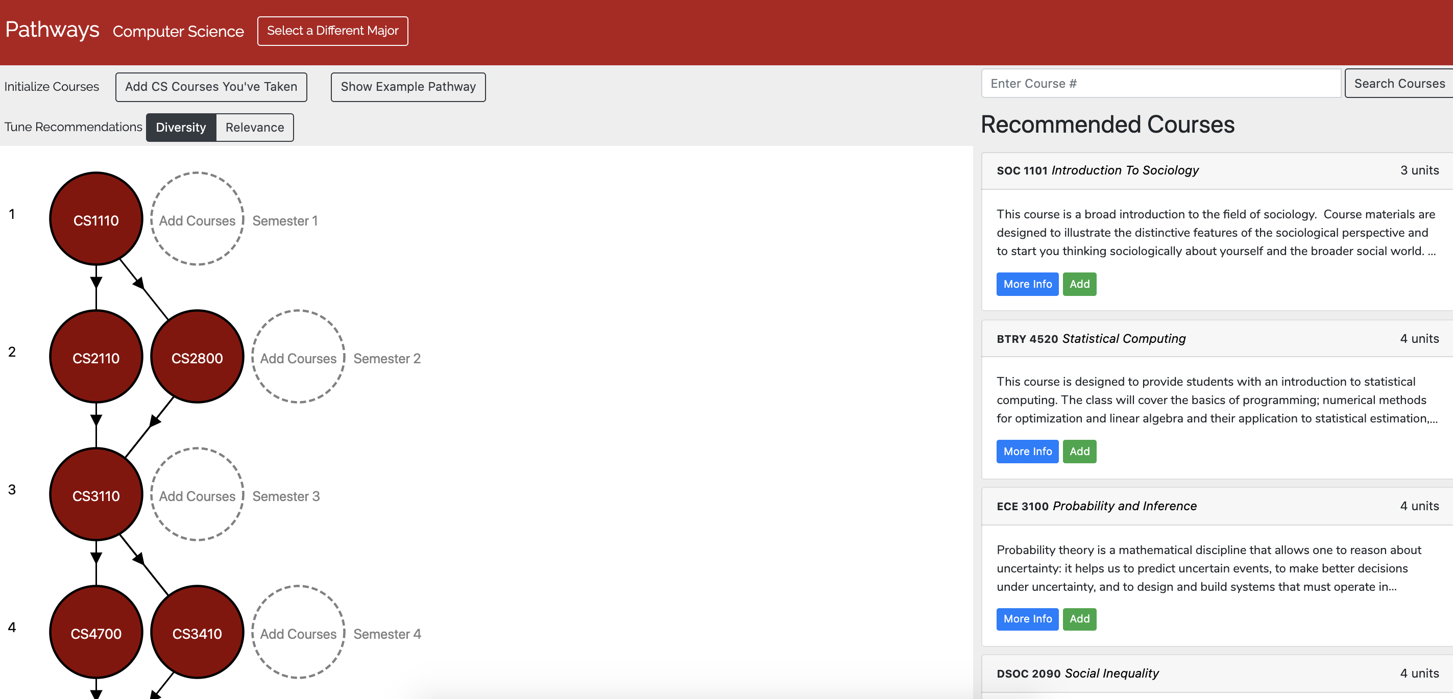
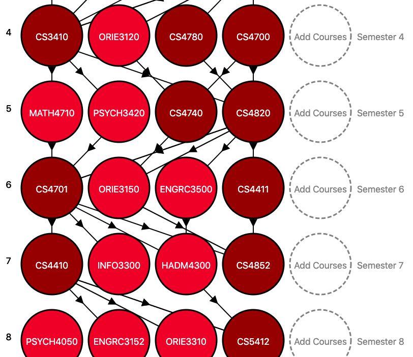
We decided to enforce a grid layout for our visualization, with course nodes organized into 8 rows each corresponding to a semester. The structured layout allowed users to focus on a semester by clicking on a specific row, which helped them add courses and view recommendations more easily.
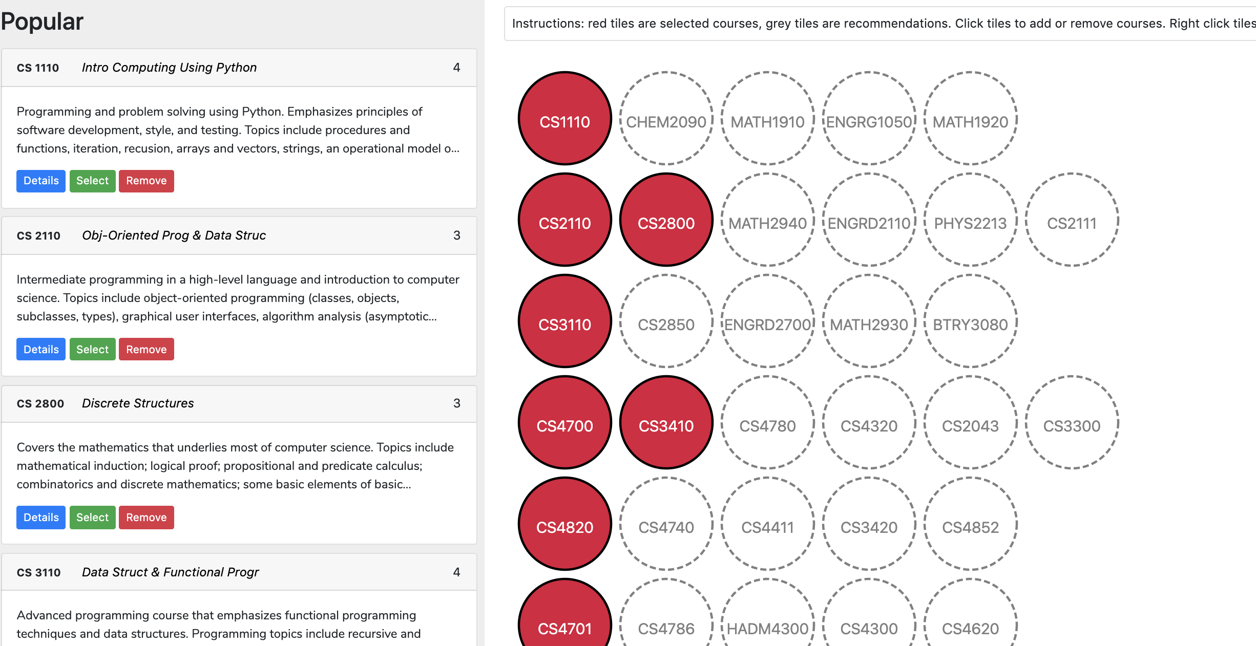
We wanted to show connections between courses in different semesters, but soon realized that displaying arrows between every pair of courses in adjacent semesters would result in the layout looking very cluttered.
To reduce clutter, we only displayed the highest-weighted incoming edge and the highest-weighted outgoing edge for each node. Additionally, we used an edge overlap reduction heuristic to re-order the nodes in each semester to minimize the number of edges that cross each other.
Recommender System #
Using the post-enrollment and co-enrollment graphs, it was relatively straightforward to build a recommendation system for courses.
We defined the task as follows: Given a list of courses the user took and what semester they took each course in, the system should output a separate list of recommendations for each semester.
The reason we provide recommendations for every semester is to allow this system to be used for planning purposes - in other words, users can put in what courses they will definitely take in future semesters, and we’ll provide suggestions to fill the rest of the schedule.
To make a list of recommendations for a particular semester, we first assign a score to each course.
Given course C, semester N, and the list of other courses already selected for a semester Courses(N): the score for C is calculated by adding the co-enrollment edge weights from all the courses in Courses(N) to C, and the post-enrollment edge weights from all the courses in Courses(N-1) to C.
The list of courses is then sorted by score, and filtered to remove courses that are already in the schedule. Then, we can simply take the top few to use as recommendations.
Based on qualitative user feedback on an early version of this algorithm, we found that the system produced reasonable results, although it had a tendency to suggest courses which were within the same department as the selected major. While that is good for some use cases, it wouldn’t help students who were looking to explore courses in different departments (use case 3).
To cater to students that want to explore courses outside of their department, we allow the user to specify that a list of recommendations for a particular semester cannot include more than 1 course from each department. This resulted in recommendations that were noticeably more diverse, although for STEM majors the recommended courses were mostly in other STEM departments.
User Interface #
In order to take this project from a functional product to a user-friendly one, we added several quality of life features.
For users who know they want to take a course but don’t know when to take it, we built a “smart-add” system. Users can add a course without selecting a semester, and our system tries to guess where to place the course. This is accomplished in a manner similar to the recommendation system, except instead of scoring courses we score semesters.
One of the biggest issues with earlier versions of the system was that that users needed to input what courses they’ve already taken. This can be time consuming and a deterrent to adoption, especially for students who had already taken many courses.
To speed up the process of adding courses, we built a bulk-add functionality allowing users to select courses by department and quickly add courses with a single click. When using the bulk-add feature, the user doesn’t have to specify which semester they took each course. The placement of the course is handled by the aforementioned smart-add feature, and user testing showed that the results offered a good tradeoff between speed and accuracy.
For freshmen who have absolutely no idea what to take (use case 3), we decided to implement an “auto-fill” feature. This feature essentially fills out all 8 semesters with courses indicative of what someone in that major would typically take, that way freshmen could compare and tweak sample schedules for each major. This was relatively easy to implement by simply filling out the schedule with the core courses from the major, and adding the top recommendations for each semester.
Lessons #
Below are the main takeaways from this project:
- Good preprocessing -> easier to make good recommendations: by preprocessing our data first into a bipartite students/courses graph and then further processing it into post-enrollment and co-enrollment graphs, it became much easier to understand our data and allowed us to make recommendations just by looking at a node’s neighbors and their weights
- Don’t discount heuristics: our recommendation system is based on heuristics, and our edge-overlap-reducing layout is also a heuristic - both may not be objectively optimal, but they are “good enough” and more importantly very fast, which makes them more suitable for our task
- User Feedback is important: as developers, we know how a system is supposed to work and when we click around it feels perfectly natural, but users who have never seen the system before might not agree. Getting feedback from users in the form of “I didn’t expect this to happen” or “I didn’t know how to do X” or “I don’t know what Y does” is very valuable, because it exposes parts of the interface that are unintuitive to new users.
- Qualitative Feedback is important: for recommendation systems, it’s often difficult to have an objective measure of how good results are. We found that qualitative user feedback was important for getting a sense for where we were doing well and where we could improve.
- Bridging the gap between “working” and “usable/useful” is hard: it’s one thing to have all the features in the backend and no bugs (which is what developers usually aim for), and another thing entirely to make an intuitive interface so that people will actually use them. This project made us appreciate how much thought goes into designing interfaces that are easy to understand for users.