The importance of data visualization is rapidly growing in today’s data-rich world, and web-based interactive visualizations such as those on New York Times or FiveThirtyEight can engage and inform a wide audience. One of the most popular tools for visualizing data on the web is D3, a powerful data visualization library for Javascript. This tutorial is intended to teach you how to make a spider chart using D3. Some knowledge of HTML and Javascript is assumed.
Spider charts, also known as radar charts, are a type of chart that can display multiple features of each data point. They are similar to bar charts, except each axis extends out radially from the center of the chart. They can sometimes be an alternative to line charts, and are useful for overlaying and comparing data that have multiple variables.
Because the variables can be placed around the chart in an arbitrary order, the total area of the plotted shape is often meaningless, and data can become hidden in some cases (such as when a non-zero value is sandwiched between two zero values). This means that spider charts are most appropriate when the variables are categorical but have a natural sequence or grouping, such as months in the year or different age ranges.
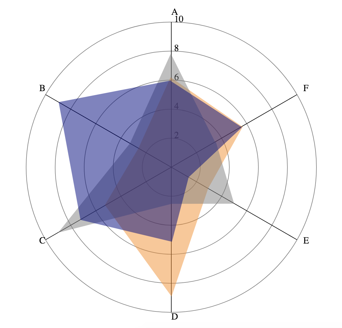
The main steps to making this chart are: plotting the gridlines, plotting the axes, and plotting the shapes for the data. Before we begin the tutorial, here is a peek of what the final product should look like.
Setup #
First to get started we will need some boilerplate code. Create an index.html file with the following contents.
    <html>
        <script src="https://d3js.org/d3.v7.min.js"></script>
        <body>
        </body>
        <script>
            //code goes here!
        </script>
    </html>
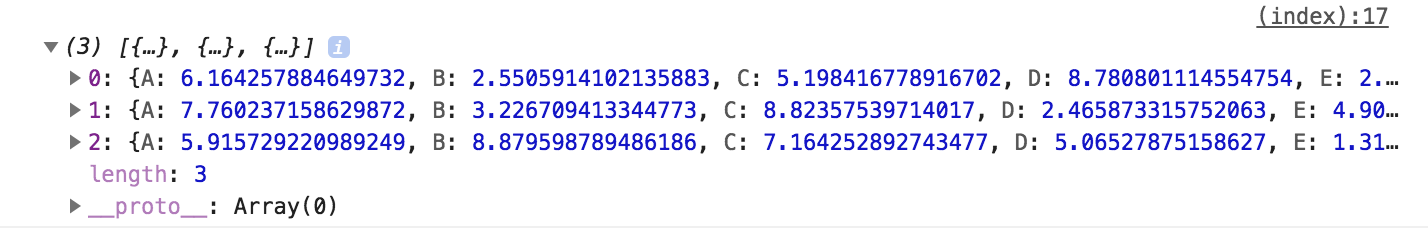
Let’s generate some fake data. Put the following code inside the <script> tag. This generates an array of JSON objects, each with the fields A-F populated with random numbers between 1 and 9.
let data = [];
let features = ["A", "B", "C", "D", "E", "F"];
//generate the data
for (var i = 0; i < 3; i++){
    var point = {}
    //each feature will be a random number from 1-9
    features.forEach(f => point[f] = 1 + Math.random() * 8);
    data.push(point);
}
console.log(data);
Note: f => point[f] = 1 + Math.random() * 8 is an anonymous function, equivalent to function(f){ point[f] = 1 + Math.random() * 8; }
Feel free to open index.html in your browser and inspect the data in the browser console; keep in mind that the data will be re-generated each time you reload the page. The console output should look something like this (note that your numbers will be different from mine):
In D3, the charts are usually displayed as SVG’s (Scalable Vector Graphics, an image format). We use d3.select to select the <body> tag, and add a 600x600 blank SVG inside to draw our chart on.
let width = 600;
let height = 600;
let svg = d3.select("body").append("svg")
    .attr("width", width)
    .attr("height", height);
Plotting the Gridlines #
D3 provides helper functions for mapping data into coordinates. We will make a scale to map our data values to their radial distance from the center of the chart. The scale below maps values from 0-10 linearly to 0-250. We will also define an array of tick marks to be placed on the chart. The page should not display anything yet.
let radialScale = d3.scaleLinear()
    .domain([0, 10])
    .range([0, 250]);
let ticks = [2, 4, 6, 8, 10];
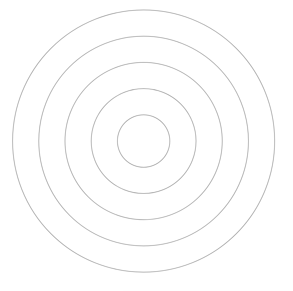
Now, let’s add some circles to mark the positions of the ticks we previously set. We place grey, unfilled circles centered at the middle of our SVG. The radius of the circle is determined by the scale we previously defined. For example, an input of 2 corresponds to an output of 50 on our scale, which means the circle for the tick at 2 will be 50px wide.
svg.selectAll("circle")
    .data(ticks)
    .join(
        enter => enter.append("circle")
            .attr("cx", width / 2)
            .attr("cy", height / 2)
            .attr("fill", "none")
            .attr("stroke", "gray")
            .attr("r", d => radialScale(d))
    );
If you want to understand what’s happening inside the call to .join, check out this page for an overview of data binding in D3.
The page should look like this now:
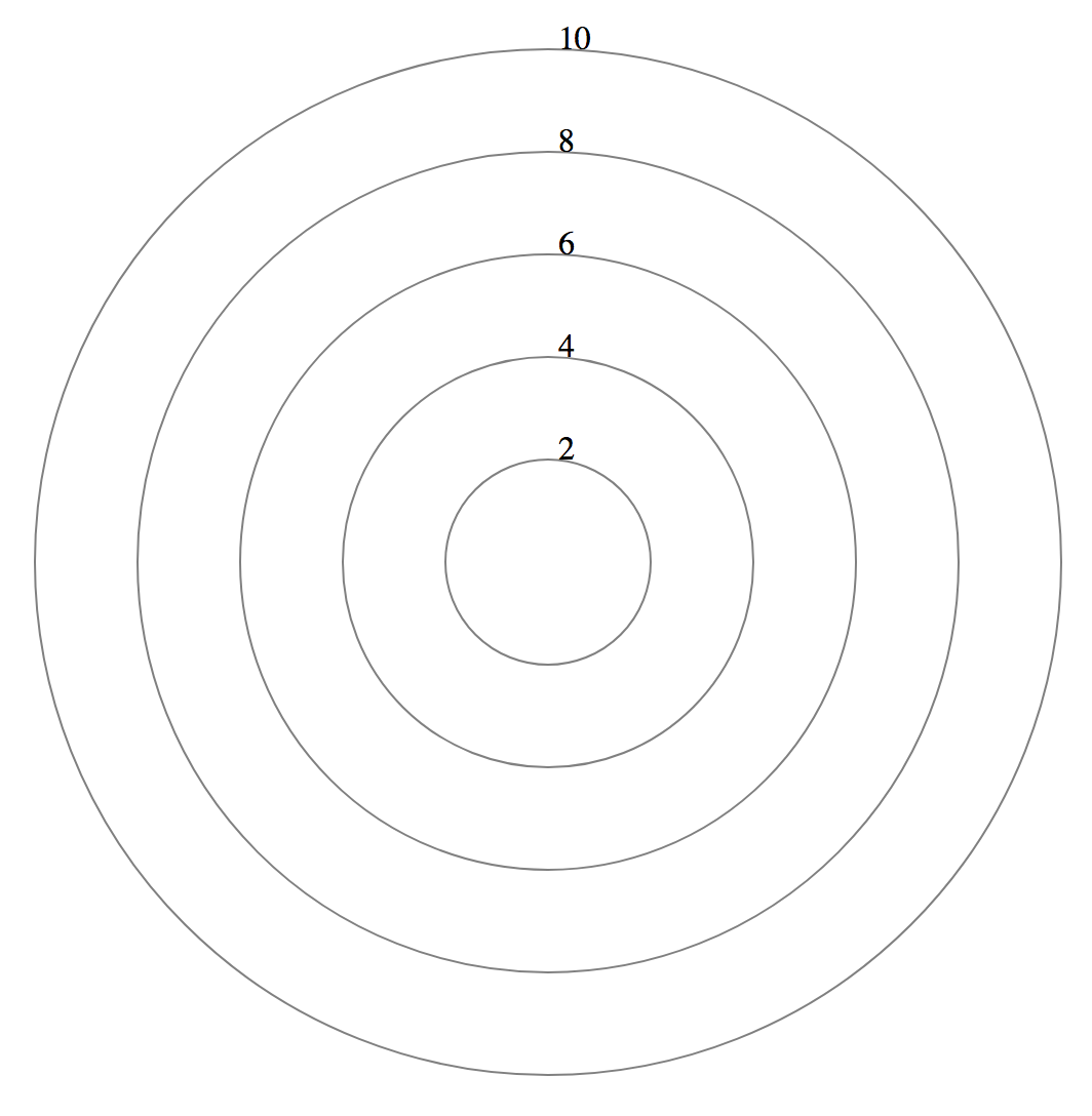
Next we will add text labels for the ticks; they will be arranged going up from the center of the chart. We offset the x value by 5 so that the label will not overlap with some of the later lines we will draw.
svg.selectAll(".ticklabel")
    .data(ticks)
    .join(
        enter => enter.append("text")
            .attr("class", "ticklabel")
            .attr("x", width / 2 + 5)
            .attr("y", d => height / 2 - radialScale(d))
            .text(d => d.toString())
    );
Notice that the y value is not the value output by the radial scale. This is because SVG coordinate systems have the top left as (0,0) and the y axis extends downwards from there (see diagram below). That means something that is 500 pixels from the bottom of the SVG has a y value of 100. Something that is 250 pixels up from the center of the SVG (like the text label for 10) will be at y value of 50.
The page should look like this now:

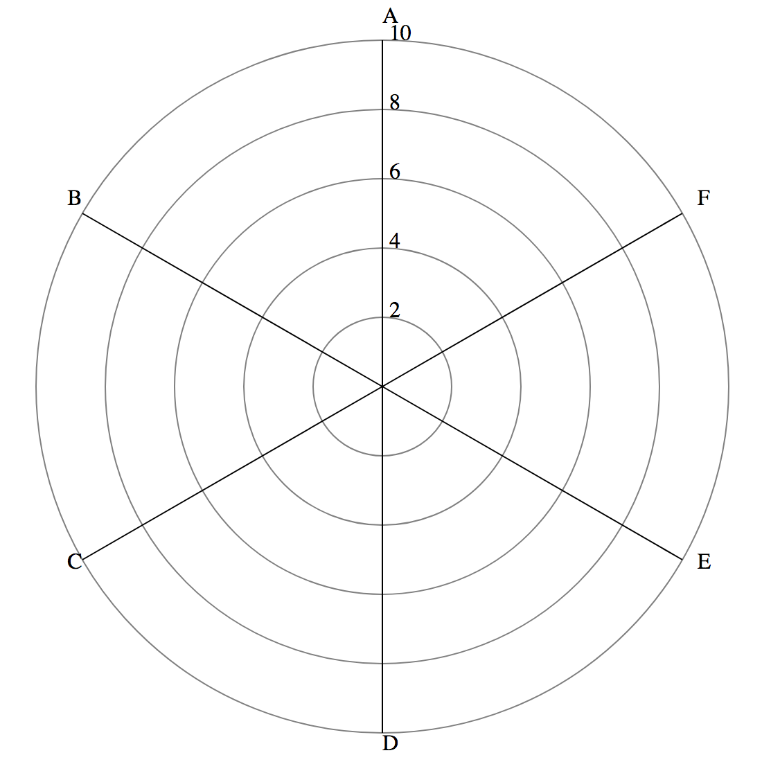
Plotting the Axes #
We will now map each feature onto a line extending outwards from the center of the chart. To do this, we need to write a function which maps an angle and value (polar coordinates) into SVG coordinates using simple trig. The function outputs a JSON object with an x and y field to represent the coordinate.
function angleToCoordinate(angle, value){
    let x = Math.cos(angle) * radialScale(value);
    let y = Math.sin(angle) * radialScale(value);
    return {"x": width / 2 + x, "y": height / 2 - y};
}
We iterate through the array of feature names to draw the text and the label. To calculate the angle, we need to know how many features there are - in this case we have 6 features, which means that the axes are spaced at every 60 degrees.
Normally, the axis at 0 degrees will extend horizontally to the right from the center of the chart. Here, we offset by 90 degrees so that one of the axes lines up with the ticks we drew earlier. Note that Javascript’s built-in math functions take radians as input, not degrees.
For SVG line elements, there are four attributes that specify the starting and ending x and y coordinates of the line. We map the text labels to a radius slightly larger than the largest circle to prevent overlaps.
let featureData = features.map((f, i) => {
    let angle = (Math.PI / 2) + (2 * Math.PI * i / features.length);
    return {
        "name": f,
        "angle": angle,
        "line_coord": angleToCoordinate(angle, 10),
        "label_coord": angleToCoordinate(angle, 10.5)
    };
});

// draw axis line
svg.selectAll("line")
    .data(featureData)
    .join(
        enter => enter.append("line")
            .attr("x1", width / 2)
            .attr("y1", height / 2)
            .attr("x2", d => d.line_coord.x)
            .attr("y2", d => d.line_coord.y)
            .attr("stroke","black")
    );

// draw axis label
svg.selectAll(".axislabel")
    .data(featureData)
    .join(
        enter => enter.append("text")
            .attr("x", d => d.label_coord.x)
            .attr("y", d => d.label_coord.y)
            .text(d => d.name)
    );
The page should look like this now:
Plotting the Data #
Now, we will draw the shapes for the actual data. We will first define a helper function to generate the coordinates for the vertices of each shape, and an array of colors (we only need 3 of them since we know our data only has 3 points, but for larger datasets you can use an scaleOrdinal and map to an array of more colors).
let line = d3.line()
    .x(d => d.x)
    .y(d => d.y);
let colors = ["darkorange", "gray", "navy"];
We will also write a helper function that iterates through the fields in each data point in order and use the field name and value to calculate the coordinate for that attribute. The coordinates are pushed into an array and returned.
function getPathCoordinates(data_point){
    let coordinates = [];
    for (var i = 0; i < features.length; i++){
        let ft_name = features[i];
        let angle = (Math.PI / 2) + (2 * Math.PI * i / features.length);
        coordinates.push(angleToCoordinate(angle, data_point[ft_name]));
    }
    return coordinates;
}
We then append a <path>, which is a SVG element that draws a continuous line between the coordinate values specified in its d attribute. These path values are encoded as a string with complicated formatting, so we are using the d3.line that we defined earlier to generate it for us. We input the coordinates for the path using .datum, and set the shape to have the correct color and filling. Opacity is set to 0.5 that way each data point will not completely obscure the data plotted below.
// draw the path element
svg.selectAll("path")
    .data(data)
    .join(
        enter => enter.append("path")
            .datum(d => getPathCoordinates(d))
            .attr("d", line)
            .attr("stroke-width", 3)
            .attr("stroke", (_, i) => colors[i])
            .attr("fill", (_, i) => colors[i])
            .attr("stroke-opacity", 1)
            .attr("opacity", 0.5)
    );
Congratulations! You have made your first spider chart in D3. Refer to the beginning of this post for how it should look, or check out a live version of the visualization here: D3 spider chart.