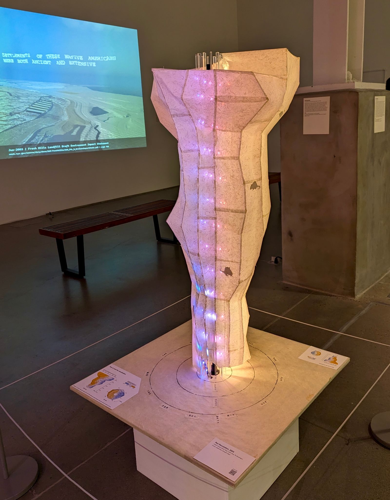
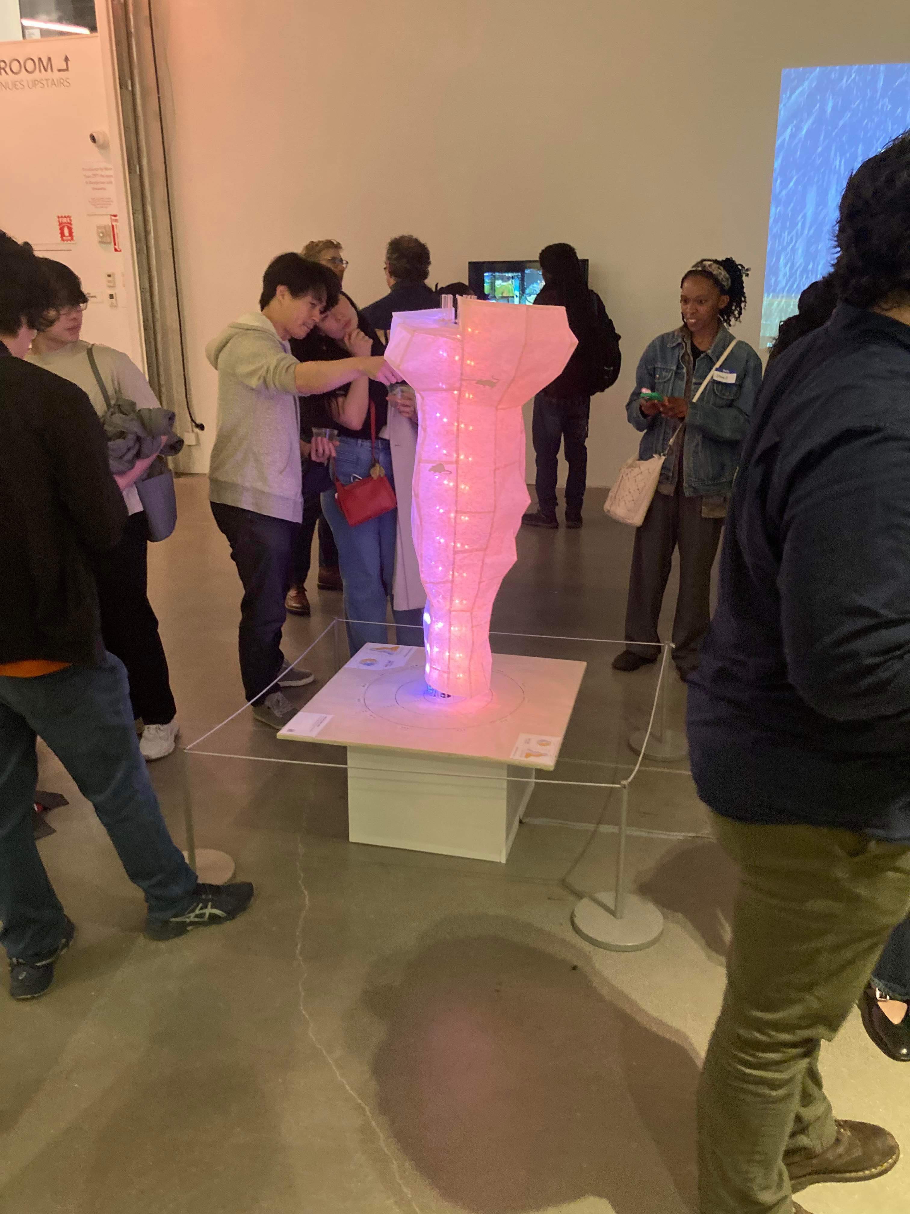
In March 2024, we unveiled “Rat Revolution” at the Data Through Design exhibition. “Rat Revolution” can be described as a light sculpture or a physical data visualization, but we affectionately refer to it as “the rat tornado”. As a data visualization, it allows viewers to trace the ups and downs of New York’s rodent infestation throughout the seasons and over the years. As a light fixture, it looks pretty darn good in a living room.
Join me for a brief retrospective of our six-month journey into the world of data art and physical data viz.
Background #
Data Through Design (DxD) is an independent collective which organizes an annual art exhibition during NYC Open Data Week, featuring works that use data from NYC’s Open Data portal. Each year’s exhibition has a different theme, and 2024 had the theme of “Aftermath”.
Several of us had been to previous DxD exhibitions, and we were excited to potentially participate as artists this year. Typically, DxD begins accepting proposals in the fall for the exhibition the following spring. Once the applications opened up and theme was announced, we immediately began brainstorming.
Brainstorming #
One early topic we discussed was the lanternfly infestation that plagued New York City in recent summers. Unfortunately, the lanternfly phenomenon was too recent and there wasn’t granular, city-level data available so we had to abandon that idea for now.
Following that line of thinking, we immediately thought of rats. They were pests that were part of the zeitgeist in New York City, and thanks to their ubiquity, we were able to track rat complaints using a publicly available dataset from the Open Data portal. We used a subset of the 311 calls dataset that only contained complaints mentioning the term “rodents”.
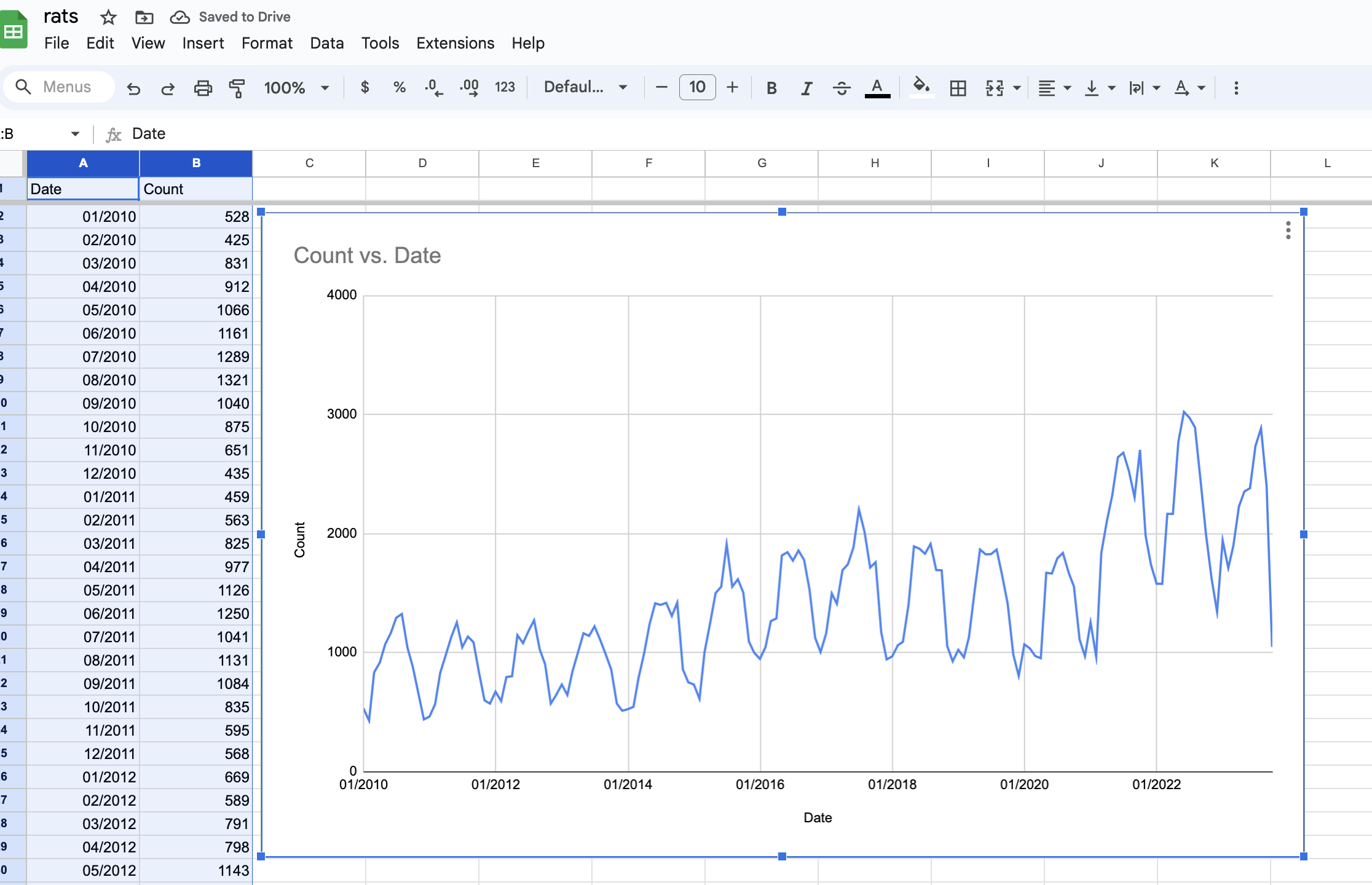
With a potential dataset in hand, we moved on to some exploratory analysis. When we plotted the data over time as a simple line chart, we saw that the number of complaints increased over time and followed a cyclical pattern that corresponded with the seasons.
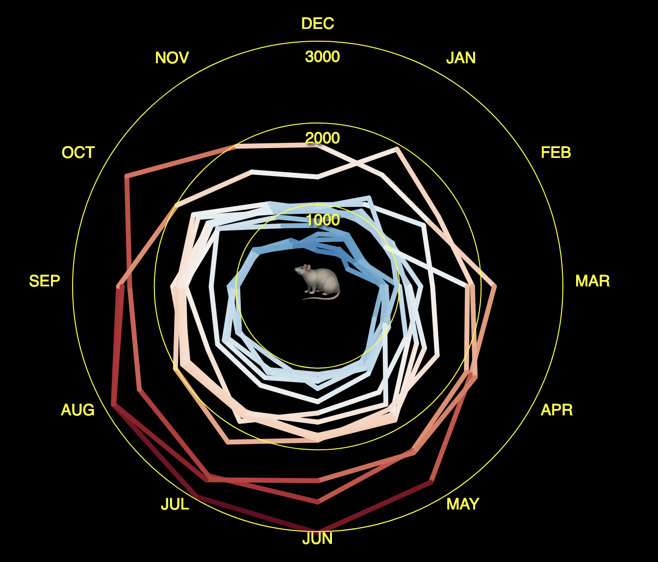
Due to the strong seasonality of this data, we saw a potential connection between this data and the well-known NASA global warming spiral. Plotting our data in polar coordinates achieved a very similar result: there was a clear seasonal trend with a spiral growing outwards over the years.
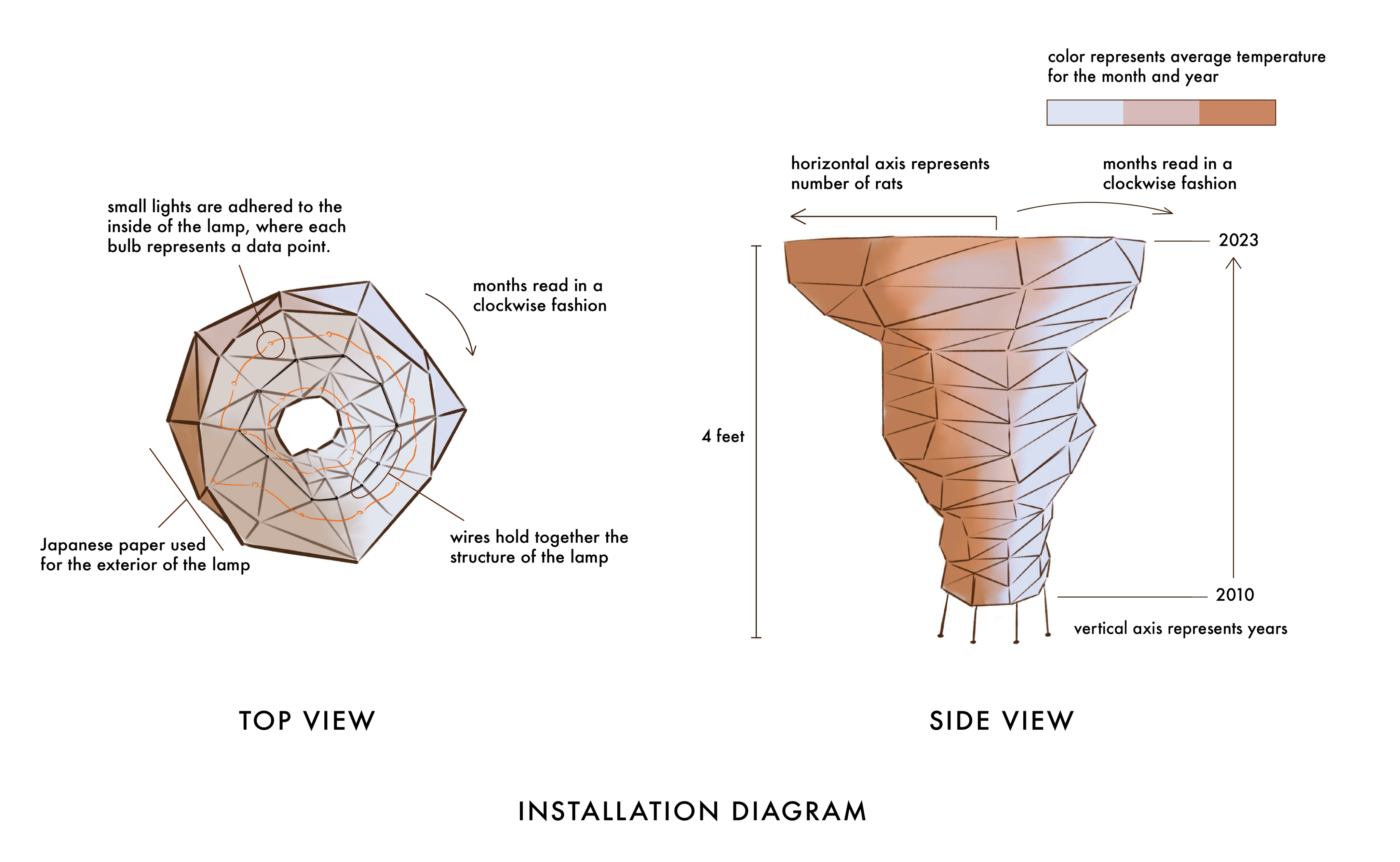
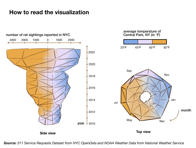
From the beginning, we didn’t have specific plans to make a sculpture but we knew we wanted to avoid just making a picture on a screen. When we extruded our rat population spiral into three dimensions with years as the z-axis and visualized the results with D3.js, the outwards spiral made the top of the chart much wider than the bottom, making the render appear like a low-poly tornado.
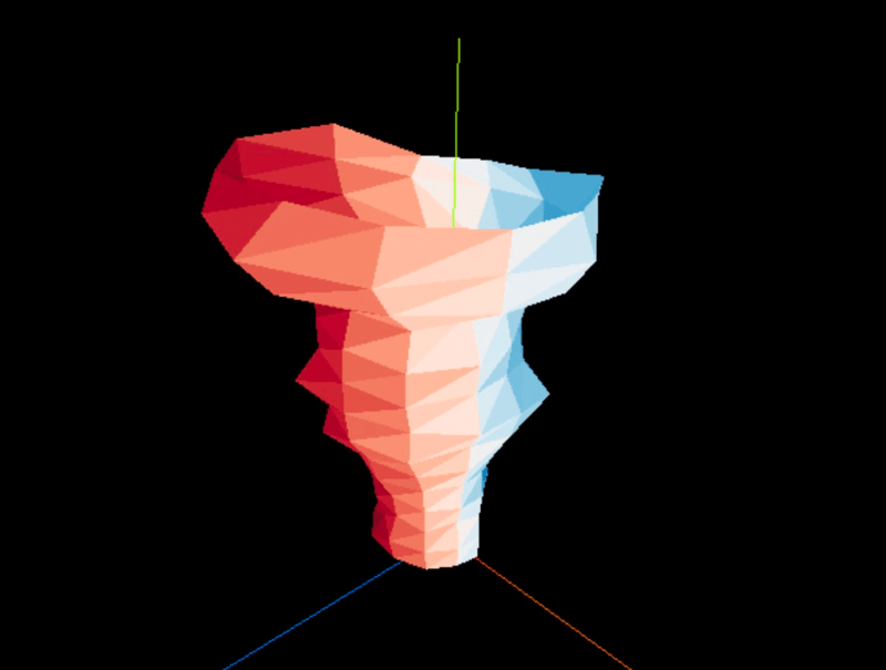
These exploratory renderings live online, if you want to see them more closely - you can click and drag to spin them around!
We were very excited about the artistic potential of this chart; the 3D polar plot perfectly emphasized the explosion in rat population in recent years while evoking imagery of a natural disaster.
Typically, 3D charts are cumbersome to read and manipulate on a screen; however, as a sculpture, this design had several interesting properties. The chart’s silhouette looked different from every angle because each vertical silhouette represented the change in rat sightings over the years for a particular month. While following the trend around the spiral, the viewer only needs to look up or down to see what the data looks like exactly one year earlier or one year later.
This meant that including the third dimension had actual value (v.s. making it 3D just for the sake of being 3D), provided a meaningful perspective for gallery visitors when they circle the sculpture and investigate the data from all angles.
We also had to pick a material for the sculpture, ideally something hollow and light for ease of transportation and assembly. After some discussion, we decided on a paper surface over a rigid frame, with an internal light source inspired by Chinese and Japanese paper lanterns and Isamu Noguchi’s light sculptures.
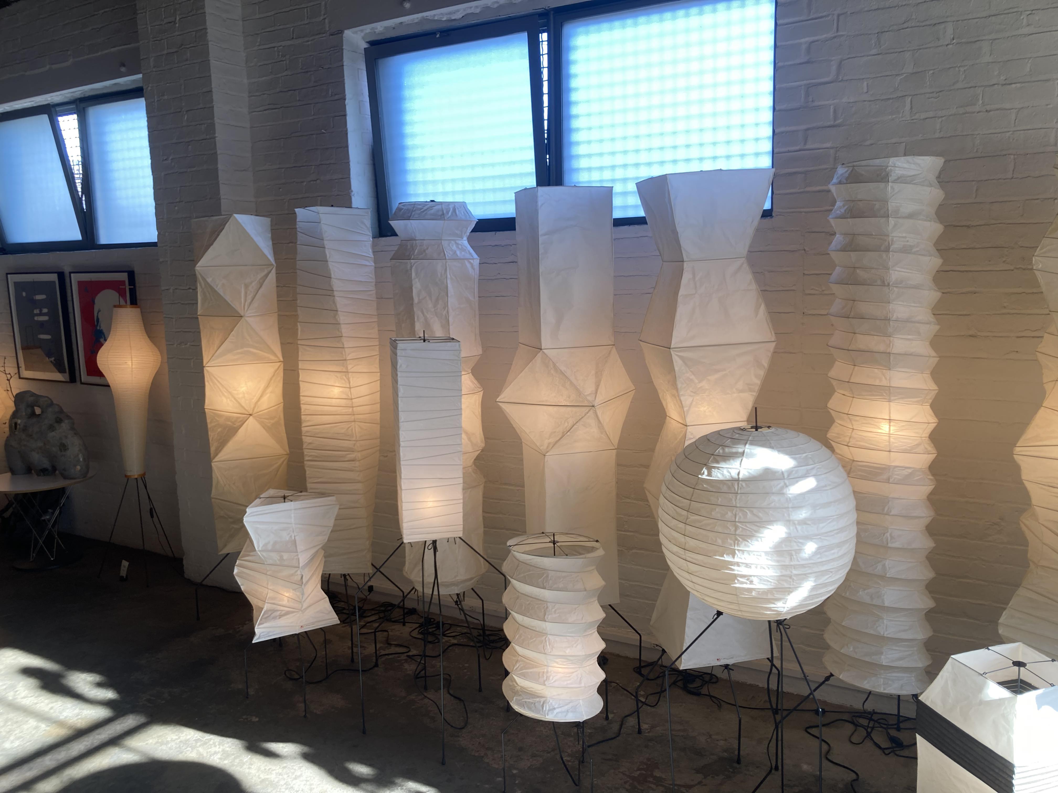
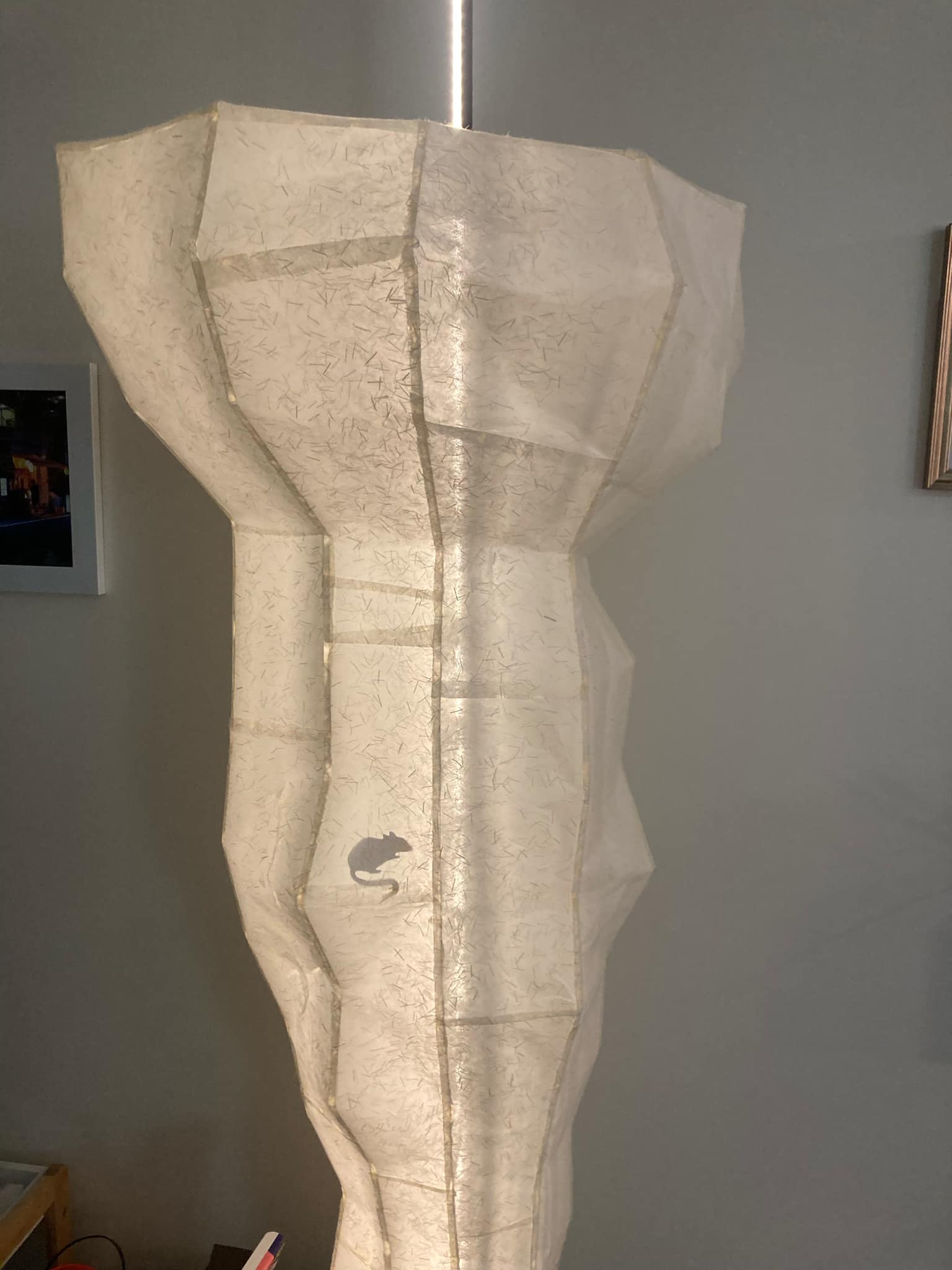
To emphasize the rat theme, we planned to cut out rat silhouettes to cast shadows on the exterior surface of the lamp. To help viewers correlate the trend with the seasonal temperature fluctuations, we planned to use multi-colored LEDs inside the lamp with each light mapped to a specific month and its color representing the average temperature for that month. A quick research trip to the Noguchi museum in Astoria finalized this decision, and we submitted the proposal to DxD.
Prototyping #
Around the end of the year, we were thrilled to learn that we had been accepted for the exhibition. There were only three months till opening day, so we got to work immediately.
While we had an idea of what the installation would look like, we didn’t have any prior experience in making physical sculptures. We were also working within some financial limitations - the exhibition provided $900 materials stipend, and we didn’t want to go over budget too much.
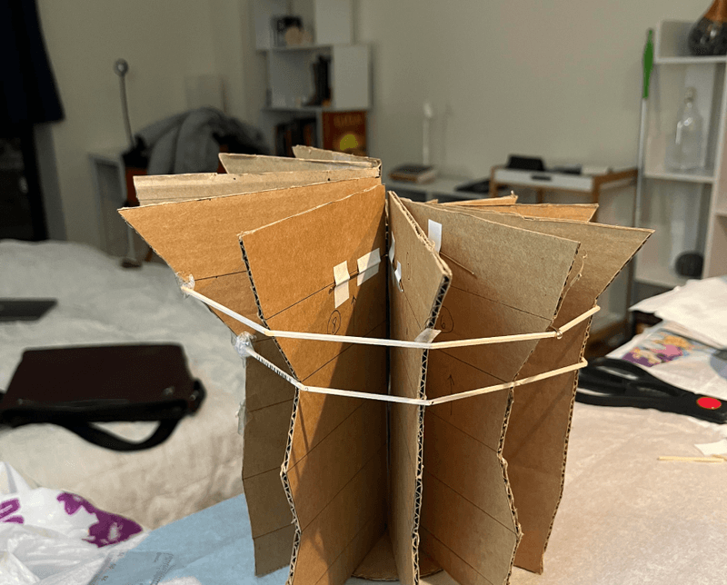
At first, we tried to replicate the traditional construction techniques of paper lanterns by using thin wooden sticks temporarily supported by a central frame, but we found it difficult to produce precise sharp angles and strong concave joints.
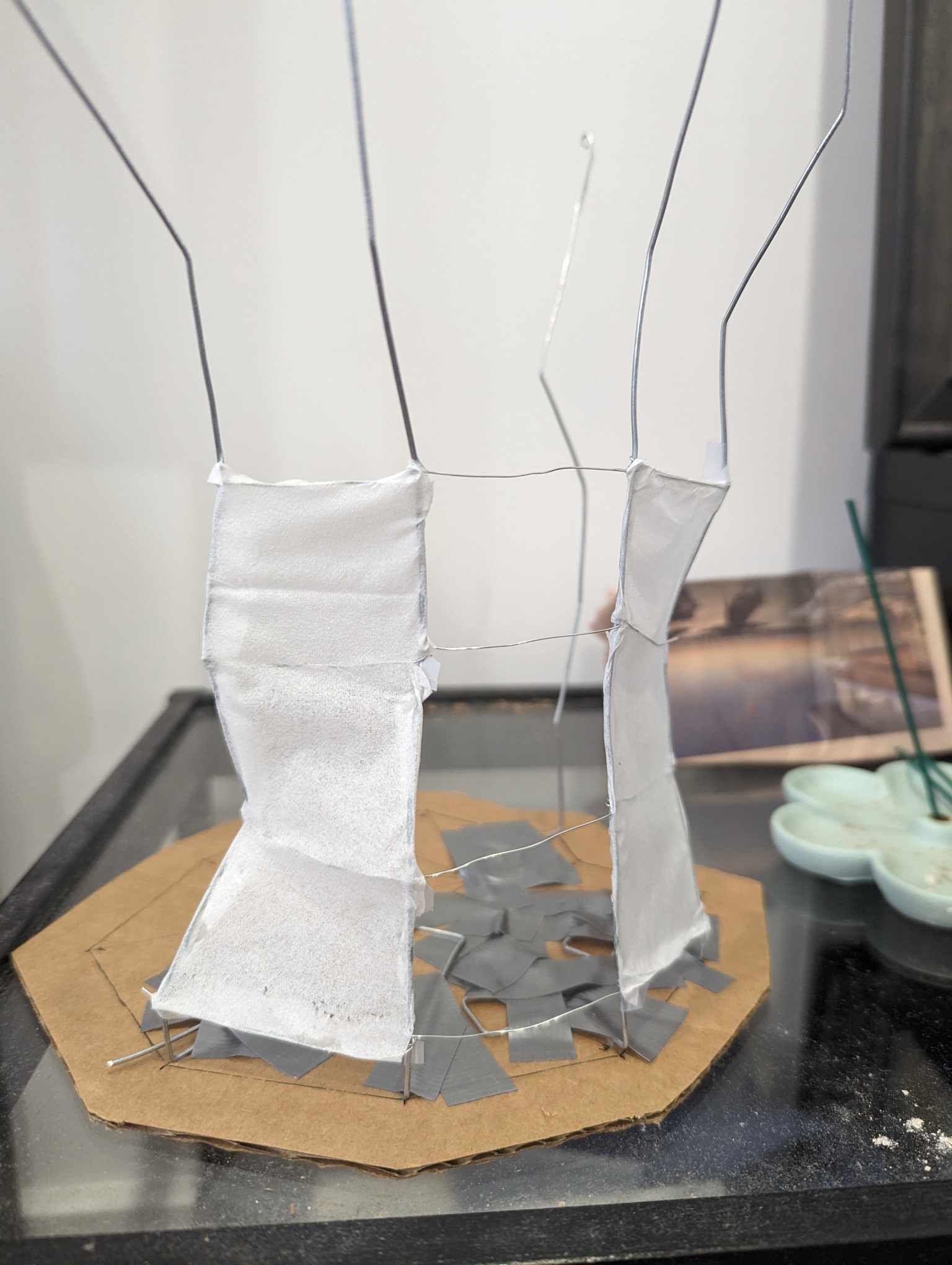
We also experimented with metal wire, but the material wasn’t rigid enough to support the lamp and prone to deformation when bumped.
Our final material exploration included a set of 12 radial foam board frames extending from the center, held together by multiple gear-shaped brackets.
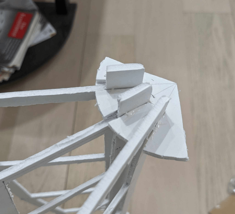
In traditionally constructed lamps, the center supports are removed after assembly to avoid casting shadows of the interior, but we soon realized that we couldn’t produce a structurally sound sculpture without them. We still wanted to minimize the shadows, which meant using a transparent material for the frames, and in the end we settled on laser-cut acrylic.
To generate the laser cut schematics, we used Python to create SVG outlines of each frame and Adobe Illustrator to place the frames on the laser cutting vendor’s template.
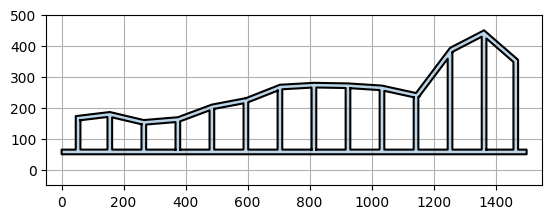
We contacted a few different local vendors, but ultimately were limited by pricing and size. Most vendors did not have a laser cutting table large enough for our design, and the ones that did were out of budget. In the end, we worked with NYCLaserCut and reduced our schematics by 30%, which ended up cutting our fabrication cost in half.
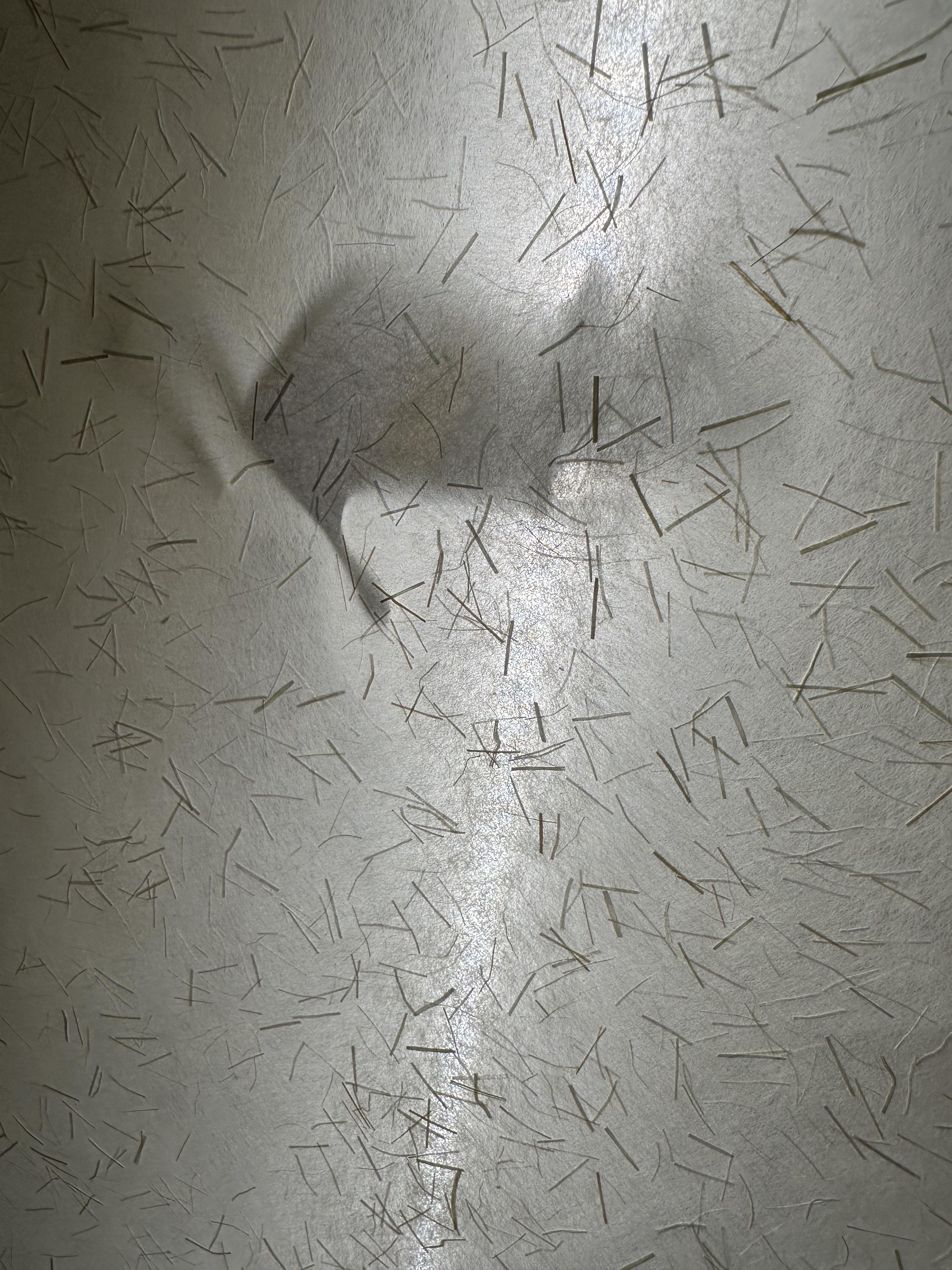
We purchased kinwashi paper for the sculptures’ surface from TALAS, a local archival and bookbinding vendor in Brooklyn. This paper had thicker fibers embedded inside, and created a very nice texture for the surface of the lamp.
Assembly #
After building several prototypes, we knew that constructing the final version of the lamp wouldn’t be an easy feat; however, we didn’t anticipate just how many complications we would encounter during the process. In true New York fashion, we were building this fairly large art installation in the confines of an apartment.
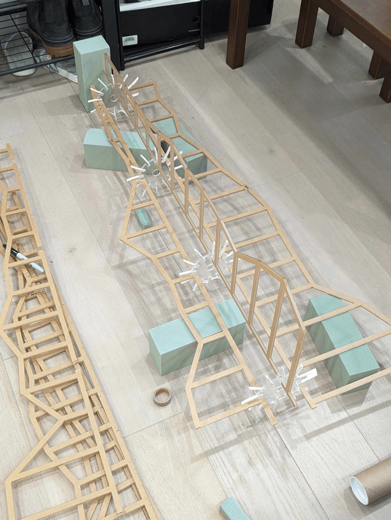
Very early into the assembly process, we came across our first obstacle. The gear-shaped brackets that were supposed to hold the vertical frames together didn’t have the correct dimensions; the spacing in the brackets was almost twice the thickness of the frames! With some creative thinking, we decided to pad the holes with foam tape and leftover wood from our prototypes. The combination of these two materials turned the oversized gear holes into snug fits for the vertical frames.
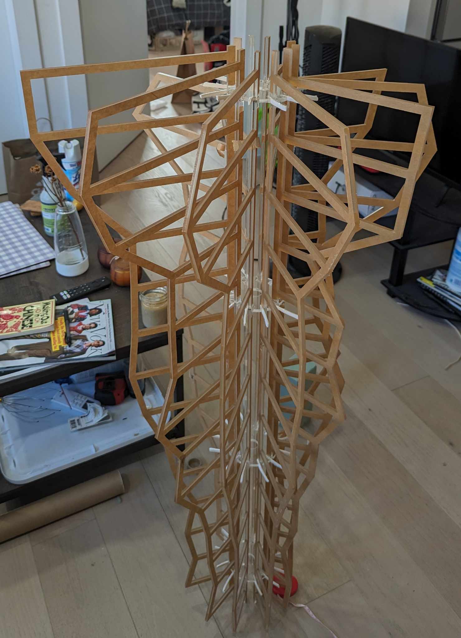
We ran into our second complication after finishing the skeleton of our lamp installation. We had initially acquired some mystery LED light strips and breadboards from the depths of our abandoned projects closet, but we didn’t know how to wire them up. It took several trips to the only electronic store in the area – when did electronic brick-and-mortars become a sign of the past? – and long nights researching in makerspace forums for us to figure out the correct materials and methods needed to wire up the LED strip.
Once we had the LED lights wired up and the base code installed into the microcontroller, we quickly realized that we had overlooked one important detail. We were using a LED strip with four pins, and the lights couldn’t be programmed individually. This meant that we wouldn’t be able to display the individual temperature data with our current set-up. At this point, we were running close to the clock, but we wanted to stay faithful to our original proposal. We decided to swap the 4-pin LED strip with a 3-pin version (with the help of some quick Amazon priming) and finally, wrapped up the final step of our assembly process.
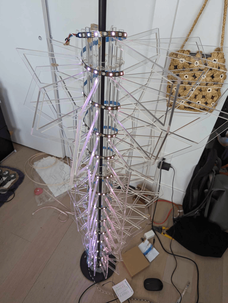
A few days before the opening night of the exhibition, the LED lights suddenly went out and no amount of tinkering would ignite them. We were stumped because nothing in the set-up had changed, which made narrowing down the cause of the issue difficult. We dropped by a local makerspace NYC Resistor, and the helpful experts there identified the issue. We were using a power supply with an output of 5 watts when we needed a minimum output of 45 watts! The underpowered power supply could have worked for a short period of time, but it was certain to overheat in the long run.
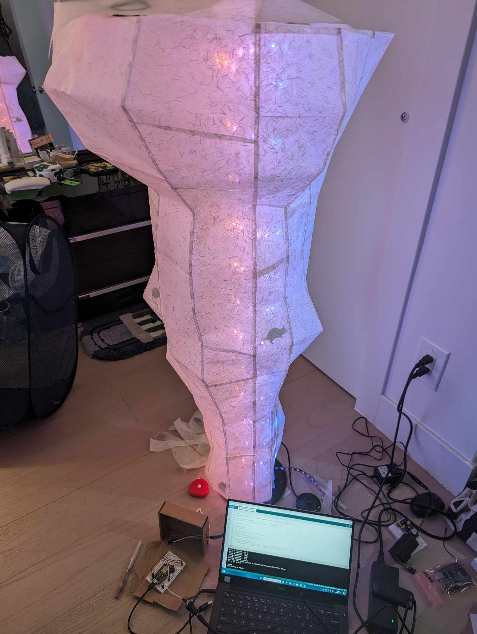
Finally, it felt like we were so close to the finish line. With the LED lights installed and running properly, we glued the washi paper panels onto the acrylic skeleton. We also constructed a wooden base for the sculpture, which allowed us to draw axis and grid lines, as well as attach a guide explaining how to read the installation.
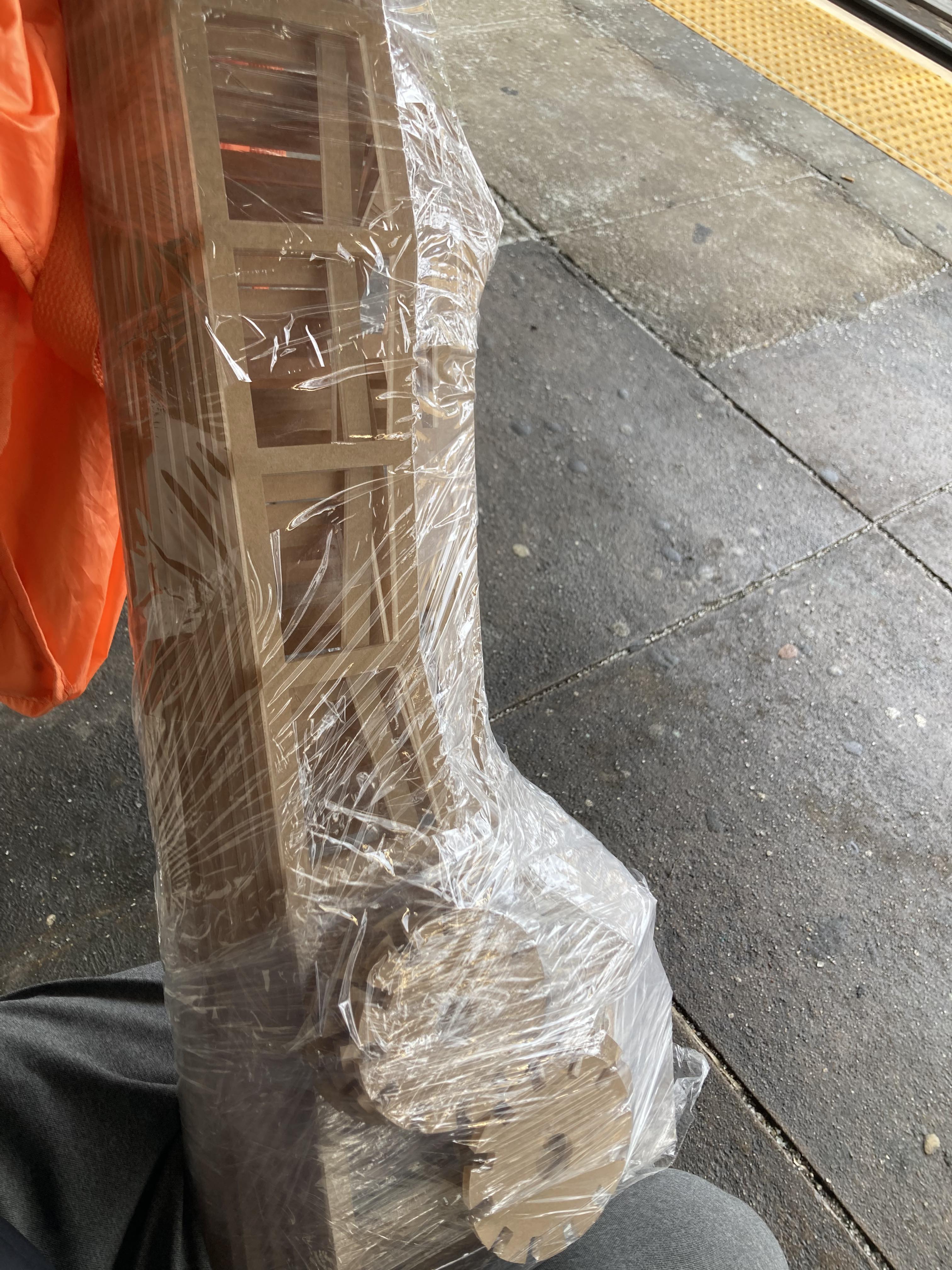
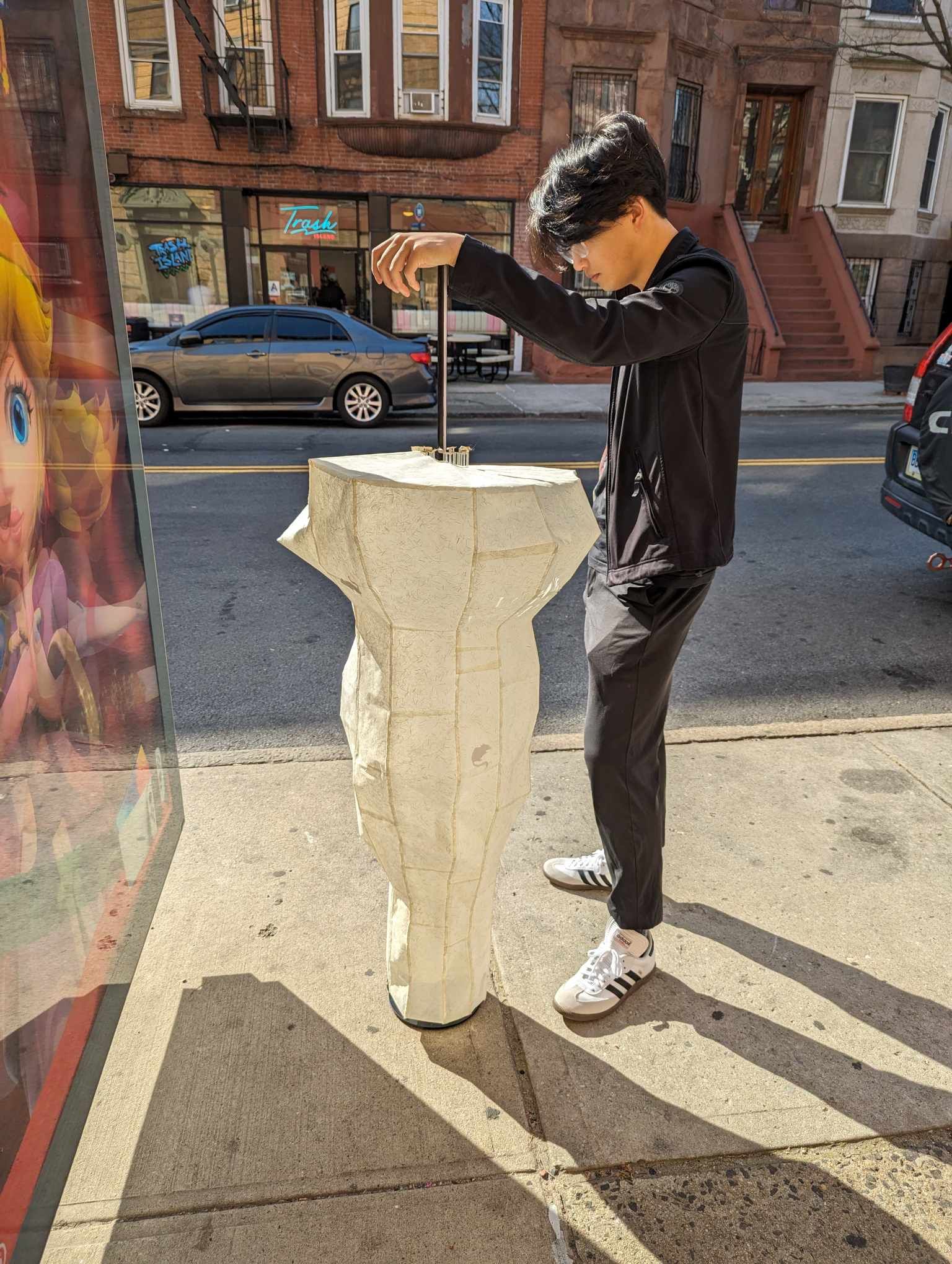
Construction was finally complete and only one final obstacle stood in our way: we needed to transport the 5ft-tall lamp from Bed-Stuy to BRIC in Downtown Brooklyn, where the exhibition was being held. The paper panels were fragile so moving it by car was out of the question, and we were worried that the lamp would topple over if transported on a moving truck. In the end, in true New York fashion we brought our sculpture onto a local bus for 45 minutes, and carried it through the streets for the final few blocks to the exhibition.
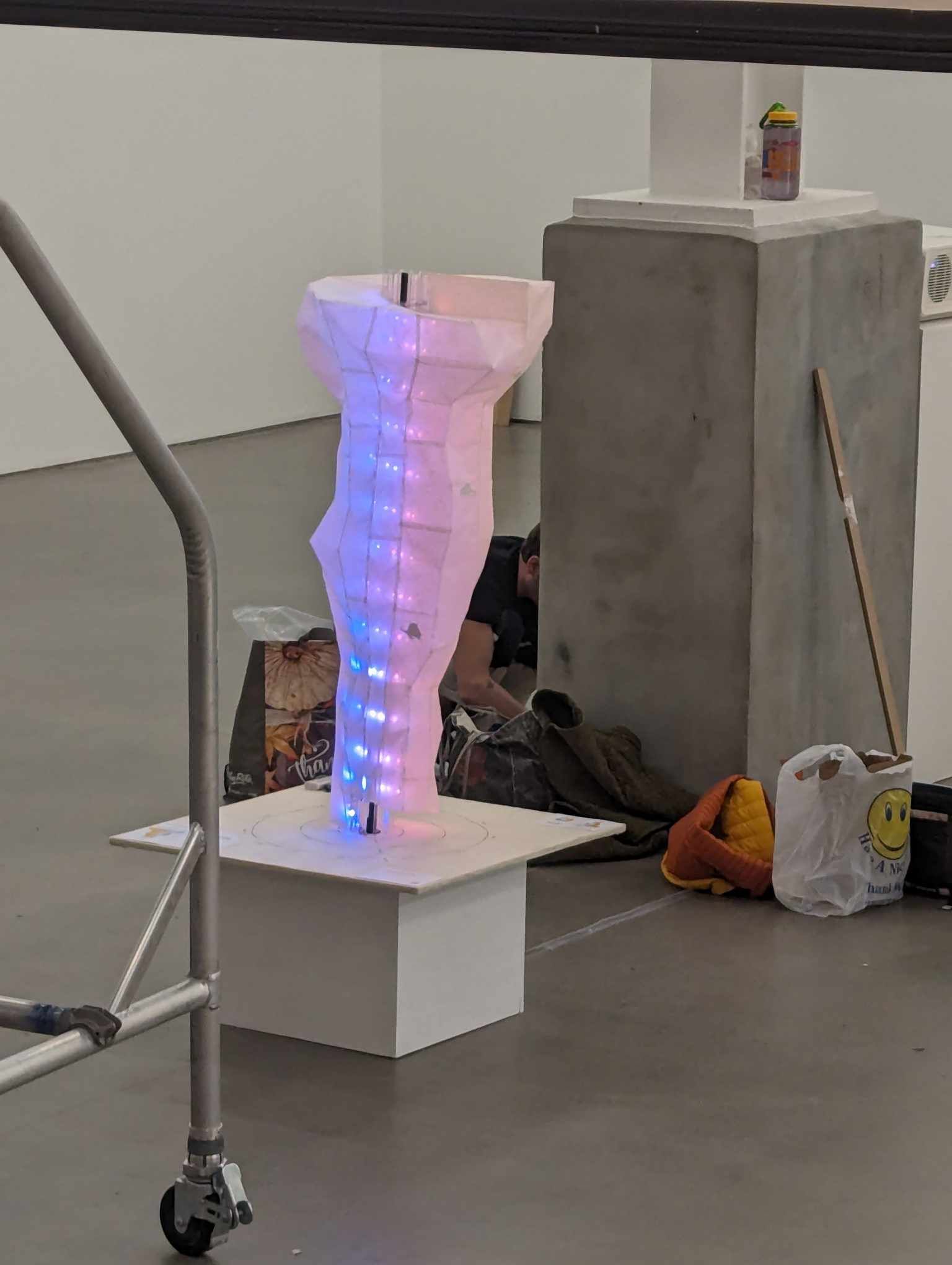
Given all the complications during our prototyping and assembly phase, the installation process went by quite smoothly. As we were leaving the exhibition space, we turned back to take one final look at our sculpture. Often in the development process, the original design can get lost in the flurry of fabrication limitations and physics laws and time constraints. But the lamp looked just as we had envisioned, with its tornado-shaped silhouette and soft warm glow, obstructed by the small rodent shadows.
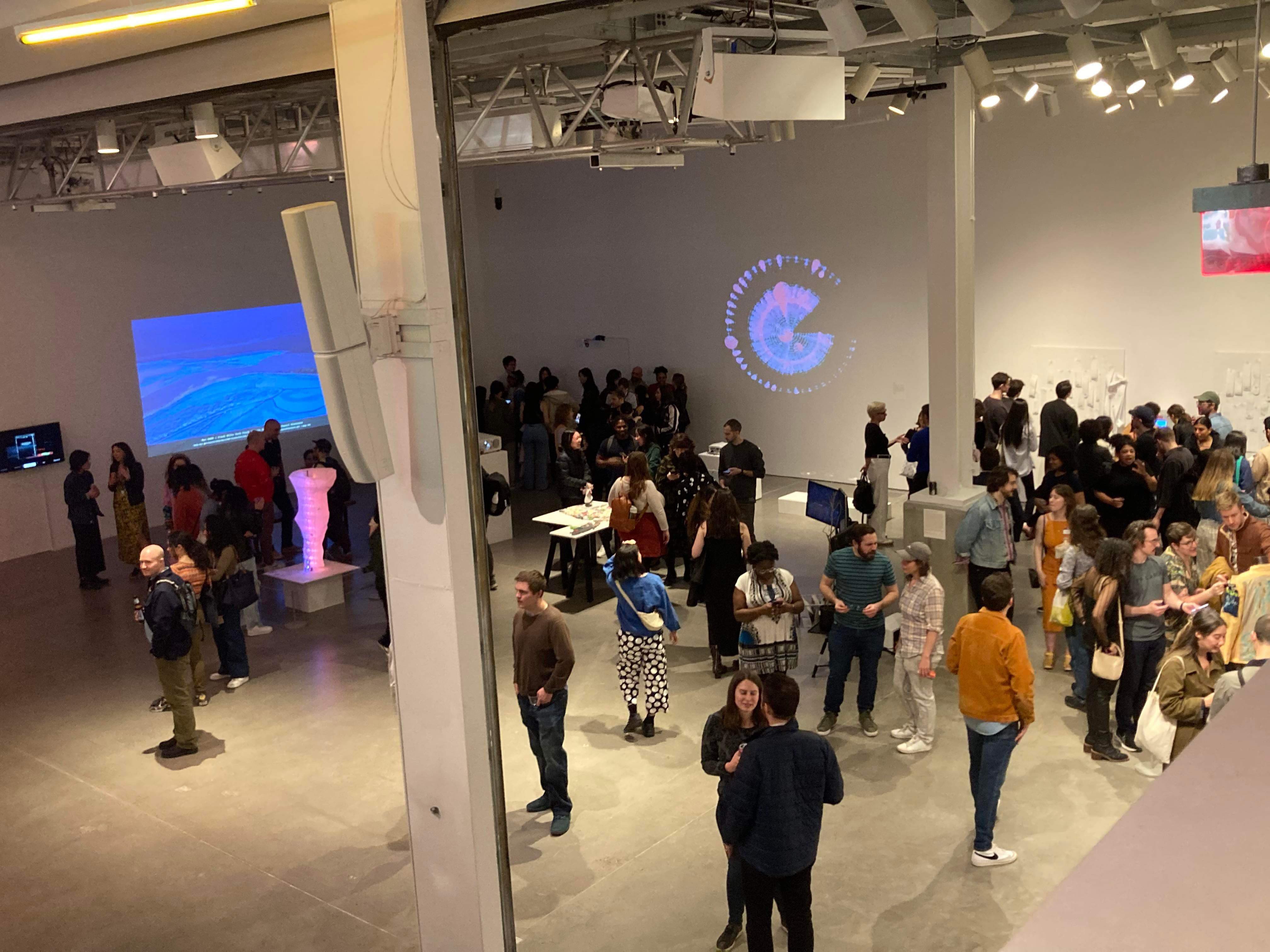
It was such a surreal moment–just six months earlier, our team had taken on this project with a little more than a paper drawing of our vision and now that vision was mirrored before us. All of this couldn’t have been done without the support from local NY vendors, DxD organizers, and NYC Resistor members, and we are immensely thankful to all of them for helping make this possible.
Conclusion #
It’s been some time since the exhibition, and our team is finally able to look back fondly at this experience. The Data Through Design exhibition – and on a larger scope, all the events held during NYC Open Data Week – is such a unique event that creates space for data enthusiasts from all walks of life (students, engineers, artists, public officials, industry partners) to mingle and get inspired by the civic tech space.
Nowadays, data visualization discussions are commonly focused around the digital space, with major innovations happening around acessibility, novel interfaces like “scrolly-telling”, and precise mappings of data to visual elements. There is not a lot of discussion about data visualization in the physical space, where viewers can feel the scale and size of the dataset and be forced to reckon with the trends emphasized in the visualization.
Physical data visualizations are still few and far between, but we hope that there will be more opportunities in the future to explore new forms of storytelling with 3D visualizations.
For now, the lamp has found a happy home in my living room.
To see more photos of our project, you can visit Pia’s website.